Newsletter - Links - Advertise - Contact Us - Privacy
 

Neo Art Deco student tower takes Glasgow back to black

December 10 2024

Neo Art Deco student tower takes Glasgow back to black

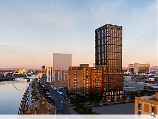
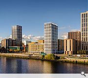
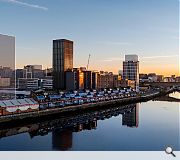
An emerging forest of towers in Glasgow's Anderston district will be given a new centrepiece with plans for a svelte 25-storey student tower that seeks to evoke 1920's opulence over 2020's austerity.

Construction giant Graham harbour big plans for 138 Hydepark Street, proposing a sweeping jet-black student tower with glossy scalloped ceramic panels and curved glass corners to imbue the site with a dash of gilded-age glamour.

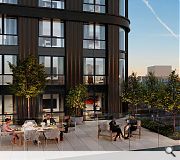
Hosting 410 student flats above a ground-floor amenity podium the terraced tower combines outdoor lounges and a communal kitchen, in a rectangular form modelled on the proportions of New York's Seagram Tower.

Referencing their inspiration behind the design Cooper Cromar described Minerva Way as displaying 'Undertones of 1920’s art deco with elegant slim-line frames and metalwork.'

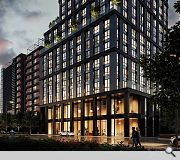
Outlining their approach to materiality the practice added: "Glossy black scalloped large format panels enhance the verticality of the facade, with black simple concrete horizontal elements intersecting every third floor. Subtle and timeless it will weather well in Glasgow’s microclimate. In the words of Henry Ford in the 1920’s: ‘any colour the customer wants as long as it's black.’"

Attention to detail reaches the crown of the building, extending the scalloped panels and rounded corners of the floors below with art deco-style decorative metalwork concealing the rooftop plant.   

A jet black finish and curved corners will set the tower apart from its peers
Amenity spaces are grouped around the ground and first floor levels to bring life to the street

An external terrace is located on the 11th floor
An internal viewing room is located on the top floor

21 Comments

Ben
#1 Posted by Ben on 10 Dec 2024 at 10:55 AM
This proposal is fantastic, probably the best proposed in the entire country this year. Get it built!
Roddy_
#2 Posted by Roddy_ on 10 Dec 2024 at 11:04 AM
A welcome departure from the cheap buff-brick clad brick boxes that appear to be predominating. It is sad to say, but you can sort of tell when something looks a bit too good to be true for the city. And on that basis I confidently predict this will not come to pass in the manner depicted. Rather like every other development of this kind expect horse trading of the site to precede a VEing exercise.
Credit where its due though - probably the best tower design we've seen in the city thus far.
Bob Smith
#3 Posted by Bob Smith on 10 Dec 2024 at 11:04 AM
Awesome, Well done Cooper Cromar
Whispering Andy
#4 Posted by Whispering Andy on 10 Dec 2024 at 11:50 AM
Whisper it…….but that is marvellous! Great work by the CC and Graham guys. That forgotten part of the city is really undergoing a renaissance!

My only concern - which I’m sure will be echoed by others on here - is the lack of garden allotments.
Barry Anon
#5 Posted by Barry Anon on 10 Dec 2024 at 12:03 PM
Great work by the Architects. Nice to see something high class come out under the control of the new Tall Buildings Guide. Let's hope the Client and Planners can keep an top of the Contractor in respect of the VE and it's delivered as is. If so, it'll be a beautiful, stand alone tower in what can only be described as a new 'Quarter' of Glasgow.
Fat Bloke on Tour
#6 Posted by Fat Bloke on Tour on 10 Dec 2024 at 12:33 PM
OMG -- does anyone understand history / does anyone proof read the PR fluff before it is sent out.

The bold Henry and his colour comment -- that was a decade earlier and related to the challenges of mass producing cars in an economical fashion.

Black paint dried quicker and so shortened the paint line.

Henry in the 1920's was a time of stagnation / decline / total collapse as he struggled to engineer a replacement for his signature vehicle. The lines stood still for 6 months as the tried to understand the success of GM.

GM -- multiple models / multiple brands / multiple colours.

Architects and their PR -- not a match made in heaven.
Was Art Deco at any point ever big into black?
McKintosh would have been better.
More local / more credible.
Plus it needs a boost.

Matilda
#7 Posted by Matilda on 10 Dec 2024 at 12:37 PM
Who would have thought Cooper Cromar would be showing the other Glasgow designers how to do elegance.
It’s certainly much better than that white tower with the cheap bricks at Platform.
Well done CC
Fat Bloke on Tour
#8 Posted by Fat Bloke on Tour on 10 Dec 2024 at 12:51 PM
Big auto -- colour is free / texture is cheap.
So a black tower is just a cheap way of moving the discussion away from a very basic as in cheap design.

However the plinth looks ambitious even if the multiple terraces add complexity and complicate the look.

Glesga PBSA klondike running out of steam -- the design will pivot nicely to a hotel.
Not a lot of our plooky youth on show in the visuals -- very mature / very hipster / very artificial.

However great addition to the area -- a few more and we will have a real / happening new residential district that looks the part.
Jimbob
#9 Posted by Jimbob on 10 Dec 2024 at 18:14 PM
Way to go guys, this is class
Love the Art Deco nod
Lovely
#10 Posted by Lovely on 11 Dec 2024 at 08:22 AM
The main part of the tower is good (if you like towers that is).

The lower part is confused and does not sit well with the upper part or the context.

Definitely above average but that is not saying much here.
Mies van der No
#11 Posted by Mies van der No on 11 Dec 2024 at 09:22 AM
Sorry to be the bearer of bad news, but this is just as boring as every other PBSA tower in the pipeline.
Chris
#12 Posted by Chris on 11 Dec 2024 at 09:47 AM
#12 It’s clearly quite a step up in quality and detail than the standard brick boxes that Glasgow usually gets these days.
Sven
#13 Posted by Sven on 11 Dec 2024 at 10:41 AM
It’s likeable and brings a bit of Manchester new build to a developing part of the city. I do think it’s totally wasted on students and that market is tapering off due to demographics and economics. As long as the building is easily converted to non-student use…
David
#14 Posted by David on 11 Dec 2024 at 12:33 PM
Some interesting UR comments from the design team above - i'm struggling to see what really sets this apart from all the other hi-ish rise getting built. Oh wait - it's got round corners - that must be it! Is that what makes it 'Neo Art Deco'?!...whatever that is!
Fat Bloke on Tour
#15 Posted by Fat Bloke on Tour on 11 Dec 2024 at 14:04 PM
Leftfield -- maybe.
Pie in the sky -- probably.

With all the activity in the area and the new homes being built -- is it time to try and revitalise the Fastlink idea?

Better buses / better branding / better bus stops and put in a second leg to Byres Road / GU?

The area is a bit of a desert for transport links at the moment with issues of connectivity across the Clyde and the Clydeside Expressway.

Plus Fastlink kills all credibility surrounding the Glasgow Metro chat.

Two birds / one stone.
Robert
#16 Posted by Robert on 11 Dec 2024 at 19:40 PM
I know the benchmark is not high but this is the best proposal I’ve seen in Glasgow in some time
Chris
#17 Posted by Chris on 12 Dec 2024 at 13:11 PM
#16 Careful with those positive comments now, people might think you're part of the design team!
juan de los angeles
#18 Posted by juan de los angeles on 12 Dec 2024 at 16:02 PM
Looks like yet another upended shoebox, albeit with rounded corners. Another filing cabinet for students. Sad commentary if this really is the best proposal.
Jake Janobs
#19 Posted by Jake Janobs on 13 Dec 2024 at 10:28 AM
#8 / #15 - Fat Bloke, are you feeling OK? You almost made some positive comments. Truly, the spirit of Christmas is among us...
Mark
#20 Posted by Mark on 14 Dec 2024 at 22:45 PM
I'll not intrude on this outbreak of positivity from Cooper Cromar's boosters – just to point out that the proposal bears no resemblance to the Seagram Building! The plan and elevational proportions are nothing like Seagram, far less the fenestration, detailing and materials.
D to the R
#21 Posted by D to the R on 16 Dec 2024 at 10:01 AM
Right you lot ... enough cooper cromar battering and back to you door schedules.

The nature of the negativity on here is EXACTLY what's wrong with the architectural profession. Too busy in-fighting and arguing with each other to see that the profession is gubbed. Why not use some of yer energy to lobby the RIAS or the ARB to pull their fingers out and actually do some proper professional promotion?! Or ... continue to slag each other off.

Anyone on these threads who thinks that an architect still floats in to meet the client in a SAAB wearing a turtle neck and clutching his/her/their Mont Blanc pen has their head up their a%*e - Making buildings with ANY architectural merit is hard graft ... we should at the very least applaud each other for trying to do so.

Post your comments


All comments are pre-moderated and
must obey our house rules.


Back to December 2024

Search News
Subscribe to Urban Realm Magazine
Features & Reports
For more information from the industry visit our Features & Reports section.