Dundashill expansion brings Colony-style living to Glasgow
November 12 2024
The latest expansion of Dundashill, Glasgow, has been brought before planners with a bid to deliver a further 88 townhouses and apartments for private sale at the elevated development site.
Complementing earlier phases the latest wave of homes will again be delivered by Stallan-Brand and Haus on behalf of Bigg Regeneration, drawing the peripheral industrial zone of Port Dundas one step closer to becoming an integrated component of the northern city centre.
Building on the success of Speirs Locks the development is billed as a 'community-centric' neighbourhood of homes for private sale and mid-market rent, emphasising green infrastructure delivered by Rankinfraser.
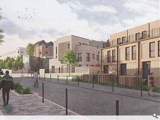
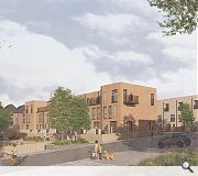
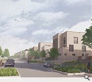
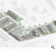
Positioned as a place to reconnect with nature, beat social isolation and combat climate change the anti-suburban build takes the form of a series of terraced blocks addressing Vintner and Harvey Street's via their gable ends, articulated by projecting brick details, save for two prominent corner blocks which define their junction with a strong urban edge. In addition, one terrace of colony-style housing, popular in Edinburgh, will be introduced along Borron Street to help activate the street frontage along the site perimeter.
Outlining their approach to the latest phase the architects wrote: "... there was a desire to develop the base typology in a more radical fashion; exploring how multiple stacked dwellings could be contained within a similar footprint (diversifying the housing mix) whilst also creating a more articulated gable condition that contributes to the streetscape."
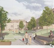
Rounding off the northern edge of the Dundashill masterplan the latest homes are to be arranged around a series of landscaped courtyards with a curated graffiti and street art programme by Yardworks as part of a broader place strategy. All homes are to be built from concrete bricks with corrugated sheet metal used as rainscreen for external balconies.
|
|
9 Comments
This is urban design 101 guys.
It actually reminds me of some of the courtyard spaces in Cumbernauld but even in the 60's, they knew that the adjacent buildings should address and be oriented towards the public space.
It also reminds me of these interstitial spaces in Dennistoun - take note of the abundance of public life.
https://www.google.com/maps/@55.8600045,-4.2272233,3a,75y,44.65h,91.25t/data=!3m7!1e1!3m5!1sIYKZ4uXs5FSECpzMDCbEuw!2e0!6shttps:%2F%2Fstreetviewpixels-pa.googleapis.com%2Fv1%2Fthumbnail%3Fcb_client%3Dmaps_sv.tactile%26w%3D900%26h%3D600%26pitch%3D-1.252101203706971%26panoid%3DIYKZ4uXs5FSECpzMDCbEuw%26yaw%3D44.64625399014017!7i16384!8i8192?authuser=0&entry=ttu&g_ep=EgoyMDI0MTEwNi4wIKXMDSoASAFQAw%3D%3D
The die was cast in the masterplan with all these sub-optimal elements, with the architects just filling in the blanks.What it does show is the lack of proper design governance and understanding from the City authorities of what makes good urban streets and squares - see also Sighthill masterplan and to a greater or lesser extent New Laurieston.
What this demonstrates - rather depressingly- is three things. One- that principles behind PPiP masterplans (usually designed by urban designers) are not worth the paper they're written on ; second, when designers (nearly always architects) start to 'play around' with the masterplan or ' draw on the principles' of the masterplan (as it says in the DAS), they usually end up with really horrible spaces like the one pictured above - or the horrible parking bay dominated street to the rear of Harvey St. Third depressing thing is that City Design (not apparently staffed by urban designers) allows this stuff to stand - whether by design or by politics.
Let's not even broach the idea of the Urban Design Panel which, it seems, is a milk and water organisation. Note that nary a Design Panel report has been published since 2020.
There are already 2 key pieces of design guidance ; Designing Streets and Creating Places. They don't really underpin quality because they are so vague (and discretionary). Instead they are aimed at curbing the worst excesses.This is in addition to the City's Residential Design guide and Supplementary Guidance in the Development Plan. Unfortunately these can and frequently do get negotiated away or are ignored from the get-go and there is no one to insist on the pendulum swinging in favour of quality.
The design quality (of the houses themselves) here is certainly better than you'd get with a volume house builder but as for the overall marks of quality in the layouts ; the streets and the public spaces, the same mistakes are being made here that are being made with the horrible stuff being delivered on the edge of town ie in Robroyston.
One wonders what interim measures (if any) are being brought to bear here, given that it might be another 5-10 years before any shops or faclities appear on N Canal Bank Street. Same with Sighthill. But then we also have the paradigm of the CWG village in Dalmarnock which now has had a decade to get going and not one more single shop in their High Street. Oh , sorry there is a Lidl in the pipeline ... praised be !!!
Post your comments
Back to November 2024
Like us on Facebook
Become a fan and share



The area lacks good connections to the city centre and its remoteness will be its downfall -- Spiers Wharf has been a backwater for 30 years because of its poor connections to civilisation.
Civilisation as in shops and amenities.
Consequently interesting with potential but lots still to do.