Dundee conservation area to be given a contemporary twist
November 4 2024
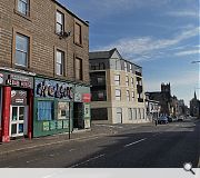
A high-profile gap site in Dundee's West End Lanes conservation area has been earmarked for a small mixed residential and commercial block.
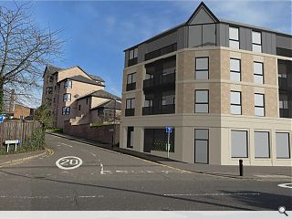
The neglected junction of Perth Road and Ryehill Lane will host a new corner shop behind a reconstituted stone ground floor facade. The five apartments above will adhere to the established built form while introducing modern amenities such as private balconies, a whole-house ventilation system and a partial green roof.
In a statement, Arktx wrote: "There are very few development opportunities along this important stretch of Perth Road. The current vacant site is dilapidated and an eyesore. The development provides an opportunity to provide a valuable mixed-use contemporary intervention into the existing townscape.
"The five new residential apartments above provide a rare opportunity to purchase a new-build environmentally sympathetic property in the heart of this much-sought after community. Each has an external balcony and private space to enjoy."
The build is animated by a chamfered corner feature to introduce a 'modern twist' to the conservation area.
9 Comments
Contemporary twist .. NO Acceptable .. NO NO NO
An awful piece of design. Truly awful.
Some potential and suffers from poor imagery. Which is unusual in this day and age. A better, more texturally accurate rendering would help. And also lose that pointy roof at the corner.
Post your comments
Back to November 2024
Like us on Facebook
Become a fan and share


