Scottish Opera win approval for mixed-use Glasgow HQ
October 23 2024
A major cultural and student housing development in north Glasgow has been recommended for approval following a meeting of the city's planning applications committee.
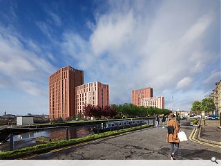
The recommendation relates to updated plans filed by Page/Park Architects on 26 September which show tweaks made to the giant twin tower Scottish Opera proposal which will transform the Speirs Lock area.
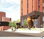
In response to concerns raised at the first iteration of the scheme, the architects have redesigned a pend entrance and canal stairs to provide greater activation and overlooking opportunities. Alternative colour visualisations of the preferred choice of brick were also produced. A planned green wall will now take the form of planters independent of a retaining wall at the behest of Scottish Canals.
In an agenda paper, the committee wrote: "... Scottish Opera is the largest of the four national performing arts companies that are located within Glasgow. Its ongoing success is crucial to the cultural ecology of the city and to Glasgow’s sense of itself as modern, vibrant and outward-looking city. Approval of this mixed-use scheme not only secures the future of Scottish Opera and supports the ongoing success of the adjacent cultural quarter, but also presents a major opportunity to regenerate a brownfield site, improving the setting of and access to the western side of the Forth and Clyde Canal.
"The provision of active frontages and commercial uses would encourage footfall and in turn contribute to the vitality, viability and safety of the area."
Cycling provision has also been boosted with stores located below both the southern and northern steps.

A darker shade of brick is now depicted following concerns that the original scheme was too 'bright'
|
9 Comments
An extraordinary decision.
Brutally incongruous from a distance and patently disfunctional at close quarters. It is so desperately frustrating- it need not have been this way with some place leadership and design governance from the City and with a client like Scottish Opera but when even the vaguest of 'masterplans' for the area is ignored, what chance is there of creating something that could have addressed the canal edge in a positive and vibrant manner. It should have been host to a plethora doorways opening onto the canalside edge and wall buildings with windows all facing onto the water. One, two or perhaps three possible commercial units/cafes/public facing spaces onto the canal walkway would have fed the potential vibrance. Instead we have these strange coffin-shaped monliths with public access and spaces hidden away in undercrofts below the level of the canal. And then we wonder why canalsides/riversides are so much better in the Netherlands or Denmark or Germany (*insert pretty much anywhere else).
There has been some great stuff happening along the canal corridor which makes this even harder to take but it does feel like the City's newest busted flush to go alongside Hamiltonhill,Sighthill, Blackfriars and the last hurrahs of Collegelands. Very,very sad.
The canal has its own challenges -- a port built halfway up a hill being one of them.
Contour canal in a city centre setting -- only one side was developed so only half a job done compared to other waterways in an urban setting. Glasgow cannot be an economy done at half chat so ScOpe have to be commended for making something of the other bank.
Plus set rental would appear to be a growing business. It might be middle class artisan manufacturing but at least it is manufacturing and if they want to grow using funds from these two sites then at least they are putting in the effort / thinking caps on..
If only they had replaced the Meadowside Granary with large scale buildings showing of this design vibe and colour palette.
My thoughts -- interesting solution / better than filler. Sleepy hollow area of the city that could develop nicely if change and investment are applauded rather than snowed under with complaints from the fat and happy.
Post your comments
Back to October 2024
Like us on Facebook
Become a fan and share


