'Replan masterplan' tweaks £250m Northbridge community
September 19 2024
Keepmoat and Elder & Cannon Architects have hosted a second-stage consultation outlining their planned changes to the Northbridge masterplan, a housing-led regeneration of brownfield land at Sighthill, north of Glasgow city centre.
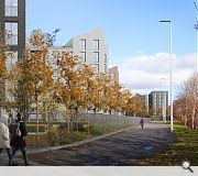
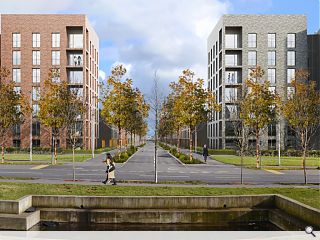
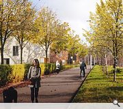
The £250m planned community comprises homes, shops and public spaces connected by tree-lined roads and a 'garden bridge' offering onward connection to George Square, with further tweaks being made to the next tranche of 754 homes.
Following feedback from an initial consultation two additional apartment blocks will now front the main boulevard as part of an overall increase in density across the site.
In a consultation statement, the applicant wrote: "The density has increased from the planning permission in principle and the aim is to maintain this."
Dedicated growing spaces for residents are included in the revised public realm for the latest phase, again overseen by LDA Design.

Tree-lined boulevards and active travel routes will connect the development, billed as the largest regeneration project of its kind outwith London
|
13 Comments
Elder and Cannon should read humanise.
E&C are committed Modernists, trained in the Modernist idiom and bring those predelictions into their masterplans. It works works well as far as individual buildings go, but when the scale becomes that of a neighbourhood, the sterility of Modernist planning permeates the thinking; island buildings, lack of human scale, cul de sacs, poor block structure, dull monotonous housetypes. Even the dreamhaze visuals (which are very nicely executed) cannot hide the fundametal failings of this as a piece of urbanism.
In many ways, they set the paradigm with their 2 smaller schemes in Bridgeton and Maryhill which both shrink away from and reject addressing the street edge in favour of point blocks at jaunty angles.
https://www.google.com/maps/@55.8486274,-4.2255737,127a,35y,39.54t/data=!3m1!1e3?authuser=0&entry=ttu&g_ep=EgoyMDI0MDkxNi4wIKXMDSoASAFQAw%3D%3D
https://www.google.com/maps/place/Cowal+Rd,+Glasgow/@55.8942641,-4.2962453,149a,35y,270h,39.5t/data=!3m1!1e3!4m6!3m5!1s0x488845baaecc617b:0x62830271178aab40!8m2!3d55.893909!4d-4.3017311!16s%2Fg%2F1v3kmn96?authuser=0&entry=ttu&g_ep=EgoyMDI0MDkxNi4wIKXMDSoASAFQAw%3D%3D
They did things much better in the past when they needed to address the urbanity of tenements of Dennistoun, Shawlands and Govanhill- or working within the masterplan of New Gorbals.
https://www.google.com/maps/@55.8571599,-4.2226098,136a,35y,34.78t/data=!3m1!1e3?authuser=0&entry=ttu&g_ep=EgoyMDI0MDkxNi4wIKXMDSoASAFQAw%3D%3D
https://www.google.com/maps/place/Govanhill,+Glasgow/@55.8400411,-4.2614049,128a,35y,90h,39.53t/data=!3m1!1e3!4m6!3m5!1s0x488846ed93a86c83:0x4f51ed935534dfb6!8m2!3d55.8363765!4d-4.2633074!16zL20vMDd3M3d4?authuser=0&entry=ttu&g_ep=EgoyMDI0MDkxNi4wIKXMDSoASAFQAw%3D%3D
https://www.google.com/maps/place/Shawlands,+Glasgow/@55.8276141,-4.2860218,87a,35y,180h,39.56t/data=!3m1!1e3!4m6!3m5!1s0x4888465f3a9f1c09:0xcc216c2d1d52aec2!8m2!3d55.8251245!4d-4.2864469!16zL20vMDQwczBz?entry=ttu&g_ep=EgoyMDI0MDkxNi4wIKXMDSoASAFQAw%3D%3D
It need not have been this way. How about - conceptually at least -creating a block structure that creates active fronts to the path i.e. closes to flats, set-back front gardens and entrances to townhouses/maisonetter/semis. It does not and should not have to be like this.
I'd love to say that the city planning dept will catch these fundamental issues but I think we all know that's not true.
As much as the moody dark brick/minimal articulation schtick works up to a point - and works well in some examples - it's not a one size fits all approach.
Being stripped back and rational is fine, but it doesn't have to be at the expense of the street.
Grim is a word that doesn't do this "improvement" justice.
I get that E&C want to stamp their own identity onto the site, but going by their consultation boards it appears to be a soulless mess of a scheme. The previous Collective design wasn't perfect but at least it wasn't this bland mess of meh.
Additionally, it appears that they are proposing to just leave a big chunk in the middle, which will be the same as the first phase (with its copper / zinc gables and buff brick). That's ridiculous, it will look so odd!
And those house types are atrocious. With there very narrow plots, the tiny back gardens, the weird add-on's to the rear, the whole exercise smacks of trying to squeeze as much out the site as possible.
Surely this will get kicked by GCC.
Post your comments
Back to September 2024
Like us on Facebook
Become a fan and share


