Newsletter - Links - Advertise - Contact Us - Privacy
 

Visuals reveal the 'village' concept behind New Monklands Hospital

August 7 2024

Visuals reveal the 'village' concept behind New Monklands Hospital

New visualisations illustrating the 'village' concept behind the New Monklands Hospital at Wester Moffat, Airdrie, have been produced.

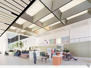
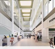
In their latest project update, NHS Lanarkshire and Keppie Design show ground floor public areas could appear, centred on a lofty 'street' extending from the east entrance.

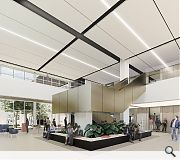
All departments, services, staff and public areas will be arranged along this central spine, which extends to a western atrium via a central square. This latter hall will have room for charities and community groups to set up stalls in an area defined by a grand central staircase.

Keppie Director David Ross said: “The philosophy is an environment on a comfortable scale for people, with interesting spatial experiences for adults and children.

“The main public street is the building’s principal artery, connecting each district via three important ‘civic spaces’, which create places to dwell or hold activities. The idea of a green ‘lung’ within the campus is a constant, providing light and offering aspects to the landscaped spaces outside.”

Key features of the hospital include electronic self-check-in kiosks and 'digital walls' beaming information to waiting areas.

The West Atrium will be home to a variety of retail units
Vertical access to levels above and below is provided at Mid Square

6 Comments

Fat Bloke on Tour
#1 Posted by Fat Bloke on Tour on 7 Aug 2024 at 15:46 PM
I wonder if any lessons have been learned from the CoViD19 pandemic -- like more hospital beds and surge capacity if it happens again?

I fear not.
D to the R
#2 Posted by D to the R on 7 Aug 2024 at 16:43 PM
Looks great – Shame it hasn’t been NHS’d yet. Wall protection, bump rails, acceptable LRV’s and contrasting signage – that’ll kill it !

Whisper it too … All those rooflights are coming out in a VE workshop.
Stevie
#3 Posted by Stevie on 8 Aug 2024 at 09:31 AM
“The philosophy is an environment on a comfortable scale for people..." what were they designing for previously? Horses?
Boris
#4 Posted by Boris on 9 Aug 2024 at 10:27 AM
Good effort to design something that looks like a hybrid of Livingston designer outlet, The Forge Market and the old Pollock shopping centre all in one .. that will be wonderfully familiar for the patients and staff, along with comfortable in scale of course.
A Local Pleb
#5 Posted by A Local Pleb on 13 Aug 2024 at 12:37 PM
With all of the these lofty internal volumes has the future maintenance / access strategy been carefully considered and are the proposed surface floor finishes robust enough to endure the imposed traffic loading of the inevitable MEWPS / Cherry Pickers that will be required to keep up the appearances?
showbiz Sam
#6 Posted by showbiz Sam on 13 Aug 2024 at 21:03 PM
in a previous life, i had the misfortune to accompany someone here at 2am. My memory is that of an interminable labyrinth.
The trouble with these corporate visuals is that IT ALL LOOKS JUST THE SAME EXCEPT ITS IN 3D. I dont see any attempt to make a space or route memorable by use of colour texture or visual form in order to aid navigation of the hospital for visitors. It would be a relatively painless fix. Just change the script as your starter for ten.

Post your comments


All comments are pre-moderated and
must obey our house rules.


Back to August 2024

Search News
Subscribe to Urban Realm Magazine
Features & Reports
For more information from the industry visit our Features & Reports section.