Newsletter - Links - Advertise - Contact Us - Privacy
 

Sauchiehall Street student flats promise never-before-seen GSA views

July 19 2024

Sauchiehall Street student flats promise never-before-seen GSA views

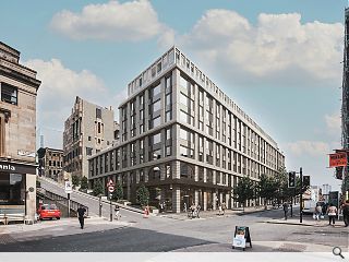
A prominent eyesore in the heart of Sauchiehall Street is to be given a new lease of life with plans to erect purpose-built student housing by Vita Group.

Haus Collective has submitted a detailed planning application for the key site, in the shadow of the Glasgow School of Art (GSA), by showing how a food court can bring new life to the flagging street scene.

Placing food at the heart of its offer 356 student rooms are clustered around communal kitchens, all stacked above an expansive ground-floor food hall that spills up to a mezzanine level. Promising 'never before seen views' of the fire-ravaged landmark the halls will be built around a raised public courtyard, the setting for a planned programme of events.

Addressing its high-profile location Haus wrote: "Proposals seek to address sensitivities surrounding the proximity of the GSA building, prominently located in an elevated position to the rear. Key to this is presenting new and accessible public space offering a full view of the rear of GSA."

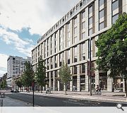
Hitting the street with a 3m deep collonade the proposal includes the introduction of external stairs to both Dalhousie and Scott Street's to mitigate the steep topography and maximise usable street frontage.  

A 3m deep colonnade will invite custom from Sauchiehall Street
The rear courtyard will be closed out of hours to curb anti social behaviour

20 Comments

Georwell84
#1 Posted by Georwell84 on 19 Jul 2024 at 19:50 PM
It looks great but why can't the current entrance to the ABC be retained.
EM0
#2 Posted by EM0 on 19 Jul 2024 at 20:46 PM
I find it so hard to believe that they cannot put a scaffold around the main entrance and preserve it! Same architect as Slefridges in London! I hope this is continually blocked until they incorporate some of the old building! Complete disgrace!
Lovely
#3 Posted by Lovely on 20 Jul 2024 at 15:12 PM
Looking a lot like a mediocre London Street and that's before we analyse what's inside it, how it's built, why it's built and what went before.
Harry Kipper
#4 Posted by Harry Kipper on 20 Jul 2024 at 22:55 PM
#3 It may look like a mediocre London street, but it's better than 95% of the stuff that gets built in Scotland.
Bowfin
#5 Posted by Bowfin on 22 Jul 2024 at 10:55 AM
This proposal is nothing short of a dog's dinner. It's an incoherent jumble of mismatched styles (what are te random arched bits all about?), poorly thought-out spaces which are glaringly impractical. A covered collanade at street level is just asking for trouble anyone who remembers the old Stirling's Library will attest to that. The facade looks like an awkward collision of random elements, with no sense of harmony or visual appeal.
Surely the planners will not approve this shambles of a proposal?
ABC
#6 Posted by ABC on 22 Jul 2024 at 11:25 AM
This proposal is an affront to the very principles of good architecture. It's as if the designers threw every bad idea they ever had into one hideous monstrosity, hoping that something would stick. Unfortunately, nothing did.
Lovely
#7 Posted by Lovely on 22 Jul 2024 at 13:37 PM
Agree with the above actually was being far too kind with my initial comment.
Citizen Keen
#8 Posted by Citizen Keen on 22 Jul 2024 at 15:15 PM
High quality stone instead of chunky rainscreen metal cladding, please.
Observer
#9 Posted by Observer on 23 Jul 2024 at 11:12 AM
This is a perfect example of how not to approach architectural design!
David
#10 Posted by David on 23 Jul 2024 at 13:44 PM
1980's Chicago anyone?...without the class...
Showbiz Sam
#11 Posted by Showbiz Sam on 23 Jul 2024 at 13:55 PM
Back to the Future (yet again).

I daresay, this is how the Strathclyde Uni's McCance building will have looked in its day, but somehow its 'cool' now!
Naw! It nivir wiz and it nivir wull be, ya dafties!
https://www.theglasgowstory.com/image/?inum=TGSS00010
CR Mack
#12 Posted by CR Mack on 23 Jul 2024 at 13:57 PM
A worse scheme than the one that was refused previously.
It looks higher than the last scheme Haus had knocked back, gets rid of the ABC facade, and the elevational treatment is a real mess.
Poor stuff.
Weigan
#13 Posted by Weigan on 24 Jul 2024 at 12:07 PM
What a missed opportunity for such a high profile city centre site.
The designs and proposed use are awful.
Gordon
#14 Posted by Gordon on 24 Jul 2024 at 12:44 PM
Sadly, just tacky. Glasgow Smiles Gone.
Ghetto King
#15 Posted by Ghetto King on 25 Jul 2024 at 09:28 AM
If or when this gets built it will put more pressure on those in charge of the building behind it to get their act in gear , otherwise, I can see the site being sold to complete the look for the whole block.
Alistair Robertson
#16 Posted by Alistair Robertson on 9 Aug 2024 at 09:12 AM
Waste of space. Ugly cash cow... explicitly Glasgow council ineptitude.
So lacking in so many criteria...as usual an opportunity to enhance, only to be deliberately negated. Glasgow city is a landmark of exquisite, unique historical significance...it should be cherished and protected as a matter of course... It's a peoples city...not to be sold of too unconnected, uninterested, unimaginative Lego inspired money grubbing shisters. Shameful, inadequate and wholly inappropriate. Real lack of civic consideration. Disgusting action from our very sketchy council city elders.
James J
#17 Posted by James J on 22 Aug 2024 at 19:12 PM
It's insane how some architects still seem to be allowed to design without any contextual , heritage or sustainability considerations. Other than offering the maximum profit to your clients, you have a responsibility to the city and its residents, and it's really sad to see proposals like this produced, especially from local firms.
outraged individual
#18 Posted by outraged individual on 23 Aug 2024 at 10:59 AM
It really is just tremendously poorly designed.
George
#19 Posted by George on 24 Aug 2024 at 14:18 PM
Looks like something from a bad ps2 game
glasgowc
#20 Posted by glasgowc on 3 Sep 2024 at 16:07 PM
@#1 maybe because it was on fire and left to rot for a long time?

Post your comments


All comments are pre-moderated and
must obey our house rules.


Back to July 2024

Search News
Subscribe to Urban Realm Magazine
Features & Reports
For more information from the industry visit our Features & Reports section.