Newsletter - Links - Advertise - Contact Us - Privacy
 

Crosshill mosque expansion to deliver a geometric pavilion

June 4 2024

Crosshill mosque expansion to deliver a geometric pavilion

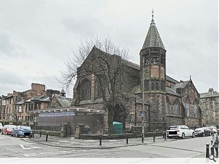
A mosque in Glasgow's south side is set for expansion with the submission of plans for a single-storey pavilion to improve accessibility and facilities.

Al-Farooq Education and Community Centre has tasked Lee Boyd Architects with creating a contemporary addition to the late Gothic Revival style former church, principally as a means to segregate ceremonial wash facilities from the prayer hall on religious grounds.

Stating the thinking behind their approach the architects wrote: "The design intent for the proposed extension is to conceive a contemporary addition to a traditional building, deliberately contrasting the construction styles of late Victorian and the early 21st century.

"This is done with respect to the ordering and hierarchy of the visual composition of the former church, using new materials that resonate in tone with the existing masonry."

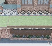
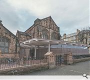
Comprising a glazed welcome lobby, reception and ablutions space the 90sq/m will sit on the Dixon Street frontage, using a flat living roof so as not to impose on the gable windows of the nave. The underside of this roof, visible from the street, is expressed as a diagonal timber structure.

Finished in corten steel, glass and timber the extension will be delivered with increased border planting to soften its impact on the street.  

A living roof will reduce the impact on neighbouring properties
Diagonal timber detailing reflects Islamic geometric art

7 Comments

Graeme McCormick
#1 Posted by Graeme McCormick on 4 Jun 2024 at 11:55 AM
I usually enjoy the contrast between a new statement building linked to a repurposed property, but I don't think the extension talks to the original building. They could have been much more radical but still respected the vertical framework of the original rather than a jarring horizontal shed.
Roddy_
#2 Posted by Roddy_ on 4 Jun 2024 at 13:51 PM
When you look at the street view images, you can begin to see how the extension destroys the coherence of the whole and the formal, axial relationship to the street edge. The flat roof and lattice supporting structure -especially where it projects beyond the roof line doesn't help to visually incorporate the form. Seen better from Lee Boyd. Clunky.
Luke
#3 Posted by Luke on 5 Jun 2024 at 15:02 PM
A stain on the front of a beautiful church building!
Marion
#4 Posted by Marion on 5 Jun 2024 at 16:27 PM
Materials chosen and placement work well with the building but that very horizontal roof is painful. The original building has no horizontal roofs, so it sticks out like a sore thumb. The roof should flow from the building, not jut out of it. it should slope and stagger down from the original wals. Could incorporate some arches and things to soften the shape and make it beautiful too.
Iain
#5 Posted by Iain on 5 Jun 2024 at 18:41 PM
If Glasgow City Council in any way respects it's own conservation areas, I'd suggest this is a good opportunity to prove it.
Matt
#6 Posted by Matt on 6 Jun 2024 at 15:07 PM
Lee Boyd Architects have been fairly prolific in delivering some of the most compelling and memorable church extensions in recent years. I think this looks interesting although the images don’t do it justice. As with other similar projects, the success of the design will be in the detail and materials…the strategy looks pretty sound…IMO obvs..
Surely there are more deserving projects that require such catastrophizing criticism.
Showbiz Sam
#7 Posted by Showbiz Sam on 6 Jun 2024 at 15:38 PM
Really like it. It does what it says on the tin. Architecture as advertising. Sensitive. Apposite. It sings, and it relates to what was there i.e. a blank wall with two windows.
Planners cant imagine that there are other aesthetic ordering systems other than a dull homogeneity and that extensions by their very heterotropic juxtaposition can create a dynamic relationship with the original building.
I for one am glad that Lee Boyd have existed so long. Quality.

Post your comments


All comments are pre-moderated and
must obey our house rules.


Back to June 2024

Search News
Subscribe to Urban Realm Magazine
Features & Reports
For more information from the industry visit our Features & Reports section.