Forgotten Blythswood gap-site to bring residents back to central Glasgow
May 17 2024
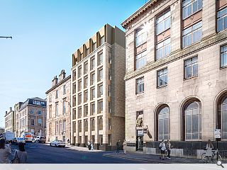
A new apartment block is set to bolster efforts to repopulate Glasgow city centre by delivering six dual-aspect apartments on a vacant site on Blythswood Street.
Specialist residential developer Videre has teamed up with Axis Mason Architects to deliver the project on a longstanding constrained gap site, with no record of ever having been fully developed.
In a planning statement, the applicant wrote: "The site on Blythswood Street is currently a vacant plot. Recent history (2000’s) shows the site being used for garages but prior to this it is unclear what or if anything has been built on the site. Having studied historical maps and understanding the typology and development of the surrounding area it is quite possible that this site has never been fully developed.
"Sitting to the rear of an original terrace on Bath Street would suggest that the site would have originally been used as stables and coach houses and access directly from Sauchiehall Lane."
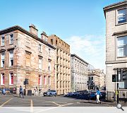
Responding to the adjacent Keppie House the vertical infill employs a set-back upper floor and occupies the full site area, cantilevering on upper floors above Sauchiehall Lane to maximise usable floor space. Employing stone for the primary facade and brick for the side elevations the building is to be topped by dark bronze metal with deep reveals and a chamfered lintel detail to maximise light.
Architectural metalwork will also be incorporated in the form of a decorative balustrade and entrance doors with a residents gym also provided.
9 Comments
If that's where the money is, surely a more elegant solution can be found that fits in with the rest of the streetscape.
But for once, it's good to see a proposal which respects the streetscape, someone clearly had a look at cornice heights and proportions and decided to embrace the existing environment in a mindful way. Generally speaking, more like this please.
Where I think it could do a bit better is in the detail - a more pronounced or deeper cornice would help to visually separate the penthouse element and it should return around the lane side. I don't like the way the brick and stone cladding crash into one another around that side either. This could have been better resolved as could the top level - which looks okay looking south up the hill but is a bit clunky looking north.
This is nevertheless a step in the right direct but the devil (or god) will be in the details. Well played though.
Post your comments
Back to May 2024
Like us on Facebook
Become a fan and share


I know the top floor apartments are where the money is, and this is presumably what drives this approach, but it's out of kilter with the streetscape.
Even if the height and depth shown at attic level is essential to the profitability, a recessive colour more akin to the adjacent slated roofs might lessen the impact.