Plan bee bid to transform former Scottish Widows HQ aired
May 31 2022
Fund manager Schroders Capital with development management specialists Corran Properties and Morgan Architects have opened a public consultation to relay plans for the former Scottish Widows headquarters at 15 Dalkeith Road, Edinburgh.
Design work is underway on proposals for the selective demolition and adaptation of the office complex to simultaneously reduce its footprint while improving its environmental performance, energy use and access to natural light.
Works would entail the removal of five of 12 hexagonal 'modules' to the rear as well as an undercroft car park and boiler house to free up land for housing. Sections of the remaining roof would also be removed to permit daylight to a new atrium and obsolete curtain walling is to be replaced.
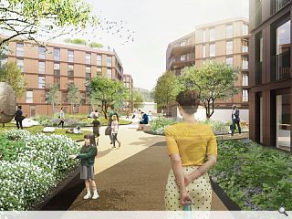
This would open up the remainder of the site to the rear for a new residential quarter comprising 190 flats spread across five apartment blocks, extending the beehive geometry of the A listed main building along Holyrood Park Road. Employing a bronze metal cladding system to match the main building these additions would feature large external terraces and balconies set within landscaped grounds.
A deadline for public comment has been set for 22 July ahead of a planning application in August.
|
|
3 Comments
The liner/ corner blocks feel incongruous to the rest of the site. Are they trying to form a street edge and if so, why? They certainly restrict the weak pretence at a hexagonal grid landscape.
The hexagonal blocks are far too close to the street edge and do little or nothing to enhance the listed build setting…other than they are hexagonal…The building line should be maintained here.
Are the buildings shown indicative for now?? the architecture and spaces on offer seem so formulaic and insipid.
This really is not good enough for this key site.
Pity key sites like this are not put to architectural competitions.
Post your comments
Back to May 2022
Like us on Facebook
Become a fan and share


