National Gallery: Strong Foundations
23 Jan 2024
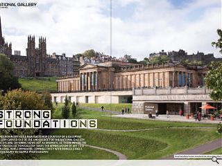
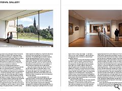
Homegrown art has a new backdrop courtesy of a basement gallery carved out of the undercroft of the National Gallery of Scotland. Offering views out as dramatic as those within the Scottish collection gallery takes the appreciation of art to a new level while improving connectivity with Princes Street. Photography by Dapple Photography.
Holding a position atop Edinburgh’s historic Mound, the National Gallery of Scotland is an indisputable classic, asserting prominence through its bridging of an urban aperture. Long the subject of change, Hoskins Architects’ redevelopment of Playfair’s neoclassical structure is the latest instalment, charged with increasing the galleries’ footprint and producing spaces suited to the contemporary consumption of Scottish art. Central to this reimagining were questions of circulation, with Hoskins ambitiously proposing a pseudo speedway, a processional route which, in aspiration, challenges the galleries’ historic commitment to the cul-de-sac, while accepting the objections such arrangements attract.
For the less discerning, Hoskin’s success in this area is laudable with several piercings made throughout the fabric, with attention focused on reworking the 1978 basement addition; however, stopping for a moment, the claim of a continual circulation route becomes nonsensical when you are forced to stop and turn throughout the route. Whilst these quasi-balconies do offer opportune points to engage with the space, the need to turn back on oneself challenges the central concept of Hoskins’ scheme. Adding to the spatial ambience is the well-curated material palette that attempts to complement what exists to produce a finish appropriate for a building of this importance. The hardwearing and considered materials, as they were described during the visit, do much to support this bridging of both practical and aesthetic requirements.
That said, this effort is compromised by the frankly indefensible construction which plagues the reinvented structure; panels which sit out of place or in some instances are removed from the wall entirely. Here, both contractor and client fall short, with the former failing to deliver and the latter failing to hold them to account. As an architecture steeped in such a rich history and hailed for its iconographic status, it is disappointing to see a level of ambivalence and a finish that fails to bolster the ambitious claim of the institution’s ‘world-class’ qualities. Construction aside, more commendable is the openness of Hoskins’ new entrance, a reimagined space which dismisses previous concerns and engages with Princes Street Gardens at the structure’s foot. The public feel of this space dispels the gloom and challenging arrangement of the previous space, by opening its arms in an attempt to drag people in; perhaps a must in a cultural epoch in which a lively ‘Starry Night’ – an animated version of Van Gogh’s masterpiece – garners attention unimaginable to that of the work of Scottish master Alexander Nasmyth.
Perhaps bowing to the punter, the entrance contains the staple of every ‘successful’ cultural institution, a shop and a café, each retaining the position it held in the original plan. Although approaching these spaces with a light touch, Hoskins’ approach does well to help both spaces utilise the floorplan on offer whilst tweaking the hierarchy, by projecting the shop forward from its previously hidden position. Cynically it’s hard to imagine that this move doesn’t reflect the contemporary importance of neo-liberalism within cultural spaces, however, Hoskins’ delicate reworking of the programme within the existing footprint illustrates an attentiveness to the structure’s history and an appreciation for refitting the built over ‘blank slate’ thinking. Adjacent to the reimagined shop, the cafe is arguably given a more significant position. Despite minimal intervention, it is clear that Hoskins along with the client have carefully considered, and in this case, attempted to curate the visitor experience. The glazed façade is largely responsible for this with views across Princes Street Gardens retained with the architects recognising the sense of drama this prominence creates. Coupled with the efforts to consolidate circulation routes was the desire of both the client and Hoskins to improve the overall accessibility of the gallery spaces, recognising the impact inadequate planning can have on useability. Despite the main route beginning with an unapologetic staircase – a constraint imposed on the architects by the existing floor levels – Hoskins have attempted to confront the demanding level changes whilst retaining the distinct zones, professed markers of the building’s rich and evolving history. That said, it does feel that the staircase could work a little harder, as it lands a little ‘flat’, lacking the grandeur one might expect from an institution bestowed with the tasking of presenting and maintaining a National Collection of Art; it falls short of say Chipperfield’s Neues Museum stairway which successfully blends old and new and to instil a feeling of grace and anticipation. Gallery spaces are ramped with gentle slopes allowing for movement unconstrained by stark level changes.
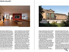
Although presenting a feeling of constant flux, sitting on a pseudo-conveyor belt, doing away with the ‘all too common’ pauses and bottlenecks, created as levels awkwardly change, is subtly striking, feeling refreshing though perhaps unnoticed by regular visitors. A goods lift to the rear, that also services the entire horizontal axis is a similar change, alleviating the complexity of navigation that plagued the galleries’ previously cleaved form. The promise of a world-class institution is exemplified through the planned meeting of architecture and art, a relationship the client and Hoskins strived to achieve from the start. Elements of the gallery’s permanent collection play a pivotal role through positions that feel less random and more deliberate; a suspicion confirmed whilst being shown around. Views created through the punctured Hoskins façade, which purportedly draws its ordering from Playfair’s building above, are pivotal in achieving this. Adjacent artworks respond, presenting the same view but from a different moment in time, offering the visitor an opportunity to engage with the contemporary and the historic; arguably an experience essential in understanding and appreciating a cityscape steeped in history.
This integration and blending of past and present continue in the architecture’s fabric, with the retaining of the late 1970s extension being a notable success within Hoskins’ scheme. Although any change to the fabric of the original Playfair building, would have met with much exuberant critique, the light touch by Hoskins playfully pushes the boundaries of what is possible in the context, with the opening of an axial view being a significant architectural moment. The view is less than impressive, largely failing to engage a specific moment in the existing skyline, however, when its inclusion is considered as consequence rather than effect, the additional light it provides takes the fore and as such is inviting. The ‘view’ is a result of Hoskins’ larger circulation strategy in which a circular stairway now connects the upper level of the gallery with the basement below; allowing the architects to achieve their continuous circulation route. Surprisingly, given Hoskins’ bold approach to retrofit at Aberdeen Art Gallery – another seminal cultural space within Scotland’s portfolio - the light touch approach taken within the existing Playfair galleries feels lacklustre and lacking in forward thinking. The National Gallery should be an institution in the present that employs the past whilst retaining an eye on the future. Caveating this though, the sustained features, characters and palette of the Playfair spaces likely please those within a Scottish art world for whom an alteration would have been a cause for concern. A missed opportunity does however present itself in the latter extension which forms the core of Hoskins’ reworking, in which the same conversative approach carries through. Again, this is understandable, however, it doesn’t help in positioning the gallery as front and centre in the here and now; plainly, the finished article lacks an ambition Hoskins Architects have been able to successfully display elsewhere. Stepping beyond the threshold, the reimagined landscaping tasked with mediating the relationship with Princes Street Gardens is notable, blending a contemporary take on the civic within a profoundly public urban grain. It is without a doubt an important moment in the visitor experience, allowing wider engagement; it pulls folk in by extending the galleries presence beyond the walls in which it is contained.
The extended ‘plaza’ and rationalised entrances to the site are ultimately responsible for this positive change. While Hoskins’ extension is without a doubt demanding at points, the endeavour to revitalise an exacting space can largely be branded a triumph. A space has been created which is more accessible, more open and more suited to the display of art. That said, exhaustive praise would be misplaced. Hoskins’ architecture here is safe, it’s perhaps a little boring; it does little to challenge the misplaced tropes levelled against retrofit by supporters of ‘blank slate’ thinking. Whilst the architecture and approach of Hoskin may be of a place and time, the reworking of the National Gallery feels like a missed opportunity to place, through an extolled building, art at the fore of public imagination – a comparison made particularly poignant in light of James Forbet Architects recent alterations to the National Portrait Gallery (London) and Hoskin’s work on Aberdeen Art Gallery, which is undeniably a bolder rallying call for the potential of well-considered reinvention. In sum, Hoskin’s reimagining of the National Gallery of Scotland is a well-achieved work, successfully providing opportunities for the greater display of art, the rectifying of outdated spatial arrangements, and the transformation of challenging circulation. However, it falls a little flat, faltering at an opportunity to create an architecture that would place art firmly within the public consciousness.
|
|


