Burns Road: Shaping Up
19 Oct 2023
Cumbernauld has emphatically turned its back on high-rise housing, drawing precedent from classical crescents over post-war angular blocks. James Haynes asks whether the New Town trailblazer has lost its edge against the backdrop of plans to demolish the town centre ‘megastructure’. Photography by Andrew Lee.
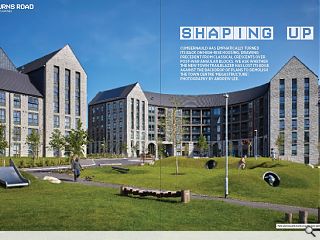
At the outer limits of Cumbernauld, the roofscape of Burns Road peaks above the established canopy and marks a contemporary presence, a move away from the modernist vernacular that is synonymous with the town. Approaching from the North, the canopy, which camouflages the scheme’s non-idiomatic brickwork, subtly embraces the construction’s newness and gives a retort to the lingering vapidity that characterises much of the surroundings.
The fresh surfaces have a fashionable allure, whilst the crafted landscaping proves grounding, drawing reference from that which went before. Burns Road is referenced as the latest element of Cumbernauld’s reimagining, a project that seeks to reposition the town, and importantly those that occupy it, as vital to contemporary Scotland rather than as a footnote to its history. Delivered by Sanctuary Scotland Housing Association, in collaboration with Collective Architecture, these new homes help achieve this aim; providing residences with amenities suited to modern spatial requirements and to expectations of much needed energy performance. During a site visit, architect Alan Smith emphasised this element, highlighting the schemes ‘green’ credentials whilst acknowledging that environmental expectations and standards have improved since the scheme’s construction began. The physical presence of a project which manifests as a series of new builds is the most obvious example, that said, it was prior to Collective Architecture’s engagement that the site was levelled removing any opportunity to reimagine what previously existed. As Smith notes this, one cannot help but ponder the possibilities that might have been achieved; had this opportunity for creative architectural thinking in the context of a re-development not been missed.
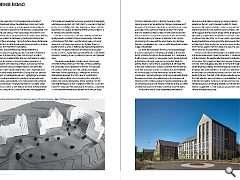
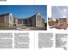
Despite a fondness for curves, which initially unsettles the quietly beautiful brutalism of the enclosed spaces, Collective Architecture’s effort offers a neat foil which breaks with local vernacular to enthuse a new energy into the site. There is a playfulness to it, a sense of freshness perhaps lacking elsewhere in the town. The gables that block-end the principal structure contest this effect slightly, feeling a little awkward in their uneven alignment, evidently driven by a desire to capture the impressive views. The generous application of balconies to the principal unit offers further evidence of this intent, whilst establishing the community-centric ambitions for the site. The balconies are a pseudo street, a place to meet, gather, and engage with those that occupy the space. Although the architects attempted to approach this with a level of sophistication, initially producing designs for a congruous floor and ceiling pattern, the constructed outcome differs, suffering from the cost-engineering so common in projects of this kind. Such is the narrative throughout, with details lost as the process progressed. A more prominent example can be seen in the window sizing of the two adjacent units. In built form the scaling of the openings avers a homely ambiance, in large a consequence of the panels that sit towards the sill and an aesthetic more closely associated with a pastiche of Manhattan (New York) rather than the heartland of 1960s Britain. As with other aspects this is less a function of design than of prudence, with the architect ambitiously pushing for a series of Juliet balconies capable of capturing both views and the action below, only for these features to be displaced by more cost-effective solutions at later stages of the project. Out front, the compulsion for the curve continues though in a more subtle fashion. The landscape, similar to the curved motifs scattered throughout the façade and form, embraces a fluidity previously lacking. Here, people-centric design is placed at the forefront through meandering routes that break the existing site in a manner that is accessible to all. Although this is standard contemporary practice, Collective Architecture has done well to produce a series of moments that are referential to the sweeping curve that connects the site to the wider urbanscape.
Completing this and continuing a referential theme, the presence of artworks scattered across the site are a neat reference to the ambitious series of artworks completed as part of Cumbernauld’s post-war revamp, whilst also acting as a series of useful way finders for the sites somewhat maze-like paths. Whilst overall, Burns Road unashamedly embraces its Kildrum suburban history drawing out opportunities for advertence, the car - a principal agent within the town’s renaissance like revival - is hidden, treated as a secret that everybody knows but one wants to share. During our visit, Smith suggests that this wasn’t design driven, alluding to the rigid parking requirements set by North Lanarkshire Council for a scheme of this size. Whilst such is excusable it epitomises the developmental forces at play across the site, however, the team at Collective Architecture has had some success in producing work that rails against the towns dialectical style, that said, their efforts have not occurred without strain. The choice of brick is one example of this desire to break with the local vernacular.
Chosen by the client, in collaboration with the architect, the palette reflects a desire to embolden ideas of freshness. This is largely achieved with success, however, the concrete bricks that appear speckled at moments throughout are a little jarring. Similarly, the same charge can be touted for the glossy tiles at the periphery of the site, a consequence of their incongruant colour failing to match the dark hues of the building’s façade. That said, Smith offered a rebuttal, explaining that their selection was contingent on the availability of material within the reclamation market. Such an approach tears up the standard play book, challenging aesthetics as the sole driver, and instead is suggestive of a new approach grounded in addressing climatic and resourcing issues. Climate considerations are particularly relevant to the site according to Smith, as its unique microclimate makes it more susceptible to the harshness of the Scottish winter. The snow clips marking the transition between façade and roof are the most obvious architectural expression of this and their presence illustrates the time taken by Collective Architecture to consider such matters. Putting time and effort into understanding Burns Road seems to have been at the fore of Collective Architecture’s approach with community consultation proving a foundational element. Whilst this is difficult to read in the architecture on an aesthetic level, the level of occupation and use of the flats as well as adjacent spaces appear to concur.
Take the balconies, which one might expect to sit unused, they are clearly places of animation with residents making the most of them, as evidenced during our visit, an act made more impressive by the unfavourable weather conditions. Their corridor-like nature is arguably fundamental to this, providing pseudo streets in the sky; a language familiar to the high-rise yet achieved in this instance in a more considered way. The balcony appears to be both private and public, the spaces are open, yet one feels a sense of ownership as activities and use changes as one moves between the units. A similar theme runs throughout the site. Whilst passing between units, Smith explains that this comes from the client’s emphasis on community with a distinct fund ring fenced at the beginning of the project being key to enabling this. Not only does this feel like a much-needed move, imagined to enliven the lives of the residents but it also grounds the project and Burns Road in the rich history and traditions of Cumbernauld’s association with Public Art, such interests being founding tenets of the 1960s development.
Given that the site’s 131 units are fully occupied, Smith tells me, wholly reasonably, that we are unable to view the interiors. This obviously limits the scope of discussion by removing the opportunity to consider the lived experience of those that inhabit the work. That said, through examining the plans a sense of the interior shines through. Whilst there are perhaps issues generated by the zealous use of the curve, the spaces appear both rational and pragmatic. They are neither architecturally complex or overall basic, a charge often levelled against social housing schemes. Arguably, the greatest success is the capturing of views facilitated by the clear sight lines and the position of the scheme outwith the town centre. The views on offer can be understood and undoubtedly play a pivotal role in how the architecture is experienced by those that live there. In sum, Collective Architecture’s Burns Road is not revolutionary but it is a good example of a well-considered social housing scheme.
By engaging with residents from the outset the architects have successfully negated typical concerns and instead produce moments that are both engaging and enriching. Whilst the presence of curves is perhaps a little overbearing at times, the rationale for their use is sound and works well in engaging the view. The project is a good example of taking and using the little wins, it illustrates how considered architecture can be achieved on a limited budget and in challenging circumstances.
|
|


