St James Quarter: Capital Planning
21 Jan 2022
You’ve heard the toilet humour but what’s the reality behind the largest development to reshape Edinburgh in a generation? We grab our shopping bags for one of the most inauspicious launches imaginable to see whether the St James Quarter is already outdated.
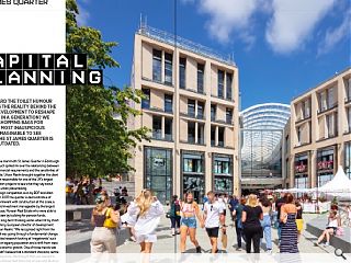
The first phase of the mammoth St James Quarter in Edinburgh has already seen much spilled ink over the relationship between contemporary commercial requirements and the sensitivities of a World Heritage Site. Urban Realm brought together the client and the design team responsible for one of the UK’s largest inner-city regeneration projects to see what they say about current attitudes to urban placemaking.
Product of a design competition won by BDP and Allan Murray Architects in 2007 the quarter is demonstrative of the long lead times inherent with construction at this scale, a high risk, high reward investment manageable by the largest developers, in this case, Nuveen Real Estate who were able to take the long-long view by building for pension funds.
Asked how this long-term thinking works when hit by short-term crises Martin Perry, European director of development at Nuveen, told Urban Realm: “We recognised right from the beginning that retail was going through a fundamental change. We did a lot of detailed research looking at ‘megatrends’ such as new technology, an ageing population and a shift from west to east in terms of economic growth. One of those trends was urbanisation. We didn’t believe that a standard shopping centre was going to work anymore. We thought that you needed to build a proper piece of town that had a mix of uses and 24-hour life not just from a physical perspective but also from a cultural and social perspective.”
Did Perry ever fear being overtaken by events, not just in terms of the pandemic but also the accelerating shift toward online shopping? If Nuveen were starting the St James Quarter today what would change? Perry continued: “We were designing it for tomorrow and I must be honest. I got to about 2018 and I started to get a bit concerned that what we were creating was going to be out of date by the time it happened, bearing in mind design work started in 2007. But if you look at the tenant lineup across the leisure, residential, offices, hotels and retail about 96% of it’s now contracted. What felt incredibly brave in 2007 doesn’t feel brave at all now.”
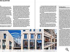
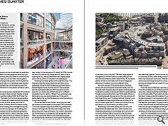
Following a soft launch in June the £1bn, 1.7m sq/ft development will open in phases through next year and is already drawing 50,000 people per day despite only 50% of the full build being occupied. The centrepiece of phase one is a curved four-storey galleria designed to promote movement at all levels and allow alternate points of entry so it can blend in with the urban grain of the New Town. Shunning more typical retail environments the development works with the existing topography and with complementary leisure uses to encourage broader activity. As the single biggest intervention, the curving gallery is the commercial focus of the development and is an extension to the surrounding street network, blurring the boundary between indoor and outdoor environments: “It is a hugely complicated piece of geometry. We needed to straighten it out ever so slightly to get the right view onto the square. It’s almost like flying by ailerons, slightly shifting until we got the right angle for the punch-through onto the Balmoral”, project architect Allan Murray, now at Allan Murray Design, told Urban Realm.
“The thing about the gallery is you can always see the sky. It’s a tempered environment open to the air and open to the rain as well, in part. So, you don’t have any smoke extraction, heating and cooling systems. That releases the roof for apartments so you can start to have people living up there. People will say it’s more shops and that’s true. But it doesn’t mean that those shops were on the High Street anyway. That argument is not entirely consistent.” BDP architect director Oliver Wilson said: “You opened the door on the old John Lewis and you didn’t know where you were. You felt you were trapped within this old shopping centre. Now, it’s much easier to understand where you are, you see glimpses of other things within the galleria and think, oh, what’s that over there? There’s a continuous movement through the building and that was a conscious decision to reach out to the city and become part of the surroundings. You’re extending the street around from Princes Street to George Street.”
Turning the traditional closed box mall inside out to create a more permeable environment was at the heart of the concept. As Wilson continues: “There is a huge change in level across the site. So normally you’d have a development, which has a front door, whereas here we have several front doors where you can get in and it leads to a far more interesting experience because you can enter at any level and circulate within the space. It is a place for people. “When the tram is relocated to Picardy Place the flow of people coming from that direction should improve. That’s why we put so much work into Little King Street itself, that’s going to drop people into the lowest level. If you take the primary entrance of Princes Street at Register Square then it was really important, not to let the level below be seen as a sort of second-class citizen. Level three has a natural entrance off St James Square so you hardly notice you’ve walked up 5m from Princes Street. We associate shopping malls with the main entrance and a service yard at the back but we’ve got lots of entrances knitting into the surrounding cityscape, this isn’t another big box dropped from the sky.”
Expanding on the benefits of enlisting Mother Nature to provide ventilation Kenny McNally, at Allan Murray Architects, added: “There’s a 4m gap at the edge of the galleria roof and that’s primarily for letting smoke out in case of a fire. So we don’t have to subdivide it into lots of small areas for smoke fans to handle. It feels like an enclosed space from within but if you go up to the higher levels particularly when the cinema and the catering areas are open, you can look down into the galleria from the bridges crossing at the top level. One of the perennial problems of shopping malls is an underutilised upper level and how to treat the complex three-dimensionally to ensure that each floor has its attractions to draw people vertically as well as horizontally.” Despite the commercial success, one element of the scheme in particular has provoked critical comment. Despite not being scheduled to open until the middle of 2023, the W Hotel, The Peeled Orange or The Golden Turd for those less appreciative of its coiled charms, Edinburgh’s newest landmark has already been judged in the court of public opinion with a host of unflattering nicknames. Is there a sense of frustration among the project team at the scathing press coverage?
Murray said: “There’s no question that this is going to be the talking point. There are many buildings around the world that people have strong views and opinions about, it doesn’t make them wrong, it doesn’t make them right and having a nickname isn’t always a terrible thing but it’s a pejorative nickname for this one. It’s here and contributes in a different way to how many people want to see a contribution. There is a legitimate argument about what you want to see in the sky. “Is that the only answer? No, but it’s the answer that has been chosen. Is it the only piece of St James? No, 90% is the rest and how it fits with the city. A large part of St James is about repairing the city, creating a destination and bringing people back to the city centre. It’s one piece in an assembly job.”
Revisiting the broader genesis of the hotel Perry adds: “The hotel terminates the George Street and Leith Walk axis but deliberately misses the North Bridge because Robert Adams General Register House sits at the end of it. They purposely went for a landmark building and that required us to move away from our master plan architects and go for a different competition (won by Jestico + Whiles). If you were asked what Edinburgh is now, you would probably say ‘it’s the world’s leading festival city’ and that flamboyance is what the building is trying to demonstrate.” Do you fear that the toilet humour surrounding the hotel has drowned out other aspects of the project? Perry answered: “One of the enjoyable things about researching development history in Edinburgh was that every time a major hotel came about, there was a huge controversy. The Cockburn Association was formed based on a development that people didn’t want. When you read stories about the townsfolk lighting torches and sharpening their pitchforks to march against the Balmoral being built, you can’t even think about Edinburgh without the Balmoral Hotel now.” Is there beauty in contrast and contradictions, should everything always be in harmony? Might locals one day come to love their cuckoo in the nest? “We have a large degree of homogeneity in the New Town but actually when you look hard there are differences there,” states Murray.
“As the master planner, we have to think about how we allow change and difference. It’s healthier if you’ve got different hands.” Key to this approach is the priority given to interstitial spaces, with core commercial components spilling over into the public realm through a series of squares, entranceways and borderlands providing ample opportunities for people watching through a porous building that is open to the public 24 hours a day. Standing beneath the open arms of the main entrance off Leith Street Murray said: “I’ve always admired Corbusier’s work in Chandigarh and these angled plates are reminiscent of his work. It frames a great view, it’s capturing a big bit of the city and draws it in. In the old centre, you were in a hole.”
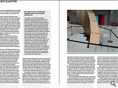
Resembling a multi-tiered iceberg with 20m of its bulk lying beneath the streetscape, the St James Quarter turns challenging topography to its advantage with a ground floor connecting Multrees Walk at one end to Little King Street, nine metres below, at the other. “It was important for us to see every bit of the city attached, because if you remember Little King Street hit a brick wall at John Lewis, there was no sense that it was part of the city. Now it’s an integral route and links to the new Picardy Place and tram stop, notes Murray. “That was the big challenge. How do we get three storeys of retail to work effectively together? One of the most important things is to avoid any tail ends, there’s always a loop so you don’t have to turn around and come back. There are lots of different views across and through because it’s curved, not flat. You see glimpses of frontages that you wouldn’t if it was straight. It’s visually dynamic.”
Does that mean architecture is secondary to placemaking? “It sounds sacrilegious to an architect but architecture has to play a role in making people feel comfortable, having a sense of joy and bringing safety. There’s plenty of amazing architecture that doesn’t make you feel that amazing. If I walk outside some big glass skyscraper it’s not improving my life. Architecture needs to connect in a much more phenomenological way... ‘that feels like a good space. I’m going to walk in there.’ Murray muses. Does that mean we have become preoccupied with the iconic and lost sight of wallpaper architecture? “Aldo Rossi talks about memories of a city, if every building is special, you have a cacophony of things shouting at each other.”
Apart from the aesthetics one of the biggest concerns has been the impact on an already ailing Princes Street. What are the ramifications of what is effectively a self-contained town centre in the city, is this the final nail in the coffin for pre-existing retailers? “It will return and it’ll be much more fitting and connected. It’s like a public square, a long public square admittedly, that we’ve just filled with buses. So everyone feels uncomfortable but you can imagine that space as being entirely pedestrianised. How do you animate that street space and stop calling it a bus lane and start calling it a public square?” asks Murray.
Arriving at a pivotal moment for Edinburgh as the city emerges from lockdown desperate to reactivate the city centre will it help or hinder the broader city? “The council has already changed the rules so Princes Street doesn’t have to be 100% retail. I think it’s every third unit, notes Perry. “Between George Street and Princes Street, you’ve got Rose Street and what that means is that the retail units often aren’t deep enough in effect and because you’ve got a valuation system for retail in Scotland that that uses 30-foot zones, rather than the 20-foot zones in England, it makes these shallow units, incredibly expensive. What was missing in the city was deeper shop units and one of the great advantages of using this slope was that we could effectively bury these into the hillside.
“The second thing is it’s a pretty harsh environment in Edinburgh, particularly with the wind and while St James Quarter is not hermetically sealed, it is a covered street on two sides whereas Princes Street is a mile long and if you go shopping on it you have to turn around through all the shops that you’ve just passed. Between both House of Fraser stores and the Arcadia stores you’ve lost about 30% of tenants on Princes Street in the space of a year and a half so it looks quite devastating.” How does St James fit in with the feared hollowing out of city centres, is there a danger of an urban exodus, reversing the big migration to city centres of the past 20 years? What were the challenges of building what is, effectively, a town centre in one building? McNally said: “Having residential on top of their retail you need to have drainage to the outside that has to be designed in such a way that it’s not going to inconvenience the retailers. That puts a constraint on the mechanical and engineering guys, but there are different grids and span structures for each part of the building that took a lot of time and effort to work out between ourselves and BDP.”
Standing as the knuckle between the Old and New Towns St James Quarter had to cram modern floor plates behind a streetscape that had to blend with Georgian terraces. How was this possible? “We used a panel system for the envelope with limestone-clad concrete or reconstituted stone for the secondary elevations”, recalls McNally. “I worked with Laing O’Rourke and the subcontractors to develop panel sizes that were suitable for lorries. We didn’t break down the scale too much.” Were there any compromises you had to make in terms of keeping both the world heritage and commercial sides happy? “I think because its predecessor was so disliked that everyone was happy to see it knocked down and something better put in its place”, he replies. What were the biggest challenges of working in the city centre within a World Heritage site? “You have to take the planners with you on the journey and justify the height of the building and the massing right from the start, and not just from? selective viewpoints”, observes McNally.
“The hotel is designed to come above the general characteristic height. But the vast majority follows the level of George Street as the ground falls away. We had an early meeting with the planners and I showed them the model and they said, okay, show us from the top level of a double-decker bus at North Bridge. You just lift the model and there you go, there are no surprises down the line. We built a one to 50 scale model that was five feet high in our office.” Edinburgh has a reputation for being a conservative city, in contrast to Glasgow, so does the St James Quarter change that equation? McNally said: “It’s still a contextual design and so it goes back to the historic footprint of the old St James Centre so there’s almost a historical basis for it. A lot of analysis was done early on about the roadways, and how to widen footpaths. It’s not a radical departure from anything that’s gone before. It’s very contextual in drawing from the streetscape to give you the outline of the building and then we carve the galleria through that to tie Princes Street to Multrees Walk.” Perry continues: “There is policy support for investment, particularly in retail because there has been no notable development in Edinburgh. There are pockets outside the city at the Gyle, Fort Kinnaird and Cameron Toll because nobody could assemble a site big enough because of the world heritage status. As a result over the last 20, 25 years Edinburgh has been losing its place and the city council were keen to sort that out.” Arriving at a difficult time for the economy and society with the world-changing before our eyes at a breakneck pace, does this signal that the death of the shopping mall has been greatly exaggerated?
“We have something that’s quite a loose fit, so we can still have things moving around. We can change the uses later on. We’ve got a cinema, an aparthotel and apartments to support it. Mixed-use has got to be the future for city-centre developments,” says Perry. Does a mixed approach extend beyond the four walls of the St James Quarter itself into the surrounding cityscape and what soured the initial relationship with the Dunard Centre (a £75m concert venue led by Impact Scotland, Sir David Chipperfield and Reiach & Hall Architects)?
Perry explained: “We had just spent the best part of £27m removing reinforced concrete as an external material. So, we found the materiality of the building to be at odds with World Heritage status where that was not a material that we or anybody else could use in that context. The second issue was that they were breaching their skyline policy that we relied on and we had gone into contracts based on views because it was protected by policy, we weren’t particularly happy that that was reasonable and fair. We think that a council and government-led project should be of a higher standard than the private sector, not a lower standard.”
Now the emphasis is on partnership, such as concert packages with the hotel, utilising car parking for guests unwilling to risk a ballgown on Lothian Buses. In that sense, St James isn’t a full stop, even once the last workman has left, but a staircase to bigger and better things. Attention has now shifted to the final shell and core works for the remainder of the development in advance of an internal fit-out including the cinema, hotel and high-level apartments above the main galleria. Whatever qualities St James Quarter brings on the ground it is the skyline that may make the biggest impression and it is this which may give planners pause to think twice about future applications with ‘landmark’ pretensions. Long used as a form of affection for new buildings with nicknames ranging from the Armadillo to The Shard and The Gherkin it is clear that whatever deprecatory language is used to describe Edinburgh’s newest attraction it has already earned its place in history.
|
|


