Graphic Communication: Visual Art
20 Oct 2021
The journey from planning to construction is often defined by compromises but what happens when those limitations are stripped away? In a world where photo shopping has become an adjective Urban Realm speaks to artists on the front line between realism and idealism to establish where the boundary should lie.
A quiet revolution is underway in how architecture is presented to clients and public that goes beyond depictions of an unrealised future and raise important considerations around style and substance here in the present. As visualisations become the conduit between the profession and the public, do these images describe what’s being delivered more precisely than words or are visualisations simply not honest enough?
To get to the bottom of this Urban Realm spoke to Grant Watson, director ar Touch3d Media and asked whether visualisation can mislead? “Absolutely. Sometimes visuals can be over-embellished and the artist and designer/architect can push things too far to mislead people on the impact a building might have on a certain area, or make everything look unrealistically utopian. I guess it depends on the aim of the visualisation, but I’d say successful visualisations aren’t just pretty pictures, they show an accurate and truthful representation of how something will look, and I think it’s ok to show that in its best potential light.”
Offering a different perspective Andy Pennington, founder of Float Digital said: “People have been critical of the role of visualisation, implying it’s been used to mislead people in certain circumstances. I don’t disagree that some visualisation can misrepresent what a final design looks like and it can be done deliberately but there is a danger in tarring all visualisation with the same brush. You have a snapshot of a process and you can’t tell how much difficulty the design went through, you don’t know what budget discussions were involved. There are a lot of reasons why a visual might be different from the result. If I was a betting man I’d bet on the result probably being different to what the architect wanted.
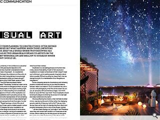
Visualisation is a storytelling process and humans have a long culture of storytelling. It’s part of who we are and visualisation is a modern embodiment of that. It doesn’t mean you’re dishonest, you’re sparking peoples imagination about what is possible. Without sounding too cheesy that’s how we change the world, it’s a manifestation of our thoughts and imaginations.”
Do the competing demands of authenticity and marketing present a contradiction and how do you strike the balance between realism and idealism? “Good visualisation has a lot in common with photography in that the camera doesn’t lie, but you can persuade, refine and enhance images. I don’t think there’s an issue with that,” says Grant. “Good visualisation should be taking the design and showing the product in its best light and make it attractive to the clients.”
One issue affecting the industry is their dismissal as skilled mimics, reproducing the work of others rather than displaying genuine creativity. Is there any truth to this? “Like any niche service, there can be a lack of understanding from clients (and probably transparency from us too) of the process involved.
“...we have clients asking us to ‘just fudge it’ with Photoshop when they want certain items added in or moved around last minute, without realising the intricate process we have gone through to arrive at the finished image. Then there are the people who say ‘that’s not a visualisation, that’s a photograph’, which I’ll take as a nod of respect.”
At the heart of how visualisations are perceived is the growing schism between ‘proper’ art of the real world and digitally-based mediums which are increasingly taking over in fields as diverse as virtual reality and non-fungible tokens. Is there still a lingering artistic snobbery that distinguishes between visualisation and traditional hand drawing? Grant says: “It takes an artistic approach to be able to create good visualisations. Composition and colour are a big part of creating an aesthetically pleasing image, and perhaps most importantly, so is the creation of an atmosphere. Looking at real life and being able to take that into a computer-generated visual is also very important – I’m often stopping out on walks to look closer at patterns in vegetation, light reflections and how shadows form.”
Taking a different tack Pennington, told Urban Realm: “I’ve worked on jobs which have been signed off internally based on visualisation alone, no CAD work was necessary. Do they give credit to the visualiser when released? Probably not. That’s a different type of appreciation. It tends to fall under the banner of whoever commissions the visualiser. People respect photographers copyright and they know there will be repercussions while with visualisation I don’t think there is the same respect.”
Do the ease and accessibility of visualisations replacing drawings at planning meetings? Grant adds: “I’d say they go hand in hand and one can complement the other. Not everyone requires visualisations or sees them as essential, whereas more controversial developments may benefit hugely from having them included in their planning applications.” Pennington says: “More and more these days people are wanting to talk over visuals rather than drawings. You could argue they shouldn’t but that’s the reality of it.
“That’s why visualisation has become more mainstream and important. Clients understand how valuable visualisation is to the process - particularly when drafts come through and they realise they’ve underestimated apsects of their design and ask you to change it. It’s satisfying as one of the best things you can do as a visualiser is influence it for the better not just portray a design but be a part of the design process.”
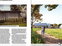
In a field like architecture where plans, schematics and drawings can be difficult to interpret there is an alluring immediacy to the context, lighting, colours and tones of a visualisation which convey richness that is absent in a blueprint.
With visualisers taking a backseat role Pennington admits it can be disheartening to know that oftentimes their work will go unrecognised but is relatively sanguine that the public, by and large, is exposed only to the finished product. Describing the role of played by ethics in this conflict between authenticity and marketing he adds: “You need to create an idealised representation of what is to be delivered,” he says. “But you also have a responsibility to be authentic.” Does this give you any leeway to stamp your creative freedom? “There is freedom because that is part of the briefing process. Sometimes the true problem isn’t what the client thinks it is. A lot of the time architects have the solutions already decided and they want you to do it for them. I’m not doing it for me or the client. I’m doing it for the person coming to the consultation who is going to object, that’s who we are trying to reach here. It’s not uncommon for a client to come to me looking for a photorealistic render and left happily with a conceptual matte painting, they understood it was more important to captivate people’s emotions.”
Is the media to blame for pushing coffee table publications, and should a broader range of styles and approaches that don’t just conform to expectations be encouraged? “The earlier you can involve a visualisation artist in the process the better will be your design,” says Pennington. “We can bring something to the process which will support your thinking in unexpected ways. It’s not so much a supplementary process as a collaboration. We still get people coming to us at the 11th hour and I laugh to myself, drawing is a graph of time against stress. Architects will work on a project for years and throughout that period, you will have peaks of stress at particular stages of delivery such as review periods or sign-offs. The tip of those peaks usually involves a visualiser for submissions, bids and design reviews. A visualisers timeline is full of those crests back to back!
“We used to be sent models, less so now with Revit and we would spot architectural problems with the designs. It would become apparent walls wouldn’t meet where they said they would and columns would be offset. There were discrepancies we would spot as visualisers and flag with the design team.”
How does the Scottish visualisation sector perform are there lots of new studios snapping at your heels with class-leading work or is the industry still underdeveloped. What’s the local picture? “Boutique studios are coming through that are doing very high-quality work. For a long time, nearly 15 years, there was only Soluis.
“They were comparable with some of the biggest visualisation studios in the world. Covid could have quite an effect on how companies change hiring practices and there is an opportunity to capitalise on that. We would commission freelancers to help who would either work among us or remotely, some could be based abroad. What this has shown is you can build a team that way.”
The role of visual artists as a gatekeeper between professions and the public carries responsibilities that are only likely to increase as technology expands the boundaries of what is possible. From new tools of interaction to a loosening dependency on local talent, the landscape of what can be achieved can only grow. In the right hands, this can help people to collaborate seamlessly together rather than just painting over the cracks.
|
|


