Fruitmarket Gallery: Yin & Yang
20 Oct 2021
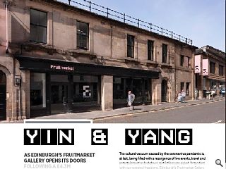
As Edinburgh’s Fruitmarket Gallery opens its doors following a £4.3m refurbishment at the hands of Reiach & Hall Architects we look at the creative forces unleashed by a collective embrace of the light and dark-side of design. Photography by Ruth Clark.
The cultural vacuum caused by the coronavirus pandemic is, at last, being filled with a resurgence of live events, travel and entertainment as lockdown restrictions are eased. In tandem with our restored freedoms, Edinburgh’s Fruitmarket Gallery has thrown open its doors to allow creatives to unleash their pent-up potential within. As one of the first through its doors Urban Realm not only admired the work of the artists inside but also the efforts that have gone on behind the scenes to create a space worthy of display.
Led by Reiach & Hall Architects the £4.3m revitalisation has seen the existing space refurbished and extended into a neighbouring vegetable warehouse as part of a general move from nourishing the body to the mind. Updating a building that has already led several different lives, most recently at the hands of Richard Murphy Architects in 1991, the latest refresh has been driven by a pressing need to provide more gallery space for artists.
Those demands have led to the undoing of virtually all the changes made during the 1991 refit, much to the chagrin of Richard Murphy Architects who lament the loss of their work after just 30 years. Murphy refused to be drawn on the changes when asked but his upset is palpable in a terse statement posted on the practice website: “Almost all of what we designed; the staircase, entrance desk, bar/cafe, front door and wc’s have been destroyed. The first-floor gallery has lost all its views out to the surrounding city and has been reduced in size at either end, and the east and west clerestories no longer exist. The new project cost £4.5M; our project in 1991 cost £350,000. We leave visitors to make their own assessment of the ‘improvements’.”
Despite Murphy’s wishes and widespread respect for the sensitive remodelling, culminating in a 1993 RIBA Award, the gallery had to act after becoming a victim of its own success as it rapidly outgrew its home with increasing constraints on programme capacity seeding growing frustrations. This finally came to a head in 2012 with the commissioning of a feasibility study to establish how the venue could be extended, a process which eventually saw Reiach & Hall Architects come on board.
Explaining the need to act director Neil Gillespie told Urban Realm: “The gallery needed more space. There’s nothing underneath us, produce came in underneath with rail tracks to the side and there are World Heritage restrictions on building up. The gallery needed more space, however, there were real challenges to extending up and down. Unable to expand upwards, the Fruitmarket opted instead to sidestep restrictions by acquiring the former Electric Circus nightclub next door. This inspired a form of architectural dualism that sees the creation of two very different ‘white’ and ‘dark’ spaces.
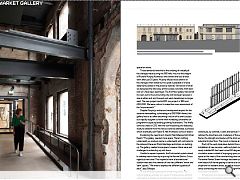
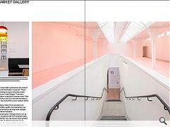
“We tried to express the different qualities of each”, says Gillespie. “It was all about quieting the whole thing down. The original galleries are seen as a series of white spaces, abstract and precise. Surfaces are smooth and continuous while detail and material expression are suppressed. The palette in the warehouse, by contrast, is dark and sensual. It is a space that relishes the directness and crudeness of the existing steel frame, the strength and texture of the brick walls and the industrial timber floor. The mood is intense, almost visceral.”
Much of the work took place behind the scenes with the installation of new services, walls and plant machinery. A newly installed lift has been turned 90 degrees to face the circulation areas instead of impinging upon prized gallery space at the head of the commanding new central staircase. The entire Market Street frontage has been opened up and now boasts full-frame glazing to serve as a continuous public shopfront for resident artists, as well as housing an accessible ramp connecting the more traditional light-filled gallery to its nocturnal counterpart.
Stripping out and reusing the timber joists and floorboards to assemble an atmospheric pitch black screen that blocks off the new access corridor has left a steel-framed, brick-lined industrial space that lends itself to performance and visual art, like a little brother to the Tate Modern Turbine Hall. “There’s still a sense of light coming through as the timber screens are purposefully not solid”, notes Gillespie. “There was a horrendous accumulation of decades of karaoke booths. What we said was why not strip it back to its structure and take out the top floor. There was a sense that we could create an almost medieval layer.”
Doubling the gallery’s footprint, the renovation and extension have permitted a wealth of complementary new facilities to be created including a learning studio, enlarged information room, cafe and bookshop.
The increasingly rapid pace of change around us can be as bewildering as it is expensive with the Fruitmarket Gallery doubtless hoping that their new, new home is future-proofed to a greater degree than its short-lived previous one. By responding to present-day needs the gallery is positioning itself on the leading edge of a cultural revival where individual pursuits of wellness and wellbeing power the kind of recreational economy at which Edinburgh excels.
|
|


