Aberdeen Art Gallery: High Culture
13 Jan 2020
Aberdeen has ramped up efforts to bolster its cultural cache with the reopening of the city’s art gallery following a £24.6m redevelopment at the hands of Hoskins Architects. Has the city successfully switched from oil to oil painting? Images by Gillian Hayes and Gus Macleod.
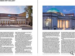
Aberdeen Art Gallery is once again at the heart of cultural life in the north east following an extensive £34.6m redevelopment of the A-listed building at the hands of Hoskins Architects. Billed as the biggest transformation in the gallery’s 130-year history the work has seen the cultural space augmented with additional display capacity, principally via a scalloped copper-clad second-floor extension.
The expanded floor space accommodates additional exhibition and education capacity together with improved visitor facilities, wayfinding and circulation. Behind the scenes functionality has been greatly improved with new environmental controls, storage and staff spaces that are contained within a newly built ‘backpack’. In all this has facilitated an increase in the number of galleries from 11 to 19 with a commensurate increase in the permanent collection from 370 to 1,080 items.
Founded in 1873 the art gallery saw growth spurts between 1885 and 1926 however by 2009 the gallery no longer met the needs of visitors or of the collection, prompting the appointment of Hoskins Architects to undertake a radical programme of repair and additions. On hand to usher an expectant media around the treasures of the granite gallery. Nick van Jonker, director of Hoskins Architects, said: “For 50 years the gallery design was led by A Marshall McKenzie who planned the original rooms but also extended and revised the complex. That left us with an interesting moment where lots worked well but lots worked poorly.
“There is a clarity as to what is new and what is old. We describe it as a creative repair, it’s not an act of undoing mistakes. We’ve moved a staircase and established axes which weren’t in the original building and we reinstated axes which were lost in the second phase but it isn’t clear what our role was and what relates to the past. We love that. It feels coherent but it’s an assemblage by dozens of figures over a century. It’s a complex history and all the more interesting for it.”
The most obvious changes take place not at ground level but above with the brave removal of the entire roof to allow an extension to rise from the existing granite walls. This has enabled the creation of temporary exhibition spaces with natural lighting as well as providing a café and public roof terrace to capitalise on the rooftop vista.
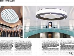
Meanwhile, a glazed roof now floods the Sculpture Court with light while doubling as a thermal stack; part of a natural ventilation strategy with concealed automated vents drawing air from the gallery spaces below.
Standing within this dramatic new rooftop space Van Jonker added: “The oval is where the laylight was, we are standing in what was the old pitched roof. The front range was cluttered with a staircase, shops and cafes. We’ve had to clear out all that stuff, improve facilities and visitor orientation. When Jura Consultants commissioned a visitor survey they found that the majority didn’t make it off the ground floor, they could see that there were higher galleries but they didn’t know where the staircase was. By the time you’re in the sculpture court it’s already behind you and by the time you’ve found it again you’re exhausted.
To remedy this state of affairs a cantilevered staircase finished in grey timber is driven through a slot formed on the edge of the sculpture court, connecting all levels to create an instantly legible gallery circuit, which now, for the first time, includes the War Memorial and Remembrance Hall. Van Jonker said: “We were studying how to insert a new staircase, partly to reach the new level but also to improve wayfinding. This wall is completely new but we hope as you walk around it’s not obvious. The new floor is practically a new building but down below is exactly as it was in 1904. It should be apparent where surgery has been carried out. The stairs are cantilevered out. Much of the new building is built on the top of the existing walls but there are a few moments where structure has to come all the way down for wind stability and bracing. Most of that hard work is done by this enormous concrete wall which carries down to the foundations with the roof and stairs hung off it.”
The rooftop extension deepens the interplay of elements by establishing a direct dialogue with the Remembrance Hall dome through its angular plan form and darting roofline which have been carefully calibrated in key views from nearby streets and from across Union Terrace Gardens, to establish a constantly shifting presence. Van Jonker added: “We have a new dialogue with that dome, which previously had nothing to do with the experience of the art gallery and museum but was the image of the building to the city. We’re delighted that you can now get out there and touch the dome and move around it in an entirely new way.
There are not many institutions who co-locate their Remembrance Hall with a chamber music hall and a museum and art gallery. But being co-located was about all you could say, they happened to share an address.” Describing the Remembrance Hall as ‘a room that you walked into and shuffled out of ’, Van Jonker was mindful of the need to improve access without compromising the qualities which made it such a powerful space. “Its acoustics are astonishing, but it wasn’t a connected part of the campus, even the temperature is different. There was a delicate balance between bringing it into the life of the institution without pretending it’s a gallery. It plays an important role in the hierarchy and together with the Sculpture Gallery comprise the principle multi-storey spaces. You can now orientate yourself. We were determined that this would tie two axes together across two levels and be comfortable to move through. The balcony was too short but it’s now a viable and programmable piece of the campus.”
Helen Fothergill added: “One of the issues we had with the building was dead ends. Visitors had to retrace their steps and find their way back. Doorways had been blocked up since the 50s. It meant visitors were unable to come down. The architects original vision was for this to sit on a four-way axis and what Hoskins has done is return it to the architects original intent as an area that can be accessed on both levels from four different directions. It also opens up a balcony area to the music hall which had been closed to wheelchair users since the 80s.”
While the new build elements have a commanding presence the changes elsewhere are no less important, with many of the most vital additions taking place behind the scenes. Christine Rew, manager of Aberdeen Art Gallery & Museums explained: “In our traditional galleries you won’t see the interventions. We’ve tried to keep the feel of those galleries. “
Commenting on how this was achieved Fothergill added: “The natural ventilation scheme sees air drawn in through window hoppers on the ground floors, we have humidifiers throughout the building and underfloor heating in the gallery spaces which drives air up through the central column and out through vents in the lantern. We rely on that for environmental control in all our collection galleries. In the temporary exhibition galleries, we have full heating, ventilation and air conditioning. The North east of Scotland is particularly dry believe it or not.”
Van Jonker added: “Initial studies looked at the viability of full air conditioning, but it would have been catastrophically damaging to the galleries. The running costs and capital costs would have been crazy, and the envelope upgrades required to make it airtight were not viable. This is a cold city and the killer moment is when you have loads of people densely packed inside while it’s very cold outside. You need to let lots of air through to control CO2 levels and as the air is very cold and dry, you need to humidify it. Natural systems need to be calibrated but they’re much more robust, there’s a lot less to break.”
Grey timber ‘portals’ at every point of transition and axis serve more than just an aesthetic and wayfinding role with van Jonker pointing out that each threshold ‘works incredibly hard”. “They serve the fire strategy, improve art handling and facilitate the humidification process to preserve the gallery spaces themselves,” he adds.
The opportunity was also taken to apply 95% UV filters on all glazing together with light reducing and full blackout blinds while access has been greatly improved through addition of one of the largest lifts in the country. “We had to take the roof off the old lift to get a Titian in,” Fothergill recalls.
Away from large-scale interventions a number of lower key changes help bed the old with the new including revamped lighting design, achieved in collaboration with Speirs & Major and the creation of valuable additional wall space by plastering over the lower half of rear courtyard windows, enabling these to serve as the principle air intake for the natural ventilation strategy. Only the upper portion of these windows remain as clerestory glazing.
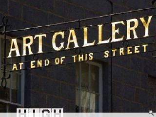
More importantly the gallery can now serve as an oasis of calm amid the commercial imperatives of the city around it, representing the physical and emotional heart of the city in a way the original building never quite achieved. Van Jonker joked that the gallery, one of the foremost institutions in the country, had previously had to advertise itself with a sign at the end of the road to alert passers-by to its existence. Not anymore, “The roof is the sign!” he exclaims. By building on what has gone before the revitalised gallery hasn’t just raised its game but now has a presence which commands attention. With this achievement the city itself can hold its head high.
|
|


