Gorbals Health centre: Healthy Living
10 Jul 2019
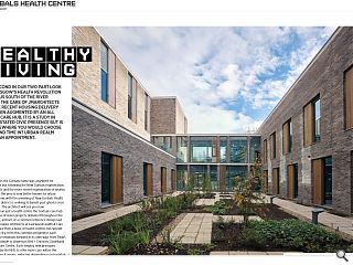
The second in our two part look at Glasgow’s health revolution takes us south of the river under the care of jmarchitects, where recent housing delivery has been augmented by an all in one care hub. It is a study in understated civic presence but is it somewhere you would choose to spend time in? Urban Realm makes an appointment.
For decades the Gorbals name was a byword for deprivation but following the New Gorbals regeneration of the 1990s and the more recent regeneration of nearby Laurieston the area is now better known for urban renewal. Now, with the unveiling of New Gorbals Health Centre the district is seeking to banish past ghosts once and for all. The architect will see you now. More than just a health centre the Gorbals care hub joins a wave of sister projects delivered throughout the city region, all born of a common reference design laid down by Hoskins Architects at Eastwood Health & Care Centre. Since then a wave of health centres has spread across the city, from this common progenitor each pushing the envelope forward in its own way; from Page\ Park’s Woodside to Anderson Bell + Christies Clydebank Health & Care Centre.
Each employ new principles laid down by the NHS to offer more care within the communities it serves, reducing dependence on hospitals in the process. Designed by jmarchitects along with civil and structural design input from BakerHicks and landscape design by RankinFraser, the £17m centre plugs into a wider regeneration programme for the inner city district, providing a single home for general practitioners, dentists and other care service providers. Delivered by Hub West Scotland alongside main contractor Morgan Sindall together with the city council and New Gorbals Housing Association the health hub stands within the footprint of the former Sandiefield Road tower blocks and so sits at ground zero of a wider vision led by Gorbals Housing Association which is in process of building its own HQ as well as new homes and an events square. Delivered by Page/Park and Elder and Cannon these elements are unified through their use of brick, a palette adopted in turn by JM for their own approach. Offering Urban Realm a look around the dark brick scheme senior architect Julie Benson said: “We wanted something that would give it civic presence.”
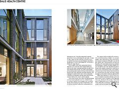
Specified to tie-in with a sister residential build by Elder & Cannon Architects the solid masonry walls of the health centre are punctured by generous glazing and Western red Cedar louvres, brightening a façade that might otherwise appear grey on an overcast day. Timber for the louvres, fencing and plant screening has all been specified to weather down in time from a perma-tan to a matching silver. Benson confirmed that access to natural daylight was the driving force behind the project, informing everything from consulting rooms with windows to the outside to maximise daylight and natural ventilation, to the inclusion of two enclosed courtyards. “Some rooms, just by nature of their use, require mechanical ventilation for hygiene purposes and to prevent noise”, said Benson. “The louvres act as barriers that can be fully opened internally without worrying about people falling out, I also think they help soften the façade. The brick does change quite significantly in the light.”
Attention to detail stretches to the use of stenciling, developed as part of an arts programme to provide ground floor privacy by blocking through views. A range of plants famed for their medicinal properties screen occupants from prying eyes while bringing some life to the elevations. “It’s not a flat opaque film - it has a bit of depth to it”, notes Benson. As the health centre can be approached from all directions each corner has been treated individually, with the most tallest massing located directly above the main entrance that faces the city centre and standing proud and separate to points of entry for the alcohol and drug recovery units, ambulance and staff entrances. This segregation is built into the fabric of the building with corbelling and transparent glazing advertising the main reception without the need for clumsy signage. Each corner benefits from large scale glazing leading onto more subtle moments such as a stepped terrace at roof level. Together these elements help to reinstate the city block, allowing the centre to bed down as part of a family of elements rather than existing apart as a standalone block.
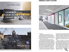
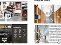
The complex brief necessitated the inclusion of four GP’s, two dental practices, children’s services, physio and podiatry, drug and alcohol recovery and social services and required a great deal of thought to go into the plan. Benson said: “The floorspace is split into three, it’s basically an ‘E’ shaped plan around two courtyards, one enclosed which is used by specialist children’s services and one which is more open. We incorporated more timber in the smaller courtyard for a softer feel and to make it more enclosed and private. Once it greys down it will lose some of that contrast with the brick but will tie in with the tone, the larger of the two is designated as managed use and will be utilised for special events “What’s quite unusual is all the GPs are on the first floor, the majority of patients will head up the stairs, so we needed to create a moment to encourage people up. You do get glimpses of other activity.” How challenging was it to deliver such a mix of facilities and services? “That’s where the consultations came in, that really guided us in how the layout should work. The separate staff entrance for example allows discreet access to the have a lot of experience they can incorporate within the new centre. Benson observed: “It’s not just medicines and doctors but architecture also has a role to play. Our main driver was natural light and natural ventilation but also ensuring that it didn’t seem like a clinical space. We tried to avoid the dreaded ‘institutional’ look. People coming here probably aren’t feeling their best and it can be a stressful experience, so all the waiting rooms have been positioned around the courtyards as far as possible.” A sad sign of the times includes the necessity to provide adequate security for staff, although this has been kept as unobtrusive as possible.
Benson said: “We and the NHS looked at how to work around the safety issue for the staff, so the desks are quite wide so we didn’t need to put in glass screens because the depth alone acts as a deterrent. We also tried to keep the main corridor open at both ends as far as possible, maintaining lines of sight and minimising hidden corners.” A public art programme further humanises the spaces with objects and pictures of local interest carefully peppering corridor spaces, some of which can even be viewed through large format courtyard windows. In this way the Gorbals Health Centre harks back to the areas storied past while asserting its position at the vanguard of community health.
|
|


