Liberton Barns: Economy of Scale
23 Apr 2019
Housing pressures are forcing Edinburgh developers and architects to become ever more rersourceful. Urban Realm caught up with LBA to find out how the practice has applied its own field work to create a barnstorming rural retreat where space is at a premium.
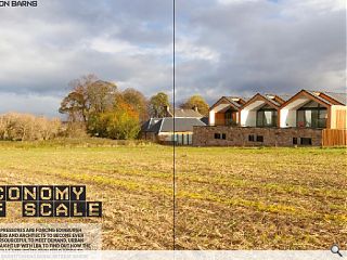
LBA with Glencairn Properties have mixed the best of rural and urban design in their latest partnership, a townhouse terrace in Edinburgh’s Liberton. The project reflects the sites past while looking to the future in specification and materials, utilising every square foot of available floor space on a highly constrained site.
Liberton Barns makes the most of an unpromising former agricultural shed and steadings by providing three, four-bedroom properties; each enjoying open aspects across fields to the Royal Observatory and Liberton Tower. Situated alongside a B-listed farmhouse, converted during an earlier phase of work, the latest additions evoke memories of the previous buildings in their massing, form and materials – including the re-use of the original stone.
Built using the Structural Insulated Panels (SIP) system to save time on site and create clean, clear lines,the development is encased in slatted timber cladding, which will mellow down from orange to silver grey with time. Each home prioritises privacy to the front by alternating solids and voids, a ‘hit and miss’ approach which serves to open up glimpses of light and movement within through slatted windows.
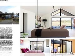
Internally each four-bedroom home is arranged around a fully glazed external void courtyard which slices straight down from the roof to bring light and natural ventilation deep into the upside down plan where living areas are located on the first floor to benefit from the views. Vaulted ceilings lead to a partially covered external terrace and a frameless glass balustrade.
Taking Urban Realm through this unique approach LBA managing director Lynsey Bell Manson said: “When you’re on-site it feels very rural even though you are literally in the city centre, the outlook is so agricultural and it was such a crisp lovely form that we didn’t want to lose that especially with the way the three houses slotted within the three roof pitches.”
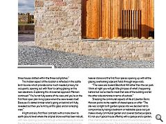
This hidden aspect of the location is reflected in the subtle larch louvres which provide some much-needed privacy for occupants, opening out with floor to ceiling glazing on the rear elevations. Explaining this introverted approach Manson continued: “You’re not fully aware of the view until you’re on the first floor open plan living space when the view reveals itself. Because it’s slatted timber what’s going on behind isn’t fully revealed but then you’re hit by all this glass and an amazing view.”
A light and airy first floor contrasts with a more down to earth ground level where the original stone wall has been rebuilt, with new openings punched through where necessary to ensure the site stayed true to its original use as opposed to introducing something completely alien to the former farm.
A key feature of the design is the use of internal courtyards to drive light deep into the interiors, increasing the amount of useable floor space on offer. Manson continued: “It was quite difficult to provide four bedrooms, the only way to get natural light in was to cut these courtyard cores out and bring natural ventilation to those rooms which open onto it. The views are from the upper floor so that really dictated where the living space goes. The boundary is right on the edge of the building so there were all kinds of issues to overcome in terms of glazing, that’s why the first floor is set back.
“It’s worked well with all the bedrooms hidden behind a heavier stone and the first floor spaces opening up with all the glazing overlooking adjacent fields through large voids.
“The views are toward Blackford Hill rather than the car park. I think at night you will get little glimpses of what’s happening behind but we’ve tried to mask that side of the building and let the other side dominate in terms of outlook.”
Stressing the communal aspects of life at Liberton Barns Manson points to the wealth of shared space on offer: “The site was so tight to fit garden spaces into we decided not to compromise by losing a bedroom or habitable space but just make a lovely communal garden and covered barbecue space. It’s not your typical house offering with a garage and a garden, it has internal private terraces and a communal barbecue and communal garden space. The purchasers are quite diverse, we thought it would be all young professionals.
“It’s an interactive space. In the kitchen, you can open the doors on both sides, as you can in the bedrooms, so the whole glazed core opens out. If it’s raining and you’re cooking or had a dinner party you could have all those doors open to the outside, it’s a very indoor/outdoor space.”
Proving that the best design often arises from the tightest constraints Liberton Barns stands apart from the ‘safe’ design approaches which often accompany a powerful heritage lobby. The result is an adventurous ensemble which has transformed an awkward forgotten space into something which stands apart from other developments of similar scale.
|
|


