PPWH: Careful by Nature
16 Jan 2019
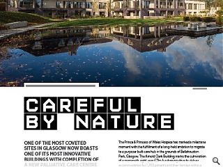
One of the most coveted sites in Glasgow now boasts one of its most innovative buildings with completion of a new palliative care centre by the Prince and Princess of Wales hospice. Urban Realm checked in to see how hospice responds to a sensitive setting and complex brief to deliver choice and dignity to patients.
The Prince & Princess of Wales Hospice has marked a milestone moment with the fulfillment of a long-held ambition to migrate to a purpose-built care hub in the grounds of Bellahouston Park, Glasgow. The Arnold Clark Building marks the culmination of a mammoth eight year £21m fundraising drive to deliver accommodation for 1,200 patients and their families within a parkland setting gifted by Glasgow City Council.
Belying its size the hospice partially burrows into the hillside to manage the scale of four interlinked ‘villas’ within the wider landscape by reading as a three storey structure from one side only. In doing so the hospice has left behind its historic home at Carlton Place in the city centre, but its front door hasn’t yet been slammed shut. Instead it has been transported to Bellahouston Park to serve as an extension of the hospices roots.
Ryder Architecture and ERZ formed the core of the design team the building and grounds cater for patients as young as 16, providing palliative care and a supportive environment for them and their families, a brief which presented a number of challenges not least how to accommodate civic healthcare services within a domestic-style building. Fortunately, project architect Alastair Forbes, architectural director at Ryder Architecture, was on hand to reveal all, saying: “The building takes the form of a series of cottages which sit under idiosyncratic roofs but when you analyse the cross section it’s a house within a house. What that does is create a stepped edge which is essentially a veranda. No matter how cold it is patients will want to be outside on the veranda a lot of the time wrapped in blankets.
“There’s a 12m rise from Dumbreck Road to the top of the site so it’s very much a building designed in section. What we did was a back of house wing which digs into the hillside and contains all the heavy lifting services which are not seen. That allows the front four villas to be far more domestic in scale. No matter where you are you can always get an outside view and we use the roof space for office accommodation. You should never be able to see the full building in its entirety from any one point, it should reveal itself as you move around.”
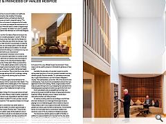
Embracing a Scandinavian innovation which involves arranging bedrooms around the perimeter of a central nurses’ station, it provides staff with full visibility while minimising the amount of corridor space. In this way the architecture helps foster cutting edge care. Forbes said: “When you look at the lower ground floor to the patient gardens which is where the Sengetun model (meaning bed courtyard) comes in. Putting staff right at the heart of the plan in sight of all the bed heads allowed us to make a connection. We just took the nurses station out and created a lounge setting with soft furnishings, making the whole thing less clinical while allowing staff to be within metres of their patients.”
Explaining how these principles were extended to the landscaping Rolf Roscher of ERZ Studio told Urban Realm: “The lower garden is modelled with a shared space in the middle and strong visibility around the edge and open to the landscape outside. The core space in the middle also has light coming down from above.”
Seeking inspiration Forbes’ first move was to book himself in for a short stay at Carlton Place in order to better understand the reality patients face in a way impossible to read from a plan or drawing. The architect recalled: “It’s what you hear, see and smell from that perspective. That experience helped me through the process.
In switching from a constrained city centre base to a parkland setting has the wealth of outdoor space brought a new dimension to the hospice? Roscher said: “There are lots of different types of outdoor space. All the bedrooms are on the ground floor and they’ve all got an individual semi-private garden terrace space which patients can take ownership of. It opens out to the larger landscape to give views and space.
“On the other side there are smaller seasonal gardens which serve as destinations throughout the year. More intimate and with a route through them that follows the flowing water down to the pond, it’s a very different type of environment. Those spaces can be used by groups or individuals to get away or have a chat.”
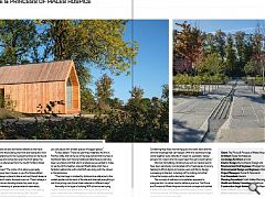
Inevitably the relocation of a private hospice to a public setting raises questions of how you transition between two very different spaces. Roscher revealed: “It’s ultimately an enclosed site, it’s got a fence around it, but we’ve tried to integrate it visually. The building takes up less than 10% of the site so the rest is landscaping. There are a lot of considerations around how you approach the end of a building. There’s a big boundary of birch trees you pass through and it’s just stepping the scale down and changing people’s perceptions before you get to the front door.”
It isn’t just patients who are benefitting from their new surrounds however and staff are happy to leave behind barred basement offices, dangling vacuum cleaner cords down stairwells and other such idiosyncrasies.
As well as providing welcome camouflage a small hill has also been developed as a meaningful landscape set piece, playing host to a meandering path which snakes its way to a hilltop shelter, a semi-indoor space where staff, families and patients can take a quiet moment to themselves. Still somewhat barren it will soon play host to a wild flower meadow but expansive views of the city skyline can already be enjoyed.
The hospice has certainly gained a wealth of facilities, in addition to space and light but In moving from the city centre has anything been lost? Forbes said: “Language is important, we always refer to people, patients, staff and volunteers. A big concern right from the outset was how you take the good parts and the atmosphere from Carlton Place? A lot of it is down to the people but there are also borrowed references that have found there way into the building, the front door being the most obvious.” Other references to the Georgian terrace can be found in the many alcoves and niches and even the front gates, the pattern for which is referenced from the South Portland Street Suspension Bridge.
Forbes continued: “The notion of an alcove was really important in Glasgow town houses so you find those dotted around. There’s always a place to take a rest and there’s always a scalloped edge which marks those alcoves out. There’s always a choice for people when deciding where they want to go.
This idea of a hierarchy of spaces extends seamlessly through to the external spaces as a means of accommodating large numbers of people while remaining calm. Roscher explained: “All the outdoor spaces have little moments where you can pause with smaller spaces off bigger spaces.”
Forbes added: “There are just three materials, the first is Penrhyn slate, that came out of the requirement that we have a traditional slate roof. Having traditional slate there would have been very black and that wasn’t a reference we wanted to make so we found this heather coloured Welsh slate which has a fantastic relationship with what Rolf was doing with the colours in the landscape.
“The inner layer is marked by brickwork as reference to the walled gardens at the back of the site and internally everything is oak. Everything uses those three materials in different ways.”
Normally in this type of building 90% of rooms are trying to grab external wall space which is why you get spread out plans. Here there was a willingness to look at a stacked building because they were used to multiple levels at Carlton Place. Something they liked was having quick and slow stairs and the informal meetings that can happen. With this site those things came together quite naturally. It’s been an exemplary design process for a client who has never been through a build before.”
Vital but intimidating infrastructure such as medical points have been sensitively incorporated within fixed pieces of joinery, helping to afford dignity to hospice users with Burns Design overseeing all interiors, including soft furnishing, to further imbue the hospice with a domestic character.
The concept of wellness is immediately apparent to everyone but it is rather hard to define in practice. The Prince and Princess of Wales Hospice this elusive concept and bottled it within the villas and parkland of Bellahouston, with a hospice infrastructure that can finally provide care and attention equal to that given by its dedicated staff.
Help us keep on caring by becoming a regular giver to Glasgow’s Hospice
|
|


