Brand Building: Image Conscious
16 Jan 2019
Taking a break from physical construction we delve into the digital realm to see what practices can do to build identity and perceptions in an increasingly image conscious world, blurring the boundaries between design and architecture in the process.
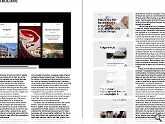
Direct your web browser to load any architect’s website and chances are your display will not thank you for the trouble, with clunky interfaces, low res images and stale content still the order of the day for most where the download limitations of the past still curtail ambitions for the future. In an effort to establish where most are going wrong and what the pioneering few are doing right Urban Realm spoke with a number of design agencies and architects to see what is required to produce a digital shop window that serves as an asset, not a liability.
Having just embarked on a web refreesh of their own Page\Park director Eilidh Henderson said: “We worked with digital designers Rabbit Hole to develop a new practice website this year. We sought to build a platform that recognises that our projects are not about the few, they’re about us all. Each of the voices and contributions of our team are recognised through our work and our new practice website seeks to offer a window into our world.
“There is a tendency to promote the person rather than the idea. If we focussed on ideas rather than personalities, a richer dialogue would emerge.”
Greig Anderson, co-founder and creative director at Freytag Anderson, is the first to state that ideas are king on the frontiers of this new world, with the onus resting firmly on the shoulders of practices to prepare a steady stream of compelling material. Anderson said: “A big learning curve for the client is to understand that there is a job for them to do in terms of managing the website content. Previously it would just be a static website where you just put something up and update it whenever you complete a new project. People’s expectations are different now with social media and everything else, so having the resource internally to manage that is a new concept for a lot of clients.”
Anderson added: “What a lot of architectural firms have done is look around at what they like and what they aspire to be. That’s quite unique as other clients require more workshop sessions to find that positioning.”
The agency has just completed work on a new website for Haus, a process which led project director Sophie Brown to establish a clear need to modify language to be appropriate for the target audience. “A lot of people don’t understand the architectural process and want to make it less opaque and more accessible,” said Brown: “Just having things laid out clearly and organising things step by step had actually won them (Haus) a new client recently. I think there’s a role for providing the basics to people.”
Do Freytag Anderson find that architects can be reticent to promote themselves by leaving it to their work to do the talking? Anderson responded: “There are not many architects who are shy in promoting themselves. It’s part of being creative that you have an ego attached to your output. They do want to do it, but it’s how you do it. If you get it wrong you will send out the wrong message or put yourself on a pedestal.
“The first thing we do is try to understand what makes a client tick. Haus for example were quite brutalist in their output but that’s tempered by their personality and that was important for us to understand. The essence of what sets you apart from the next practice is what you are like as a person. You need to make sure that your individual profile is somehow encapsulated by the brand by making sure your voice, personality and quirks come through.”
Asked why digital presence can so often be found wanting Chris Lord, creative director at Big Blue Dog said: “There is a bit of a common theme with architects not keeping up with their own branding, websites and marketing in general. For such a design conscious group of people that’s always been quite surprising for me. A big stumbling block with creatives is there are often a lot of strong opinions within each practice, it can be difficult to achieve a consensus. Being designers themselves they’ll want to be involved in the process. Without external influence from an agency you can start to go around in circles.”
Picking up on the idea of communication Henderson continued: “Completed architecture is a form of communication. Our buildings communicate to their context ideas that emerge from working with a client. The legacy we see as the best form of that communication. You never know how good something can be. No matter the project or issue, you can always find something interesting and particular – just find the ‘magic dust’.”
For his part Anderson said: “That’s tied up with the longevity of an architectural project, it’s much longer than anything we would do. That lifespan is really hard to capture. Pretty much all out architectural experience has been based on lots of content and trying to edit that down to the essence of the practice.”
It’s very easy to be pigeon holed and punch out to other sectors a divide between the design and commercial led practices. What can designers do to help break down those perceptions and have a practice be seen as being broader than its library to date? Lord commented: “It’s got to be creative and in budget utilising the left and right sides of the brain. You may lean more toward one side than the other and as a client you want to relate to whoever is right for you based on your personality. The problem is a lot of architecture firms have good projects which photograph well. If you’ve got five tabs open when you’re searching online, how do you set them apart? Part of the decision making will be the branding and how you relate to them as a company, not just the quality of the work.”
Brown ventured: “There’s a strong role for copy there, it doesn’t have to be reams of text but a few judicious lines can definitely tip that balance. It’s important to give a sense of the people behind the project. The human face certainly helps breakdown the impression of a faceless conglomerate.”
A lot of architects can be prone to discard plain English in order to reach for the thesaurus but is this aloof use of language contributing to the perception of ivory towers? Brown answered: “One of my bugbears is pretentious waffle. Nobody cares. Six concise words would be so much better. There’s a tendency to put theoretical rationalisation and flower it up with academic language and while it’s interesting to read it’s not going to resonate with the audience.
Anderson elaborated: “If you’re talking to your peers then its relevant but if you’re talking to the public and clients then you need to be more open. When you’re writing you almost slip into an automatic professional mode, but I don’t speak like this so why am I using these words that are not natural? I feel that they’re required but they’re not.
Explaining how to break down barriers between author and audience by bringing personality into play Lord carried on: “One of the benefits of us working with architects is we’re pretty similar. We design websites and branding and they design buildings but what drives you down those career paths is pretty similar, just with different outputs. They all deal with the same client issues that we do. When we come to the table and present ideas with design thinking behind it they appreciate it. You still have to deal with strong design opinions but when you meet them with reason and logic you can take them down the route that you think is professionally best for them.
“Beyond the design of the website and the branding architects do fall guilty of choosing a nice clean layout to stick their projects on. It looks fine but it doesn’t give you an idea of what they’re like as a practice. Obviously the work is important but you’re going to be sitting down with these architects day in, day out. You want to make sure that you get on.”
“What’s also important is process,” remarked Anderson. “You have an end product in a website or a building but people like the inbetween stuff when you get your hands dirty and go on-site. The website is almost becoming secondary to those moments which are most at home on social media. People are hungry for it. Ultimately the aim of any work is to start a conversation which might lead to a new project or introduction. A beautiful finished project is impregnable, there’s no in.”
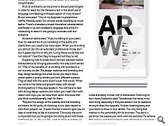
A naming convention so common it has its own three letter acronym (TLA) has swept many practices up in its thrall, although Freytag Anderson themselves have understandably chosen not to abbreviate. Outlining his own views Anderson said: “Sometimes the name is the best thing, especially if they are distinct but to create an acronym does the opposite. It takes meaning away and your back to three or four letters. The only thing that matters is the personality of the business. The work is personal, the people you work with are personal. To remove that and try and make it sterile gets informed by processes but takes away meaning.”
Brown continued: “There’s a temptation for smaller businesses to try and make themselves sound larger. The public is starting to have much more appreciation of the boutique but many businesses are still catching up with that mindset and want to sound corporate.”
The battle to make your voice heard in a binary world can seem daunting but for those willing and able to pull all the levers available to them there are near limitless opportunities for promoting analogue achievements to a digital audience. In doing so many are belatedly coming to realise that the surest way to propagate success doesn’t solely lie in the message but also the messaging itself.
|
|


