Perth Theatre: Curtain Raiser
2 Jul 2018
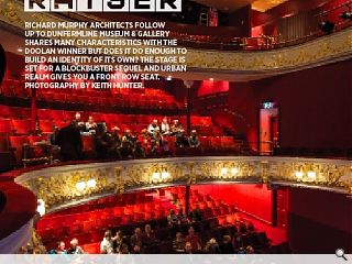
Richard Murphy Architects follow up to Dunfermline Museum & Gallery shares many characteristics with the Doolan winner but does it do enough to build an identity of its own? The stage is set for a blockbuster sequel and urban realm gives you a front row seat. Photography by Keith Hunter.
The curtain may have fallen on Perth’s 2021 City of Culture ambitions but the city is bouncing back with a transformation of its artistic offering, with the current star of the show being Perth Theatre.
When Scotland’s oldest repertory theatre company was taken over by creative body Horsecross Arts in 2005 the stage was set for a dramatic overhaul of Perth Theatre, improving access, facilities and services while retaining the essence of its Edwardian splendor – but it wasn’t until the appointment of Richard Murphy Architects in 2008 that the build truly gained momentum. Recalling those pivotal early days project architect Bill Black told Urban Realm: “The whole project started partly because this space was at the end of its useful life, all the systems were shot, the ventilation didn’t work, chairs squeaked and everything was rundown, tired and out of date. At that point it was decided to upgrade but if you’ve got all that disruption anyway why not address all the other issues of the building, such as someone who can’t use the stairs being stuck at the front door?”
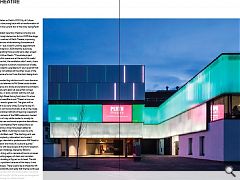
Big problems demanded big solutions and it soon became apparent that a new build element to Mill Street could double the theatres civic presence at a stroke and enable the architects to create a backlit translucent glass set piece that conveys a crisp modern aesthetic, in stark contrast with the rich red sandstone of the old High Street facing front door. On a tour of the former backcourt area Black said: “There’s a low iron content to the glass to avoid a green tint. The glass will be backlit, so we wanted it to be very white. During the day it’s monochromatic but it’s not monochromatic at all on the inside. I like that contrast.” A practice hallmark of layering is apparent from the barely visible remains of the 1980s extension, buried underneath a fresh skin of crisp white render to visually tie together the old and the new and avoid expensive demolitions.
Unpicking problems with level access at the front reception proved to be the hardest challenge, likened by Black to unravelling a tangle of string, with a cascade of knock on issues propagated along a twisting legacy of stairs and corridors. Black said: “The whole building is flipped on its head. The old front door was always a problem because of the steps, it was difficult for people to access. There used to be a wheelchair lift but that broke down constantly and really that theme continued all the way through. The back wall with frosted glass is all about drawing people towards the light. All the spaces are designed to facilitate that journey through six different levels.”
In place of a warren of inter connecting corridors the architects have carved out a processional route, opening up old nooks and crannies to a light and airy volume which naturally propels visitors through. “Our original idea was to create a public street right the way through the building and remove the steps, creating level access throughout the building”, remarks Black. “As it happens we were never able to remove those steps. You can go right the way through because both front and back doors are always open.”
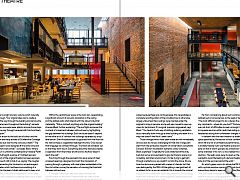
From the linear atrium to the bold use of colour and the exposed steel there are many echoes of Dunfermline Carnegie Museum and Library but was this the conscious intent? “The truth is the two projects were designed at the same time and the competition briefs were similar”, concedes Black. Where Dunfermline’s atrium is uniformly contemporary however Perth is dominated by a full height expanse of ‘mottled rawness’ where the brickwork of the original theatre has been exposed, with Black dismissive of calls to tidy it up, saying: ‘the rougher the better’. Complementing the brickwork is an extravagant use of polished plaster which had become something of a ’cause célèbre’ within the team. Initially jettisoned to keep a lid on spiraling costs Black was able to negotiate its return after striking a deal with the contractor by helping them out of a tight spot elsewhere.
Punching through the exposed brick are a series of steel wrapped openings designed to impart the impression of passing through a gateway, with steel plates embedded in the floor to further convey the sensation of crossing the threshold between old and new.
If changes in the foyer area have been dramatic the transformation of the historic theatre itself has been subtler. Previously all stalls, (the Gods having been closed off since the sixties because there was no fire escape), this necessitated a complete reconfiguration of the circulation but is otherwise largely untouched. New ceilings were inserted under the original to bring in services and a wall was moved to open up views for technicians. It’s surgical, precision engineered, says Black: “You have to find a way of slotting quite big ventilation ducts vertically down through a listed building and leave it in a way that doesn’t feel like it’s been done.”
Those changes which have been made are not immediately obvious but are no less challenging for that and in large part stem from the exhaustive research of conservation consultants Simpson & Brown to establish authentic colour schemes. Black explained: “Originally the Gods stretched all the way back but we’ve removed seats to give technicians space in an incredibly restricted environment, it’s like trying to get light through a letterbox as we couldn’t cut into the dome. At one time the dome was painted with scenes of cherubs but that was destroyed by fire 1924. All the gilding is real gold leaf, all re-gilded. As far as we can establish this is broadly the original colour scheme, there have been many iterations.” In a building awash with contrasts this baroque glamour stands apart from the industrial styled public areas.
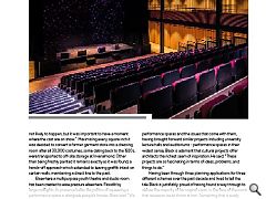
In tandem with the main theatre is a smaller performance space specified by Horsecross to host conferences and shows which fall are not a full theatrical performance. Black said: “This is a totally flexible multi-use theatre space and we decided quite early on that it wasn’t going to be a black box but would have some character of its own, so we created this inclined timber clad box. The seats pack away to open up the room as we wanted to avoid the feeling of a lecture theatre. The oak slats hide all of the services behind the walls.”
An artist’s green room sits above the Mill Street elevation with a picture window opening views out (and in), part of an overarching desire to open up the theatre. Black commented: “We didn’t want it feeling like a back space, so we had the idea of the actors congregating over a coffee as the general public walk past remarking: ‘Oh, there’s Ewan McGregor!’ It’s not likely to happen, but it was important to have a moment where the cast are on show.” Maximising every square inch it was decided to convert a former garment store into a dressing room after all 30,000 costumes, some dating back to the 1920s, were transported to off-site storage at Inveralmond. Other than being freshly painted it remains exactly as it was found, a hands-off approach which extended to leaving graffiti intact on certain walls, maintaining a direct line to the past.
Elsewhere a multipurpose youth theatre and studio room has been created to ease pressure elsewhere. Floodlit by large rooflights, its presence belies the politics of squeezing a performance space in alongside people’s homes. Black said: “We had to be quite careful with the acoustic separation on adjacent flats. It’s a constrained site right up against everything. There is nowhere else to go in terms of space, it was like a jigsaw puzzle. Light angles to windows at the back controlled heights, as it happens quite a lot of the flats have been empty in recent years so there weren’t as many objections as there might have been.”
If the project had more than its fair share of large headaches it also came packed with quite a few smaller ones, including an apparently inconsequential 3-inch difference in levels at the old entrance. A deceptively simple solution of inserting a subtle ramp was alighted on which eventually led to the reconfiguration of doorways. No stranger to the delivery of performance spaces and the issues that come with them, having brought forward similar projects including university lecture halls and auditoriums - performance spaces in their widest sense, Black is adamant that cultural projects offer architects the richest seam of inspiration. He said: “These projects are so fascinating in terms of ideas, problems, and things to do.”
|
|
Read next: Landscape Architecture: Well Grounded
Read previous: Maasai Centre: Glass Warrior
Back to July 2018
Browse Features Archive
Search
News
For more news from the industry visit our News section.
Features & Reports
For more information from the industry visit our Features & Reports section.


