Brodick Terminal: pushing the Boat Out
17 Apr 2018
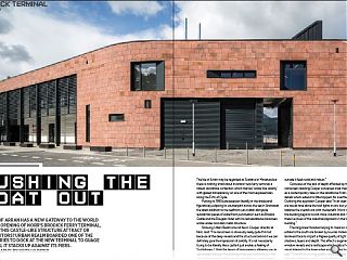
The Isle of Arran has a new gateway to the world with the opening of Norr’s Brodick Ferry Terminal, but will this castle-like structure attract or repel visitors? Urban Realm boarded one of the first ferries to dock at the new terminal to guage how well it stacks up against its piers. Photography by Keith Hunter
The Isle of Arran may be regarded as Scotland in Miniature but there is nothing small about its brand-new ferry terminal, a robust sandstone confection which marries ‘castle-like solidity’ with glazed transparency on one of the most exposed sites along the Firth of Clyde.Putting its 1990s predecessor literally in the shade and figuratively eclipsing its counterpart across the sea in Ardrossan the latest addition to the seafront cuts a dash alongside substantial pieces of waterfront punctuation such as Brodick Castle and the Douglas Hotel with its red sandstone rainscreen, white render and dark metal structure.
Showing Urban Realm around Kevin Cooper, director at Norr, said: “The rainscreen is obviously really quite thin but because of the deep reveals and the structure behind it we can definitely give the impression of solidity. It’s not necessarily trying to be literally like a castle it just evokes a feeling of Scottishness. I think the layers of transparency allowing you to see straight through the building when you’re standing in the upper lounge make it feel very transparent and yet standing outside it feels solid and robust.”
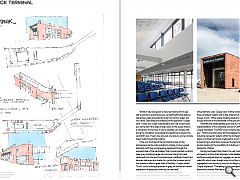
Conscious of the lack of depth afforded by the rainscreen cladding Cooper conceived inset metal reveals as a contemporary take on the sandstone finish of its peers, details which extend to little hoppers for overflows in the roof. Outlining this approach Cooper said: “In an ideal world I think we would have done the roof lights in zinc but you have to balance the overall cost with the benefit. I think the fact that the building beyond is a bit more industrial and marine-like, there’s echoes of the industrial approach in the form of the stair building.”
The long linear facades helping to mask an industrial estate to the south are broken by louvres midway along the landward face to impart a filigree quality of light by casting shadows, layers and depth. This effect is augmented by the window reveals and a roofscape which adds a fresh layer of visual interest to the town when approaching by sea. Cooper said: “Overall the curving quality helps, because it’s a long, thin robust building the curve gives it a feminine quality.”
Whilst it may look good no ferry terminal worth its sea salt would fail to prioritise access, something Brodick does by delivering a clear processional route from land to water and vice versa. Describing the simplicity of this approach Cooper said: “Unless you’ve got a double bass and a set of golf clubs you come down the steps and go direct to the buses, there is a connection to the foyer. If you’re disabled, you simply walk along the circulation zone beside the departure lounge to the central lift core. There’s one way out, one way in, giving a simple linear route through the building.
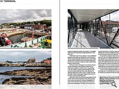
If the civic frontage of the terminal focusses on the picturesque marine-side operations employ a more rugged approach with heavy engineering expressed through the exposed steel of the sea bridges, their trusses painted a uniform deep grey including a large service tower rising from land reclaimed from the sea. Encompassing a multitude of uses from biomass deliveries to a shelter for cyclists the business end of the operation offers a great deal of flexibility. Cooper added: “It isn’t a civic building expressed in grey, we wanted an honest expression of spaces as shown by the staircase.”
A varied series of windows, including a specially constructed bay window for the harbormaster, overlook the water providing a clear line of sight to all port-side activities for office staff and crew. Cooper said: “All the windows as built to three consistent heights with a little inflection at the end to draw the eye round.” Office space, meeting areas and a mess room occupy the bulk of the remainder of the ground floor.
Internally the sedate palette gives way to a loud implementation of the corporate colours of CalMac Ferries. Cooper remarked: “The RED! colour scheme does scream at you.” Finishing touches have still to be applied to the interior including a projector system within the full height main entrance below a rooftop light scoop. Designed as a commercial element to help bring in advertising revenues the terminal operators are also looking at the possibility of including a mural or poster painted by children.
Having purchased their tickets, the vast majority of travelers will head up a stone lined staircase, while disabled passengers and those weighed down by luggage can use two double sided lifts which open straight onto a first-floor departure hall, segregated from arrivals by way of a full height glass screen. Cooper explained: “The feeling is really transparent, here’s the arrivals corridor. We had to design it in such a way that it could be fully segregated because it might be in a few years’ time that every port has to separate arrivals and departures just like airports. Although it’s not strictly enforced the building needed to be designed to allow that to happen. It’s a pragmatic response but also might become a legal requirement in a few years’ time.”
What travelers won’t find is a café as in a sop to established businesses on the island who feared that it could draw spend offshore. Instead passengers will have access to a well-stocked vending machine stuffed with Irn Bru and Haribo, although all the services are in place for a café to be swiftly installed should there be a change of heart.
\
What sets the new building apart is the sensation of space and light afforded by a vastly expanded footprint and an overriding consideration to maximise views. Cooper stated: “If you can’t design a building to take advantage of this view then you’re doing something wrong. It’s jaw dropping. The departures hall faces due north so even on a bright sunny day the quality of light is quite subdued. People come to Arran for the views so give them what they want.”
Gesturing to some of the infrastructure associated with the old pier Cooper confirmed that some of the existing caissons and an access ramp will go but the sheer impregnability of it means some will be left in place, perhaps to be turned into a terrace area for passengers. Pointing to a £1m ramp that was floated in by sea and craned into place Cooper continued: “We’ve designed the pier so vessels can dock on both sides so cruise ships for example could dock there. The great thing about the sea bridge is it can move up and down, there is a phenomenal variation in the tide. It really makes a huge difference and can accommodate almost any size of vessel within the bounds of the size of the pier itself.”
At one point the bridge was going to be removable in case a lorry with a wind turbine needed to get past but this was switched out for a static bridge, one of a number of amendments made along the way. Cooper said: “The initial version of the Brodick job started out as a single storey pavilion which became two storeys as we wanted to get the terminal building right on the front. It ended up being an island in the middle because of the phasing which required the harbour to work while we were building in the middle of it.”
A mere 15 miles of sea separate Brodick from Ardrossan but the holiday town is a world away when it comes to the quality of its infrastructure, a sign that Brodick now really has arrived.
|
|
Read next: PRS: Rental Potential
Read previous: Churches & Chapels: Church Going
Back to April 2018
Browse Features Archive
Search
News
For more news from the industry visit our News section.
Features & Reports
For more information from the industry visit our Features & Reports section.


