Hawkhead Centre: Looking Good
24 Jan 2018
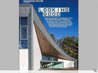
Urban Realm dropped by Page\Park’s custom-built hub for the visually impaired to see if beauty really does lie in the eye of the beholder - or whether tactile response and spatial qualities which speak greater volumes about the true nature of elegant design.
The Hawkhead Centre occupies a former garden centre on a sizeable corner plot, providing sufficient land to build a dedicated day care centre offering a range activities, workshops, training and social opportunities for members in addition to a care home, designed by Unum Partnership on behalf of Royal Blind. Maximising the opportunities presented by co-location in terms of shared facilities, staffing and infrastructure the dual development follows on from Page\Park’s delivery of a sister (albeit more rural) facility at Linburn, West Lothian.
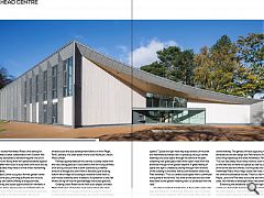
Perhaps appropriately all this activity is barely visible from the road, taking place as it does behind the low-slung confines of an arcing structure that is both screened by a healthy amount of foliage and sunk within a fortuitous pre-existing hollow which helps the building to nestle far lower than its bulk would ordinarily allow. Instead its full presence is only felt when turning off into the painstakingly manicured grounds.
Greeting Urban Realm at the front door project architect Martin Flett said: “Things the client learned from the initial project in Linburn have been fed into the project in terms of providing the best possible facilities and space for the partially sighted.” Space and light were key requirements of the brief and Hawkhead achieves both in spades by slicing a central walkway and social space through the centre of the plan, conjoining two great glass walls which open vistas from the entrance through to the garden beyond. A great feeling of space and light is created by seeing through from one end of the building to the other with accommodation either side. Flett remarked: “This is a central social space with a communal dining area at the far end. You enter at the east end and then head west to the garden meaning that it is protected from the road.”
A further benefit of straight lines in the building plan is the ease and simplicity of wayfinding with every room accessible on a single level, contained within two wings either side of the central hallway. The genesis of these opposing wings has been attributed to aircraft design but Flett favours the analogy of a birds wing inspired by the name Hawkhead. Flett explained: “You can see pretty much every room as soon as you come in so the idea was to make the spaces as clear as possible. You arrive at the east and there’s a turning area and garage off Hawkhead Road, which helps screen the noise. A garden at the other end bookends the site. There’s a real mix of mature Maple, Larch and Pine trees across the site which were a huge asset, we inherited a landscape which was already bedded in.”
Enhancing the sensations of space and light are continuous full-length high-level windows which help knit all the rooms together. Flett remarked: “We wanted to get the sense of mental mapping in all the rooms, so all the members rooms are connected in one way or another to the central circulation space. The high-level glazing means you can see that the whole way through and the glazing is frameless. Sometimes, depending on the light you can look straight through the glass almost as if it wasn’t there. Inevitably a building of this type will have a huge variety of uses so it has a sports hall, a gymnasium, kitchen, social area and workshop. We wanted the cellular rooms to feel connected to the rest of the building. Even when you’re in one of the more cellular rooms you still have a very clear connection to the column free central area. You’re not looked away in a little compartment.”
Notable by its absence was signage, which will be added at a later date to custom walnut panels above the doors. Instead, priority has been given to three dimensional tactile objects outside each room so the visually impaired can find their way by, for example, placing a wooden mallet at the entrance to the workshop so that as members feel their way along the guide rails they will know where they are. Going forward the centre will built its own signs in its workshop. To accentuate visual contrast different wall panels were used for the doors and frames to help pick them out and handrails are deliberately darker than the lighter walls, with braille stud embedded below to identify each room.
Flett added: “The building plan is organized in three parts, there’s the central section, and two wings; one to the north and one to the south. Office accommodation is tucked in above the sports hall and then the building sweeps north to a single storey, moving from an urban to a domestic scale in the process. Every circulation space is slightly wider than it needs to be. As this space tapers out it also embraces the garden in a bowl like shape so you get a sense of shelter and protection from the road. It is an oasis. If you can see out to landscape it’s beneficial to your wellbeing.”
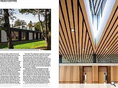
Opening out to a cavernous dining space to the west, more transparent than the eastern elevation, this volume contains a café pod which sits under the dramatic sweep of the roof. Backing onto a services core this element includes WC’s, changing rooms, a kitchen and gym with office space above. Flett said: “It contains the catering kitchen and cloak room at the far end. The timber ceiling comes down the walls at both ends of the building to give the impression of this wing-like roof, imparting the impression of enveloping you.
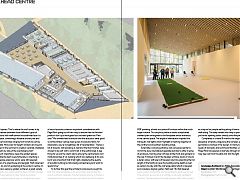
“As we move away from the road toward the care home we wanted to create something more domestic in scale. It’s always a challenge with a wide variety of room types - especially sports halls, because invariably you end up with multifunctional spaces. That’s where the roof comes in by helping us to mediate between those different types of spaces.” The sports hall itself cannot be subdivided but it is still a flexible space, containing a foldable archery net and evidence of recent activities ranging from bowls to curling and music recitals. More over full height windows at one end may be retracted in the summer to create a veranda, sheltered from the elements by way of the overhanging roof.”
Of paramount importance were the garden spaces beyond and while the team were fortunate in inheriting a mature green space extensive works were still required; notably inclusion of a greenhouse and pergola. Flett observed: “The members do a lot of gardening at the Linburn Centre, it’s been designed as a sensory garden so there’s a great variety of plants and herbs and raised planting beds. So that member can garden without getting on their hands and knees.”
As visually impaired people rely on a heightened sense of sound acoustics were an important consideration with Page\Park going out of their way to ensure that the finished product didn’t just look good but sounded great too. Flett said: “We worked hard to ensure that the acoustics were good so all the timber ceilings were given an acoustic fabric for absorption, you’re not getting a lot of reverberation. There’s a lot of acoustic wall paneling as well and the floor finishes were chosen to be soft with a cork finish in the central area. A key thing for us and the client was to ensure the centre had a non-institutional feel. It’s a building which has wellbeing at its core but it was important that it felt right, displaying the quality of a public building but also being somewhere you’d want to spend time.”
To further this goal the architects consciously sought to limit the material palette as far as possible, specifically the use of synthetic materials. Finished predominantly in timber a standalone kitchen and services unit stands proud, finished in MDF paneling, almost as a piece of furniture within the much larger volume. This simplicity belies a rather complicated cranked plan orthogonal to the floorplate which intersects in the central space. The angle of intersection inspired the triangular roof lights which highlight a meshing together of the northern and southern building wings.
Externally a concave entrance was conceived partly to mirror the busy roundabout opposite but also to offer a sense of enclosure, framing drop-off area at the front and gardens to the rear. Finished in larch the facades will tone down in time to a duller colour with piers of tapered columns extending the full length of the facility to give the building some depth as well as options to play with the roof edge detail which is tapered and includes a big box gutter. Flett said: “As that tapered space widens toward the end the rooflights get larger as well. They also act as louvres so it’s largely a naturally ventilated building. The idea behind the steel planters filled with gravel is as a tap rail so people walking along it have a straight edge to walk along. The deep reveals also help to protect openings so you’re not opening doors directly onto the path.”
Completed in a mere 18 months the singular vision is of deceptive simplicity, disguising the complex geometrical gymnastics involved in the design. In marrying the opposing needs of domestic and communal facilities under one roof Page/Park has opened a doorway through which veterans may step out from the dark and into the light.
Landscape Architect: Ian White Associates
Client: Scottish War Blinded and the Royal Blind
Contractor: CCG
Photographer: Keith Hunter
|
|
Read next: New Town: Hot Date
Read previous: UR100: Top Class
Back to January 2018
Browse Features Archive
Search
News
For more news from the industry visit our News section.
Features & Reports
For more information from the industry visit our Features & Reports section.


