St Cecilia's Hall: Noteworthy
20 Oct 2017
The second oldest music hall in the British Isles is now also the newest following a £6.5m retuning at the hands of Page\Park but is the building now more in tune with its surroundings? Urban Realm paid a visit to the new look hall to see whether it looks as good as it sounds. Photography by Jim Stephenson.
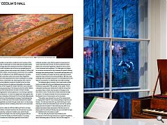
The forgotten conservators, academics and musicians of the University of Edinburgh’s St Cecilia Hall have long toiled within a surprisingly dissonant working environment. Despite being named after the patron saint of music and despite being the second oldest custom-built concert hall in Britain St Cecilia’s Hall could offer neither a sound acoustic environment nor a suitable home for its collection of over 4,000 harpsicords’, trumpets, flageolet’s and other exotic instruments. Now Page\Park Architects have repurposed this historic building into a cuttingedge venue, conservation lab, teaching space and museum – allowing the collection to sing at full voice for the first time. Lying at the foot of a dank and dingy alley in the darker recesses of the Cowgate St Cecilia’s Hall offers scant indication to the casual passersby of the treasures which lie within. Rather, the squat two storey hall does its best to remain invisible, discouraging even a second glance as it sits among its grander more ornate peers it is more curb appeal than kerb appeal, with a clump of ubiquitous Edinburgh City Council back alley wheelie bins reinforcing this lackadaisical message. Overshadowed by a canyon of Old Town stone St Cecilia’s Hall was tired, hidden and forgettable, accessed through a back door in a ridiculously claustrophobic section of Niddry Street that no-one could ever find. The bins, sadly, are still there (although there is a longerterm ambition to banish them) but the old entrance has gone, superseded by a statement metallic vision which thrusts through the full height of the hall, reaching skyward with an optimism that the facility has hitherto lacked. A cut away section doubles as an electronic gate and (at the client’s initiative), provides a sign offering welcome reassurance to visitors that they have arrived. On hand to welcome Urban Realm own arrival was Page\Park’s depute of arts & culture Eilidh Henderson who explained: “It’s a wee gem of a project for us and an unusual one for the university as a public building amongst their teaching estate. The architectural idea was to try and let this building sing again by having a gate which would signal the main entrance and so bring people in.“We had a real challenge with this project because it’s so overlooked due to the way the city evolved, it is dwarfed by much taller buildings.” The signature gate is finished in two-tone bronze in order to act as a subtle foil to the soot blackened stone around, as Henderson expounded: “We wanted it to be subtle. There’s a bespoke standing seam detail which is like the strings that you pluck, they run down into the joints in the glass to the floor, which is tiled. The tiles then unravel inside like the keys of a piano. The façade embodies the more exuberant and flamboyant forms of instruments such as trumpets. “This pattern was derived from one of the harpsichords on display which had the most amazing design of parrots and flowers. The idea was that when you were listening to music that all your senses are stimulated so you can see the parrots flying and taste the peach. It was obviously very well-to-do people that owned these instruments. We had a lot of fun playing with the motif and thinking how we could add this layer of embellishment to the interior as well.” The main difficulty the team faced related to the introduction of the servicing necessary to support the galleries, which necessarily went on the roof, much to the chagrin of the neighbours.
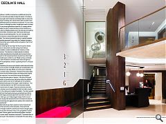
Initially conceived as an additional storey the decision to truncate was taken to keep the peace. In its place a recurring jungle motif of parrots and foliage helps to screen the offending air handling units. Above these staff luxuriate in their own cantilevered perch as Henderson exclaimed: “It’s one of the best offices in Edinburgh up there, a single span sheet of curved glass. It’s not terribly glamorous inside but it’s a lovely volume.” Despite the gloom several windows remain bricked up, a feature which probably predates even the extensive remodeling work of the 1960s. Henderson said: “We had an idea to put in some back lit perforated panels. You don’t actually need daylight there but it would have given life to the façade externally.” One historic window has been re-opened however with a sharply expressed frame while the Cowgate frontage is now enlivened by signs, backlit panels and graphics that hint at the splendors within. Upon entering the main foyer the flock of parrots follow, fossilized in a decorative concrete ceiling frieze without paint or sealant, in order to celebrate the ‘honesty’ of their imperfections. This attention to detail extends to shadow gaps, crafted woodwork and handrails which proved to be a nightmare for the hard pressed team of joiners but which have made a tight space a dream to use. Neatly turning a necessity into an asset Henderson concedes these stairs are tight but likens the claustrophobic climb to ‘squeezing the air in a musical mouthpiece’. Extrapolating the bronze and stainless steel external finishes indoors are a number of metallic details such as balustrades and bespoke bronze chair legs. Whilst not of the same metal they display a similar colour and texture.
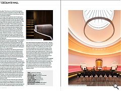
The bulk of the action takes place on the first floor where a piano and harpsichord surprise with their openness, the instruments being fully displayed without any obtrusive glass or barriers. Here too at the heart of St Cecilia’s is the eponymous hall whose distinctive elliptical shape came with its own set of challenges for the architects. “It’s reverberant because of the shape”, notes Henderson. “The concert wall was rebuilt in the 1960’s and has been hacked around into all sorts of shapes. They tried columns round the sides to dampen sound and applied terrible ‘porridge’ acoustic plaster to the ceiling and installed chandeliers. The client wanted to install more fixed seating because everybody loved sitting around the edge and historically there have been five tiers of seats – which you can’t really imagine today! There’s a lot of acoustics at play here because we had to increase the amount of soft furnishings and apply acoustic plaster, skim coated to be more reverberant.” Hidden behind your feet a system of vents channel cool air from the roof which is then extracted. These aren’t the biggest changes however as above your head a Georgian glass skylight has been removed in favour of a sympathetic modern alternative. Double-glazed and acoustically sealed it remains true to historic detail. Henderson continued: “That whole floor of plant we’ve got in the extension is to deal with this space along with the gallery.” More than just a comfort this has proved a boon for the musicians. As Henderson continued: “We used to find that instruments would fall out of tune because they were timber and would just expand.” Another aspect requiring attention was the lighting with Henderson recalling the twilight pall of the previous hall, lit by historic chandeliers (the largest of which was valued at £50k). After some debate all of these were removed (three now hang in the gallery next door), allowing a striking contemporary lighting crown to be installed. “It was contentious putting in a modern chandelier” admits Henderson but stresses “It felt like the right thing to do because it was about showing that the building is being used in a different manner.”
That approach is backed up by the fact that following past remedial efforts little of the original building fabric survives beyond the two outer walls. Henderson continued: “It’s part of that journey of the building and we were quite open in saying we’ll show you where it’s been. Adding the modern layers just lifts the space. Previously your eyes were stuck at head level because it was so dark and oppressive.” Asked whether the chandelier purposely twists as it appears to when viewed from below Henderson added: “The bespoke shape reflects the geometry of the hall and draws your eyes up, the chandelier was much lower. We didn’t survey it right so the suspension cords are actually hanging in slightly rather than hanging vertically. I think as a result it looks like it’s twisting but I don’t think it is. It’s an optical illusion.” Pocket doors seal access to the hall during performances while still permitting a clear line of sight and allowing access. Such views were paramount throughout the design process with Henderson leading the charge to incorporate axial views, ensuring people can see into the collection while opening up the external elevation (through the aforementioned reopened window) to help occupants get their bearings. Descending into the basement the feeling of light and space continues with twin outsize columns (likely sourced from another earlier building) flanking the entrance to another display gallery. The ceiling here had to be lowered in order to squeeze in all the required ventilation and services, forcing the architects to cut out sections to fit the outsize capitals. Here one of the original walls of the building was ripped out to provide a new entrance while an eclectic array of arches has been reopened.
These openings sit proudly within a new open plan volume following the removal of blockwork partitions that formed the old staff offices. The team had to remove the entire floor and insert a steel frame as it was found these partition walls were supporting the ceiling, adding to headaches generated by inconsistencies in level. Some archways have been infilled with glass enabling the space to be subdivided for singing lessons and piano practice as and when required, while still allowing for through views to the restoration lab. This new-found sense of space has been put to good use and has allowed the display of many instruments which were previously left gathering dust in storage – although a huge amount remain locked from view. Now they take pride of place within the revitalised hall as works of art in their own right. Henderson enthused: “This is a jewel box, a box within a box. You have to be able to lift out an instrument and play it at any point and we have a live conservation lab on-site because the conservator preserves every single instrument. They’re not too precious about the objects within. All instruments are displayed in the position they would be played in which lends a real dynamism to the exhibits. The space works really hard so you have people in for singing practice and piano lessons.”
All this effort hasn’t been in vain with 6,800 visitors stepping through the doors since May alone, compared with an annual tally of 4,000 before. With a concerted publicity campaign now in the offing Edinburgh seems to have added another string to its bow but in doing so the St Cecilia’s Hall has lost none of the unprepossessing charm that comes from discovering a forgotten treasure in one of the most heavily trafficked tourist hotspots on Earth.
|
|
Read next: The Battle for Home: War and Peace
Read previous: Gray Dunn: Factory Floored
Back to October 2017
Browse Features Archive
Search
News
For more news from the industry visit our News section.
Features & Reports
For more information from the industry visit our Features & Reports section.


