Maquettes: Model Behaviour
24 Apr 2017
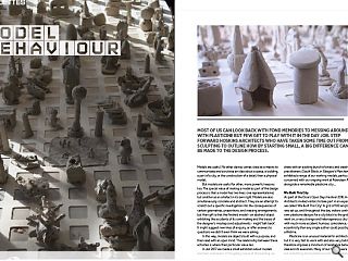
Most of us can look back with fond memories to messing around with plasticine but few get to play with it in the day job. Step forward Hoskins Architects who have taken some time out from sculpting to outline how by starting small, a big difference can be made to the design process.
Models are useful. No other device comes close as a means to communicate and scrutinise an idea about a space, a building, a part of a city, or the construction of a detail, than a physical model. But models are useful for other, more powerful reasons too. The special value of making a model as part of the design process is that a model has two lives: one representational, but another as an artefact in its own right. Models are also simultaneously concrete and abstract. They are an attempt to scratch out a specific investigation into the consequences of certain geometries, proportions, and massing arrangements; but their gift is that the finished model – an abstract object exhibiting the accidents of its own making and the traces of the designer’s missteps and adjustments - might ‘talk back’. It might suggest new lines of enquiry, or offer answers to questions we didn’t even think we were asking.In this way, models are objects built with a purpose, and then read with an open mind. The relationship between these activities is where their particular value lies.
In Jan 2017 we made a small exhibition about models and their usefulness. In the gallery space of the building we share with an exciting bunch of artists and creative industry practitioners (South Block, in Glasgow’s Merchant City) we exhibited a range of our working models, particularly those concerned with our ongoing work at Aberdeen Art Gallery, alongside a remarkable plasticine city …
We Built This City
As part of the Doors Open Days Festival 2016, Hoskins Architects invited visitors to take part in an experiment which we called ‘We Built This City!’ A grid of 190 empty squares was set up, and throughout the day visitors contributed their own plasticine designs for a city block to the grid. As the day went on, a very strange and heterogeneous city took shape – with much more accident, humour, coincidence, anomaly and eccentricity than any single author could possibly generate in a lifetime.
Plasticine is an unusual material for architectural models; but it is very fast to work with and also very biddable, and therefore imposes a minimum of resistance between an idea and its execution. Many of our makers were children, but something about plasticine and its connotations with childhood play, seems to have infected the efforts of the adults too. The contributions are therefore wild, instinctive, silly, and in the best sense deadly unserious. This city would not look as it does had the materials been cardboard, timber or resin, or had the makers been architects. In its extreme vitality, the completed work is a rich, joyous and exciting thing.
Aberdeen Art Gallery
This project, currently on site, tackles the redevelopment of Aberdeen Art Gallery: the wholesale reorganisation of the building’s interior, and the addition of a rooftop extension for temporary galleries and public terraces. The design process was lengthy, reflecting the complexities of radical reimagining of an existing listed building, and model making was central to the process. Four of these models – a representative selection across a range of scales and materials – are described and illustrated below.
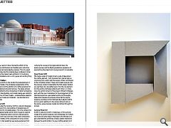
Context Model 1:200
This model studies the massing, rhythms, scale and language of a small parcel of city: one building, a triangular piece of public realm, and its immediate edges. This is the context into which our proposal nestles and to which it seeks to respond.
This is an interesting scale to work at: small enough to understand a bird’s-eye overview of the urban composition, and grasp the totality of the composition at once; but also large enough to test pedestrian eye level experiences from a range of locations by crouching down and peering into the spaces made by the model. To be able to shift between verifying the success of big organisational ideas, the aerial overview, and the fleeting pedestrian experience of approaching the project and moving around it, is invaluable.
Study Models 1:200
We made a series of models to test a suite of ideas about the rooftop element – both to assess their internal logic as convincing form, and to test the success of their contribution to the immediate context. These card models were set onto the previous context model before the final copper iteration you see there now was settled upon. How the new element and the existing roofscape relate to each other is, in many ways, the central concern of the project. Different strategies, each with their own implications for the arrangement of the internal programme, were tested quickly and thoroughly. Ideas about degrees of enclosure, about darting skyline presence, and about a form that feels like it adjusts itself to act as a good neighbour to the various domes it joins on the skyline, were proposed, tested, and refined through this process.
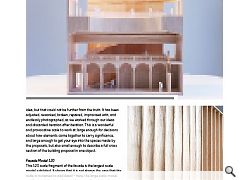
Sectional Model 1:50
A shift in scale, and a shift in model type. A 1:50 sectional model of the central sculpture court at Aberdeen Art Gallery was built at an early stage in the project, and allowed us to get understand the extremely complex spatial interactions between the existing fabric, the new rooftop element, and the new staircases connecting those parts. This model is carefully made, and looks like a model made to present a final idea, but that could not be further from the truth. It has been adjusted, reworked, broken, repaired, improvised with, and endlessly photographed, as we worked through our ideas and discarded iteration after iteration. This is a wonderful and provocative scale to work at: large enough for decisions about how elements come together to carry significance, and large enough to get your eye into the spaces made by the proposals, but also small enough to describe a full cross section of the building proposal in one object.
Façade Model 1:20
This 1:20 scale fragment of the facade is the largest scale model exhibited. It shows that it is not always the case that the scale is increased to add detail – here, the large scale model is still very abstract, and is used to assess the relationship between a human figure and the width, depth, and height of a set of ideas about a cladding module. The model convinced us of the validity of a scalloped language, and led us to seek technical solutions to achieve this. Importantly, we enjoyed the way the model was ambiguous as to the solidity of these scallops – inviting a reading both as solid, cast monolithic elements, and also suggesting lightweight, billowing, tensile structures. We have fought hard to imbue the finished proposals with something of this quality, and that aspiration has remained a touchstone for the team throughout the detailed design of the project.
|
|
Read next: Housing Crisis: Personality Built
Read previous: Aerial Adventures: High Wire Act
Back to April 2017
Browse Features Archive
Search
News
For more news from the industry visit our News section.
Features & Reports
For more information from the industry visit our Features & Reports section.


