The Thistle Centre: Prickled Up
17 Oct 2016
The most deprived community in Edinburgh now plays host to a state of the art health and wellness centre which promises to bolster the wellbeing of all who step through its doors. Here we take a step inside to see for ourselves how the magic is achieved. Photography by Cadzow / Pelosi.
Despite regeneration effort Craigmillar remains the third most deprived ward in Scotland with significant health issues and unemployment to contend with but it also contains a model village built to house disabled servicemen after the second world war. The Thistle Foundation aim to drag care for these residents and those from further afield straight into the 21st century by providing a gym, consultation and training rooms and office space – all a far cry from the previous facilities as estates and contract manager Craig Anderson explained to Urban Realm: “Since we closed the Tudsbery Centre about four years ago we’ve been housed in a residential home so all of the offices used to be bedrooms with big wet floor areas serving as bathrooms. Each bedroom had its own bathroom which they just turned into glory holes for everyone. It had masses of stuff just piled into spaces.
“We twice looked at refurbishing Whiten House but the problem was we didn’t own all of the surrounding land and lacked parking spaces.”
The new found space has already proved invaluable in servicing the needs of an influx of new patients through its doors, curious to see what has been achieved and eager to take advantage of the new facilities offered. Anderson added: “We’re so busywe don’t allow staff to use the car park to keep the space free for users. Nobody stays overnight, we have a gym so dozens of people come throughout the day and we have all sorts of classes and management courses for people with long term health issues.
“The building had to be many things to many people and adaptable in its use so that we could adapt the courses by taking walls down. Even the gym and hub space can be subdivided if we need to.“
Delivering the range and scope of the required facilities within the available budget was no mean feat as project architect Chris Dobson said: “It is quite compact and obviously everything has to fit within budget as well, it’s a charitable organisation so a lot of what we did was take standard off the shelf products but make them work as hard as we could and shape them into bespoke constructions. Part of that was delivering a facility which is easily managed and maintained.
“We shouldn’t be spending on buildings. We have a range of people coming through the door from people with physical disabilities to people needing to move around or people with Parkinson’s. We tried to do what we could to ensure it catered for everyone who came through the door making them feel comfortable but not institutional.”
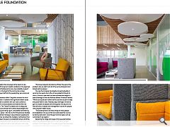
This approach dictated a lot of the material choices with the building effectively split in two; the ground floor being given over to a public health and wellbeing services and more prosaic office space and services located above. Both elements interact around a central hub which doubles as a circulation core and communal hang out. Dobson remarked: “This is the point at which everything connects. We’ve got the secure garden at the back; we wanted it to feel as open and welcoming as possible. Although the staff are upstairs we’re trying not to have a feeling of separation and to have everyone as part of a facility. You’ve got that interconnectedness but the staff have their own breakout spaces and can get a bit of privacy when they need it. It will be interesting to see how that works in practice. “
The ability to borrow space and light is reflected in the hub where no two sofas are alike, a conscious effort being made to ensure that everyone who comes in the door can find something comfortable whilst leaving plenty of room for wheelchair users. Interior design proved to be a key component of the brief and was awarded to 3DReid later on in the commissioning process.”
Off the hub lie various consultation rooms and private meeting points, separated from the main volume by retractable walls and with sound baffles to mitigate disruption. Anderson continued: “Restrictions on cost dictated that these rooms didn’t go all the way to the ceiling because they would have to be mechanically ventilated, which costs more money. So they’re all part of the main hub. It’s pretty much all naturally ventilated, apart from some extraction in toilets and while it’s as warm as it has been it can be a challenge but come winter it will be beautifully insulated.”
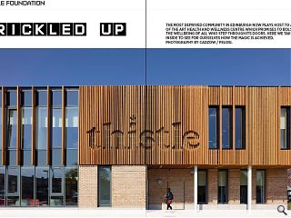
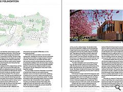
The most notable component of the design is an envelope of Norclad timber, stained via a pre-injection pressure treatment, borne out of a desire to avoid the silver weathering of material such as Larch and to create an environment which was as welcoming and non-institutional as possible. This allows the material to extend seamlessly between indoor and outdoor spaces without fear of discolouration. Dobson explained: “Everything was dictated by the feel of the building which needed to be warm and welcoming in nature. A lot of users suffer from anxiety and change and you have to rebuild that trust and get people re-engaged.”
The use of fixed timber batons allowed a Thistle sign to be incorporated directly into the architecture, alleviating the temptation to tack on a last minute plastic sign; although Anderson concedes it gave the architects a headache when coming up with a cutting schedule. The decorative timber also serves to hide built in ventilation and services although it doesn’t perform any structural function, it’s the Kingspan panels behind which give the weather protection. Anderson said: “These batons are what they normally fix planks with, they’re not designed for a facing they’re designed to have planks screwed. I saw Grand Designs a few years ago and they had tile bricks on the ground floor and wood above and it was to match the church. We couldn’t do that but I said to Chris what can we do that’s similar?
“The other consideration was to ensure that the ground floor was robust enough to stand up to any abuse it might suffer. We chose to marry the brickwork with the stone on the Robyn Chapel and the pre-cast concrete plinth mimics the houses. The chapel is A-listed and the houses in the immediate area are B-listed so virtually every structure which it meets has a listing of some sort.”
As if that wasn’t enough to deal with the design team were also constricted by a row of existing houses which defined the leading edge within which the building had to fit, including a substantial car park. Anderson added: “We had to argue to include so many parking spaces and accessible bays. We’re now looking at around 2,000 visits a month, not including staff.”
Of these visits many come for professional help and guidance but many also simply pop round for a natter, as Anderson joked: “We’ve got a slimmer’s group that come every week and get weighed on wheelchair accessible scales and they’ve been coming to the Thistle for 20 years. You’d be lucky if they’d lost a pound between them. It’s a social thing.”
Another addition to Thistle’s suite of facilities is a two bedroom flat built into the property to provide a sleepover service. It is part of a conscious drive to futureproof the service with a one to one offering. Outlining the full gamut of services provided Anderson said: “A lot of people have a full 24/7 package with one of our staff and we try to match interests such as fishing and theatre with them, it’s not just anyone. We help with shopping, personal care, bathing. We support people with long term health issues and mental health conditions.”
It is the details however which truly set the building apart with Anderson explaining the level of micromanagement required to ensure the finished product was fit for purpose: “We needed to have a floor that wasn’t too shiny because we have a number of people with Parkinson’s and that can stop them in their tracks if they think it’s wet. Even the barrier matting at the front door can’t have too many lines and the spacing has to be right or people can stumble and fall. We had to provide enough contrast between the floor and wall and furniture so partially sighted people can see where the edges are and we have flashing beacons as part of the fire alarm system.”
More than just a name the Thistle brand extends to a variety of way finding motifs using the stylised green ball and pink arrow head which represents the body and flower of the plant to point the way for visitors, with meeting rooms borrowing from a singular forest theme to unify the interior design, helping to impart a feeling of calm which was striven for throughout.
As much a place to mend the body as the soul the Thistle Foundation proves that disadvantage surroundings are no barrier to providing first class care.
|
|
Read next: The Monzie: Dereliction Duty
Read previous: St Kilda: Isle be Back
Back to October 2016
Browse Features Archive
Search
News
For more news from the industry visit our News section.
Features & Reports
For more information from the industry visit our Features & Reports section.


