Holyrood North: Victory for Digs
17 Oct 2016
With the student housing boom showing no sign of abating we pop into the University of Edinburgh’s latest residences on Holyrood Road to see how burgeoning investment has transformed living standards beyond recognition from the days of bottom.
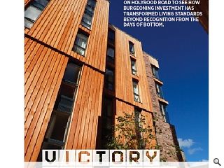
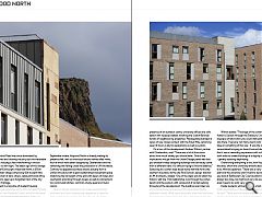
Edinburgh’s Holyrood Road was once dominated by tanneries, breweries and choking industry but the inexorable march of student housing is fast transforming it into an education hub in its own right. The latest sign of this change is the University of Edinburgh’s Holyrood North, a £50m post-graduate urban village comprising 924 student flats served by a collection of bars, shops, restaurants and office space which aims to open up a forgotten tract of the city behind the street frontage.This is the latest in a long line of student housing projects in Edinburgh (and around the UK), not least Richard Murphy Architects’ own Holyrood South, which as the name suggests is situated directly across the street. Although completion isn’t expected until August 2016, in time for the September intake, Holyrood North is already making its presence felt, with six individual blocks named after rivers, four of which have been designed by Oberlanders and the remaining two falling under the jurisdiction of JM Architects. Contrary to appearances these blocks actually form a unified structure with a giant subterranean basement space stretching the full length of the plot with layers of closes and courtyards providing through access as well as connections to a communal kitchen, common, study, quiet and music rooms.
Built in blonde sandstone, tan, cream and charcoal brickwork and larch cladding the proportion of wood to brick increases the deeper into the plan you go. Along Holyrood Road raised corner elements announce the presence of an outreach centre, university offices and café below with recessed details inverting the Scotch Baronial turrets of neighbouring properties. Passageways between a series of new closes connect with the Royal Mile, remaining open 18 hours a day for pedestrians as well as cyclists.
On a tour of the development Andrew Wilmot, partner with Oberlanders, said: “There was a lot of discussion about how much variety you should have. One of the implications we got from the Urban Design panel was that you shouldn’t keep designing buildings that obviously come from a different hand. It’s difficult trying to find the balance.” Gesturing to a corten steel laced stone wall that forms the southern boundary to the site Rod Duncan, design director at JM Architects, added: “One of the ideas was to retain the historic wall line. That relationship runs through the corten bench and the podium with various bit of corten kerbing throughout the development. The buildings are linked via a two storey basement level containing lecture theatre, basement rooms, office space and plant room with the lower basement level connecting with four pedestrian routes off through to the Royal Mile.”
Wilmot added: “The angle of the corten is the same as Hutton’s Section through the Salisbury Crags. It’s a great big piece of land which you could walk past and not know was there. There are not many clients who would be able to take on something of this size.” It was the sheer scale which necessitated bringing on board two architects each insisting that it was a rewarding experience with sufficient leeway for both sides to create buildings of a slightly different aesthetic – greatly assisting wayfinding.
Overarching everything is the John Hope master plan for the area, which the university remains absolutely committed to as Wilmot explained: “There was a very strong master plan and the university didn’t want to deviate from that. If you look at Edinburgh City Council planning guidance it’s always too close, too tight and very risk averse but in this area it seems to work very well.”
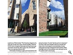
Inside students will benefit from a high standard of finish, particularly on the upper levels according to Duncan. He said: “There are twin rooms with their own balconies looking out over the city, they’re phenomenal. If you’re a student there and send a photo from your pad it’ll look like a penthouse. Wilmot added: “The University charges by the room size, not the view, which I found incredible. There are 10,000 rooms throughout Edinburgh and they’d have to go round each one and say, that’s a good view, we’ll add £10. There is no way they would do that.”
At the heart of scheme is a giant communal kitchen that looks more like the set of Masterchef than a hall of residence, with nary a Pot Noodle in sight. Duncan said: “There are 60 students per hub and each student shares a fridge with a combination lock. Every workspace had to be worked out per student to get the right amount of worktops and storage, microwaves, ovens and dining spaces.” Armed with these figures mechanical and electrical engineers were able to calculate the ventilation requirement, so obviating the need to have a forest of extractor hoods dropping down from the ceiling. We wanted as much social interaction as possible between residents.”
In order to maximise light two ceiling light wells containing both frosted and clear glass were carved through to the podium park above. Duncan noted: “I was concerned we wouldn’t get the amount of daylight we expected despite doing the analysis. You don’t feel like you’re in a basement.” The view is even more dramatic when you consider that three or four months ago this was all puddles of water; stoking fears amongst management that a Freshers Week food fight could ruin their spotless vision, although thus far this scenario hasn’t come to pass.
Commenting on a Harrison Stevens designed landscaped podium deck Duncan observed: “The podium extends up so that all students have access from the stairwells. We were here in July/August and the sun path is incredible, the light comes right in for a good three hours of the day following the herringbone layout of the Old Town. The concept was to have an active common room stacked above a quiet common room, with both being connected over two floors.”
Having languished in obscurity for centuries it is perhaps ironic that it should fall to the most maligned sector of construction to lead the way in reconnecting Holyrood to the heart of the Old Town. With a commensurate rise in the number of new residents this forgotten quarter is finally bedding down with a life and vitality of its own.
|
|
Read next: Public procurement: Bang goes your buck
Read previous: Engineering: Raising the bar
Back to October 2016
Browse Features Archive
Search
News
For more news from the industry visit our News section.
Features & Reports
For more information from the industry visit our Features & Reports section.


