Lairdsland Primary
22 Apr 2016
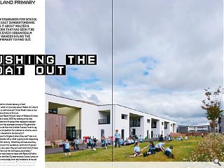
It’s set new standards for school delivery in East Dunbartonshire but what is it about Walter & Cohen’s work that has seen it be so well received? Urban Realm goes for a wander round the canalside primary to find out.
It’s set new standards for schools delivery in East Dunbartonshire but what is it precisely about Walters & Cohen’s work that has been so well received? Urban Realm takes a tour around the canal side primary to find out.Speaking to Urban Realm Michal Cohen of Walters & Cohen said: “We started this in early 2000 by looking at the way people learn and what kind of spaces that needed to happen in, We were involved in the exemplar process in England and then in 2011 we got a call from the Scottish Futures Trust to say they were running a competition for a reference scheme, was it something we were interested in tendering for?
It was very different to England where they said ‘here is an accommodation schedule, tell us what is going to be happening in education in the 21st century’. What they did here was they said ‘here is the curriculum for excellence, what kind of spaces do we need?’ It was very open, they just said what kind of areas can be scalable and laid out the workspace parameters.”
Walters & Cohen went head-to-head with Reiach & Hall to land the commission with East Dunbartonshire Council came on board in an effort to move away from the limitations of the old school, marooned by a sea of tarmac. The local authority was ultimately so pleased with what they got that they agreed to build it out.
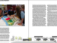
Cohen added: “They wanted to see that within the curriculum for excellence they could build schools within the current metrics and costs, which at that stage (2010/11) were around £2,350 per sq/m for seven and a half sq/m per pupil, more than the comparable standards for building in England. The Scottish Curriculum for Excellence standards are really clever in encouraging independence where learners are self-directed to a certain extent and work in teams. When you see it played out it’s much more about doing rather than sitting and being spoken at.
“We decided to go with a two storey option; I often find that an additional storey gives a feeling of progress and space. It also allows the school to be more cohesive internally instead of a sprawling space. The school came from somewhere with no space at all and they need green. There is no green roof or photovoltaics, it was all a balance between affordability and sustainability.
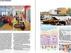
“When we started designing it one of the first things we did with the parents and governors was to discuss where the school should be positioned. We could have put it closer to the road for visibility but it would overshadow the playing fields and the nicest part of it which is the canal. This was the most important element for us, to engage with the canal, health and safety aside. If we were in Europe we’d put decks and things out into the water. There’s a low fence but only so the outdoor learning area can be used by pupils independently. From the first floor deck you feel so close to the canal so you can stand in the building and experience the canal without being outside.”
The canal side elevation has been conceived as a ‘window advertisement’ for the school and its work with picture windows showcasing pupil art and offering canal users a glimpse of life within. Clad in render and larch the build seeks to harmonise with the neighbouring offices of East Dunbartonshire Council. Cohen remarked: “There are some local authorities in London that won’t let us clad buildings in timber because they’ve had bad experiences under cheap design and build contracts where it hasn’t weathered well. What’s really interesting is that some of the oldest buildings in this country are timber and they’re perfect. The building sits with the new council buildings so the scale had to be appropriate. It’s a little public enclave with a different scale and materiality to the surroundings.”
Guiding Urban Realm to the public front of the building Cohen pointed to custom murals which have been integrated into the fixed fabric of the school. Cohen said: “We wanted to avoid a completely flat site and we had a lot of soil that was going to cost an awful lot to cart away so we decided to come up to this level so it’s not a flat pancake site. We were able to separate the parking from the visitor entrance, although we’ve got more asphalt than I’d like. What’s really nice is that although the budget was tight we still managed to get good planting from Igloo Landscape to make sure that when the school opened there would be flowering plants. During the whole build process there was a swan’s nest close to the site but not only did the swan come back but it had cygnets.”
Outdoor spaces were critical to the success of the design with the architects pushing for their inclusion against a sceptical client and end users concerned as to their usability in the depths of a Scottish winter (or indeed Summer). To get round this South African born Cohen included outdoor spaces both north and south, ensuring that at least one side is sheltered from the prevailing wind.
Cohen shies away from the term ‘exemplar’ when describing her practices work, referring to the project as a set of ideas, centred on the minimisation of wasted space and corridors. She said: “We have a corridor and classrooms with learning happening in formal and much less formal situations. The communal spaces are shared between all the classrooms on each floor so there is a movement between the classroom and the informal spaces including the smaller spaces for one to ones and the outdoor spaces in the summer. There are no doors between the classrooms so it’s really easy to move and the acoustics are brilliant, we didn’t want any space to be solely circulation so the toilets open onto each classroom. Tables can be pulled apart for little one to ones or pushed together and there are also little amphitheatre seats for group learning. “
Each classroom has a dedicated outdoor space with decks on the first floor, although Cohen insists that there is no modular building utilised here: “I have a real passion that that kind of standardisation is wrong. In the teaching areas it probably is scalable but what happens on either end. The way it looks and integrates with its surroundings is fundamental. I don’t think you’d always have that luxury. We’ve been designing schools for 15 years, we have an innate feeling for the right kind of formal and informal space size. You can give or take 10sq/m and it’s not wildly different. Everybody is anxious that things don’t get out of hand with regard to costs but it’s also about maintaining the schools. You’ve got to be careful that what you’re putting in is right for learning and is not going to be expensive to maintain.”
Facilities on offer include a full size sports hall opening out to an external terrace, as Cohen remarked: “… maybe it didn’t need to be quite so high, but it made sense from the volumes. These double doors open up into the hall so that it feels like one completely open space all the way up with younger pupils on the ground floor; everything opens out onto informal learning areas. We always try to double up on the use of things so the cooking kiosk acts as a space for functions in the hall and the stairs can be used as a little theatre. We’ve used this type of staircase before, the first school we ever did it in was down in east London and the y used this as a permanent gallery so they always had different works of art.”
A series of wet spaces and partition walls for subdividing the cavernous main hall for more intimate purposes, such as music lessons, are also included. “There are no nooks and crannies it’s all useable floor area”, explains Cohen. Children like to sit on the floor so why not give them space to do so in those areas? I love looking out at the view of the canal and the hills covered in snow, or with swans under the trees in full leaf.”
Interior spaces are painted bright red at the behest of pupils inspired by the Jolly Rodger, the boat berthed just outside in the marina, as Cohen explained: “The pupils said we’ve got to do it on the colours of the boats in the marina. This contrasts with the sober classical form of the collonaded exterior.
With all this open plan space acoustic performance was a priority for the architects, who worked hand in glove with their sound engineers to get the right amount of absorption in every space. Cohen said: “It’s incredible the difference in sound, you don’t close those doors at all now.
Cohen concludes: “It’s a public building on the most extraordinary stretch of water, I don’t think we’ll ever do another building which has water on two sides. It’s a community, there are about 300 pupils here, but it’s not noisy and that’s the most brilliant thing about it. It feels right.”
It was the canal which made the town and now the town has come back to its canal, embracing the scheduled ancient monument with a solution that is as snug as it is imposing and ensuring that Kirkintilloch no longer turns its back on its greatest asset
|
|
Read next: Brexit: Referendone
Read previous: Cottonopolis: Mills & Boom
Back to April 2016
Browse Features Archive
Search
News
For more news from the industry visit our News section.
Features & Reports
For more information from the industry visit our Features & Reports section.


