Ronald McDonald House: Home From Home
19 Oct 2015
Keppie are seeking to prove that commercial success needn’t come at the expense of compromised design principles with the unveil of Ronald Mcdonald House, the first in a new wave of design-led projects from the practice to tap into the current brick zeitgeist. Urban Realm takes a look round to see how the project stacks up.
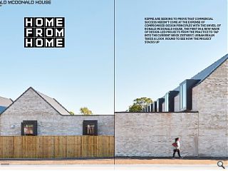
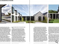
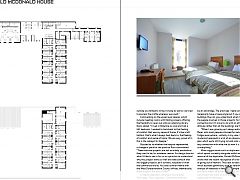
Industrial and residential quarters rarely mix well, particularly when the needs of children are paramount, but a £3.4m home for Ronald McDonald House (a charitable provider of non-institutional accommodation at children’s hospitals) must juggle both from a location on a busy main road. It is an unpromising environment, with Thales and the Govan shipyard operating nearby, into which Keppie Design have been thrust, tasked with creating an environment conducive to care and rehabilitation within a forgotten corner of the Queen Elizabeth University Hospital campus, which serves the newly built Royal Hospital for Sick Children.The charity aims to employ good design, as championed by Maggie’s successful estate of cancer care centres, to demonstrate that designing for children and their families is not child’s play despite a deceptively simple double L plan of domestically scaled Weinerberger Marziale brick ‘houses’. Deliberately built back to front the scheme presents a windowless wall to the busy Govan Road in order to cast a protective arm across the secluded courtyard and the three projecting wings of residential accommodation, each punctuated by large glazed window boxes with the whole ensemble topped by steeply pitched roofs interspersed by green sedum.
Following in the footsteps of Zaha Hadid, who is currently working on a similar home in Hamburg, Keppie’s design director David Ross observed: “We were keen for it to say something about the Govan context. I know that some people would look at the outside and think that’s quite austere but the reason for that is the relevance to the sheds further down the road.” Outlining how this marriage of styles came to be Ross’s colleague, architect Fraser Davie chipped in: “It was taking this idea of a domestic form along with the clients brief to have a home-from-home.”
A further contrast lies in the homely air within and the walled compound appearance without, something Ross attributed to the brief which aimed to shield occupants from traffic noise and the surrounding environment. He said: “Acknowledging the context of kids and their families you shouldn’t really be here, we were aware of this from the beginning. They were trying to make a building with a lot of interest and domestic scale but actually for the most part people are not going to be here to see that.”
The pitch of the slate roof is as pronounced as any child would draw and was a key component of the design from the outset. Ross said: “We went for the dramatic profile with the peaks visible from a distance. It’s a simple plan, it’s not massively complex. It’s hopefully emblematic of the kind of things we’re interested in from an architectural point of view.”
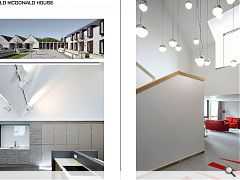
Each wing has a different usage from multi-family rooms for long term residents to a 28 bed suite for those on shorter stays. These are connected by concrete porticos housing communal facilities such as a laundry and lounge with a reception and kitchen space located at the far end. This latter room is top lit by deep set Velux windows located within the underside of the pitched roof, much like a traditional croft. Davis commented: “It’s a fairly generous floor area but these projecting windows actually add a recess space which a lot of kids have been using as cubby holes for reading or playing their iPads. It’s amazing what a difference opening and closing a window makes.”
Interior work within the design and build contract was undertaken in-house by Ronald McDonald with support from Threefold, something Ross would have preferred to have had more control over. Every room is customised with its own artwork and the bold use of colour ties in with the accents on the furniture. Davis observed: “For the children it’s quite an exciting space, there are lots of pockets of individual spaces. Even on the balconies and on the stairs there’s always something happening. The lighting may be a tad low but we tried to design it in such a way as you can see up and through it to a vantage point looking out the window.”
Ross added: “How would you ever know until you’re in that situation but it feels like a calm space and a calm context. You’ve got constant connections with life-affirming things as you saw at the Gartnavel Maggie’s Centre which we delivered with OMA. It’s visually connected to other things; it’s a building without a corridor basically. It’s sequential spaces.”
Ceilings follow the external roofline to maximise volumes and inject a touch of drama to a communal lounge, kitchen and play area. Explaining the rationale behind this Fraser said: “It was partly to get the ventilation area that we require and partly to make the aesthetics work. Because we had the vernacular profile outside we wanted to bring it inside as well so we tried to express the profile wherever we could.”
Commenting on the upper level spaces, which include meeting rooms with folding screens offering the flexibility to open out onto an adjoining library Davis added: “I lived in Elderslie as a kid and had a loft bedroom, I wanted to hark back to that feeling of comfort that was my sense of home. It’s like a loft bottom, that’s what I always hark back to, that feeling of comfort and sense of home. We are very proud of it; this is the catalyst for Keppie.”
Quizzed as to whether the hospice represented a change of pace for the practice Ross commented: “These massive projects are not as widely available as they used to be, for whatever reason. As design director what I’d like to see is for us as a practice to understand why this project works so well and take some of that into bigger projects, be it schools, hospitals or even the commercial world. You see a similar theme with the West Dunbartonshire Council offices; thematically these projects are quite similar.”
Is Keppie seeking to develop a house style? “Not really,” Ross responds. “Sometimes that can be an advantage. The practices I really admire don’t necessarily have a house style but if you look at the buildings they do, you understand what matters to the people involved in those projects. So there’s a connection but it’s more to do with an ethos and an attitude rather than all the buildings are the same.
“When I was growing up I always admired Richard Meier, who most people criticised for building big white fridges everywhere - unfairly in my view. I think the modernist approach is a bit of an obsession with the plan which we’re still trying to hold onto so if there is any connection with what we do now it is that the plan is everything.”
Minor niggles aside such as duplicate lampposts, which sprout surreally alongside whilst awaiting Council removal of the duplicates, Ronald McDonald House shows that the recent resurgence of brick shows no sign of going out of fashion. This back to basics approach which eschews gimmickry such as random cladding and overuse of materials in favour of a simple plan offers an economic means of achieving quality and as the first in a promised new wave of such projects from Keppie it bodes well for the future.
|
|
Read next: Employment Crunch: Hard Lessons
Read previous: Manuel Brickworks
Back to October 2015
Browse Features Archive
Search
News
For more news from the industry visit our News section.
Features & Reports
For more information from the industry visit our Features & Reports section.


