Byker Wall: Colour Bind
15 Jul 2015
In the depths of a housing crisis the provision of affordable homes is once again a national priority, prompting Mark Chalmers to reappraise one of the last and best regarded schemes of the post war building boom. Could the Byker Wall have been a prototype for mass delivery of much needed social housing, or was it always destined to be an exotic one-off?
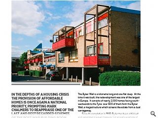
The Byker Wall is a kilometre long and one flat deep. At the time it was built, the redevelopment was one of the largest in Europe. It consists of nearly 2,000 homes facing south-westwards to the Tyne: over 600 of them form the Byker Wall, a megastructure which screens the estate from a dual carriageway.Since its completion in 1982, Byker has been criticised and venerated in equal measure. Is it an early example of sustainable design and community architecture? What can it tell us about the future of affordable housing? Is it merely social engineering dressed up in brightly-coloured clothes?
It’s unusual for an architecture magazine to return to a project years after completion: we tend to review buildings when they’re new and shiny. Yet it’s worth approaching Byker in a spirit of critical inquiry, since it encapsulates many of the issues which face social housing in the 21st century. The need to provide decent housing will never go away.
The Byker redevelopment was designed by Ralph Erskine, and his starting point were the people he saw as his clients – the residents. Throughout his career, he was careful to distinguish between sponsors and clients; in his eyes, Newcastle-upon-Tyne Council was merely a sponsor.
Erskine, his long-term collaborator Vernon Gracie plus a team of job architects including Roger Tillotson take credit as Byker’s designers. Gracie was Erskine’s site architect: when the architects took over a funeral parlour which became a mixture of drawing office and drop-in centre for residents, Gracie based himself there. He literally lived over the shop, which was decorated with a mural of Erskine’s trademark hot-air balloon.
“Erskine is unusual in that he is a thinking architect, but not a polemicist,” as the Architects’ Journal noted in 1976. This freedom from polemic sets Erskine apart from his peers: he also helped to establish the idea of tenant participation during both the design and occupation phases.
Erskine’s design statement for Byker concluded: “The main concern will be for those who are already resident in Byker, and the need to rehouse them without breaking family ties and other valued associations or patterns of life.” The methods Erskine used for tenant participation, plus the forward allocation of new houses for existing residents, were new to local authority housing in Britain.
The residents of old Byker were consulted before their houses were pulled down, and they influenced the design of new Byker. Redevelopment took place in phases, rather than the previous approach of decanting everyone then flattening the entire area. Even so, the architects became mediators between the council and residents, dealing with people’s distress at seeing their community seemingly being destroyed.
The Byker redevelopment stands in contrast to mass housing in other northern English cities: while Park Hill in Sheffield is being refurbished, Quarry Hill in Leeds and the Hulme Crescents in Manchester have been demolished. All were megastructures; the Hulme Crescents were the largest public housing scheme in Europe with over 3000 deck-access homes for over 13,000 people. All were designed by architects influenced by CIAM and the first generation of Modernists, using an approach which we now call technocratic.
Erskine comes from another Modernist tradition, which values creating a humane environment over establishing a systematic way of doing things. He understood the criticisms of Modernism in Jane Jacobs’ “The Death and Life of Great American Cities”, notably Jacobs’ conviction that architects and planners didn’t understand how cities actually work.
For example, she would ask, where does a sense of community spring from? The Byker area was well established, its old slum back-to-backs forming a close-knit community with a sense of its own identity. Erskine believed that, “The job of buildings is to improve human relations. Architecture must ease them, not make them more difficult,” and he knew that if the community was destroyed, the redevelopment would have failed.
Similarly, jobs and infrastructure were crucial. Byker has its own station on one of Britain’s rare Metro systems. It also has swimming baths and a district heating plant, which serves all the houses and flats. It lies close to the shops on Shields Road, and near the former shipyards, Tyne Mill and British Engines plant along the banks of the Tyne.
If technocratic Modernism preceded Byker, another dogma has developed since it was completed: the New Urbanism. Duany Plater-Zyberk’s main instrument of public consultation is the charrette, a one- to two-week workshop with consultants, developers, planners and the public. That may seem intensive, but participation at Byker was extensive.
When Byker was listed in 2007, English Heritage explained, “The Estate’s groundbreaking design has been influential across Europe and has proved a pioneering model for its approach to public participation.” Others have argued that consultation was a hollow exercise. However, Erskine’s methods produced meaningful results because they had breadth – anyone could drop in, anytime – and depth – they lasted for around 15 years…
Having gained experience on regeneration schemes in Fraserburgh and Kirkcaldy, I have some understanding of the cost and effort which continuing consultation takes – which is why it happens so rarely. Similarly, at Byker I did what feature writers rarely do – I spent several days exploring its courtyards and pends, speaking to the people who live and work there.
One evening, I happened to come across John “Lofty” Rames, Property Manager for Avondale House. He was interested in why I was shooting photos, and we had a discussion about how the Byker Wall is perceived. Even now there’s a lingering sense that the way Byker came about was unique. Lofty explained that, “When the houses were being planned, folk on the waiting list could go in and say they’d just had a baby. So the architect’s plans were changed and they got an extra bedroom!”
That could never happen in the world of the technocrats or New Urbanists.
As for Ralph Erskine, my interest in him began when I returned from Year Out in 1994. Duncan of Jordanstone’s fourth year visited London and explored his newly-completed, but still unlet, Ark at Hammersmith. Like the Wall, the Ark has a startling and original form, designed to mitigate the effects of an urban motorway.
Their approach to blocking environmental noise may be similar, but in other respects the contrast between the Ark and the Wall is marked. Prime office accommodation is leased out, and steadily upgraded over its life. A few years after construction, the Ark was gutted to increase its lettable area then the whisky company Seagram moved in.
By contrast, council housing was also built for rental, but due to political dogma most was barely maintained during the 1980’s and 90’s. Byker deteriorated, and its deterioration seemed to reinforce right wing politicians’ view that council housing is a doctrinal failure. That’s ironic, really, because a Conservative-led planning committee selected Erskine in the first place, during September 1968.
Around 9000 people live in Byker now. As James Agee wrote of another place and time, they’re tenants of neither the worst kind of landlord, the absentee, nor the “best” type, the paternalist. Instead, it has taken a housing stock transfer, from the local authority to the Byker Community Trust, for badly-needed refurbishment work to re-start. Virtually all of the Byker Wall was vested in the Trust, as very few residents have bought their flats.
One resident I spoke to while out walking her dog early in the morning, was scathing about council house sales. “Right to Buy? Why should anyone have the right to buy something that isn’t theirs. The taxpayers own those houses, they should be an asset for folk in need, but they’re giving them away to buy votes.”
The dog-walker is not the only person in Byker to think the Right to Buy scheme killed council housing, and illustrates the Thatcherite tension between individual gain and collective benefit. This is important because the new Byker only came about thanks to an enlightened local authority who sought the most appropriate way to deal with the old Byker, and commissioned an architect who treated social housing with the rigour it deserves.
The Wall is undoubtedly a megastructure, but Byker is not an experiment in social housing. Erskine had designed other inhabited walls and understood how they worked. His practice was based in Sweden where he built several precedents for Byker, including the Myrstugeberget in Huddinge which shelters people from a harsh climate.
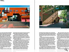
In this case, the Byker Wall forms a barrier to the dual carriageway. It steps in plan and section, just like Erskine’s Ortdrivaren scheme in Kiruna does, creating a series of roofs which glissade down from twelve to three storeys. Erskine’s office referred to these as “wilted” roofs, and they give the Wall its instantly-recognisable silhouette.
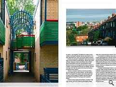
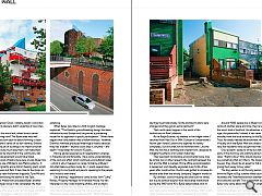
The Wall shelters low-rise housing which makes up two-thirds of Byker: a mix of row houses, maisonettes and courtyard houses set around landscaped courtyards and a meandering pattern of largely car-free streets. Parking is restricted to the outer edge of the estate, and Erskine introduced traffic-calming decades before it became popular elsewhere in Britain.
On the face of it, Byker’s architecture combines every “movement” from the 1970’s. It takes on the scenographic massing of Neo-Vernacular architecture, coupled with its rich collage of colourful materials and expressed structure. The walls are Erskine’s “warm, people-friendly brick”, in umber, buff and russet, plus the red and green rough-sawn timber cladding with blue Rigidal corrugated roofing.
The wall has two distinct expressions: a northern facade to the dual carriageway which looks like a giant brickwork mural, and a southern facade which opens out to large windows, galleries and balconies. It is overlain with timber fences, pergolas and porches which provide further articulation at a human scale.
There are elements of Post-Modernism in the fragments of crests, gateways and statuary which were built in to the new Byker – but rather than a droll architectural joke, they’re quotations from Byker’s past which were rescued during the old Town Hall’s demolition. And of course Erskine’s design process is true Community Architecture.
Thirty years on, Byker’s design quality and the subsequent problems which compromised it are clear. As early as 1974, Colin Amery observed that there was insufficient finance for the estate’s maintenance. For example, the pathways and semi-private courtyards created by Erskine to encourage interaction became overgrown, providing secluded areas for anti-social behaviour.
Byker is one of the poorest wards in Newcastle, and at times there have been outbreaks of anti-social behaviour from “problem” tenants. Maintenance budgets and housing allocation are led by political policies far beyond Erskine’s remit, although he fought very hard for the things he could influence.
However, Erskine did succeed in achieving forward allocation of houses – for those who wanted it, and of course not everyone did – and there’s no doubt that local residents had their say. As Roger Tillotson wrote, when Erskine flew in to Newcastle for design sessions, “We were in trepidation of what his taxi driver from the airport said about the new housing, which Ralph thought of as unbiased comment worthy of debate. This could mean changes to buildings already under construction if Ralph thought it was a better solution.”
The redevelopment was completed over 30 years ago, and I’d suggest that the immediate question is whether it’s a good place to live. When I got off the Metro at 7am and walked through the portal of Raby Gate, the air was full of birdsong. Erskine’s landscaping is mature now, and broad-leafed trees spread fingers shade across the Wall. The bright colours of the pergolas and balconies sang out, and washing lines were hung with laundry.
When I returned at 7pm, there were children playing in their gardens and courtyard areas, and spilling out onto streets which are car-free. One of Erskine’s aspirations was, “To learn how the presence of people will transform ‘space’ into ‘place’. Instead of housing or working areas, we should strive to create places for living.” The Byker Wall was alive that evening, and it felt like a safe, attractive, human-scale place to be.
Having established that, the over-arching question is whether the Byker Wall is a good model for affordable housing. That’s a political question rather than an architectural one. The Byker Community Trust must be aware that rules south of the Border restrict its ability to fund building work, whereas an hour up the road in Scotland the government has found innovative ways to fund local authority housebuilding. If we acknowledge the worth of decent housing, the next step is to work out how to pay for it.
Walking around Byker, you realise that Erskine’s motive was to create something of social worth. The hot air balloon which he drew into every perspective is a hopeful symbol, representing the ability of the human spirit to rise above whichever adversity we throw at it.
|
|
Read next: Pen and Think: Drawing Board
Read previous: Eric Parry: Lost Streets
Back to July 2015
Browse Features Archive
Search
News
For more news from the industry visit our News section.
Features & Reports
For more information from the industry visit our Features & Reports section.


