Pen and Think: Drawing Board
15 Jul 2015
In an age of clattering keyboards nothing quite beats the silence of spilled ink but an increasing conjunction between the two is opening up fresh vistas for those with the time and the skill to put their ideas into practice. Here Urban Realm speaks to an enthusiastic Lauren Li Porter of Graven Design to find out what makes a good drawing leap from the page.
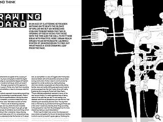
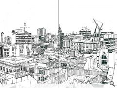
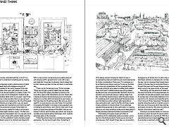
Adopting an eclectic approach incorporating everything from painstaking line drawings to painted posters, Porter’s insatiable appetite for experimentation is fed by the urban aesthetic of her hometown, a common thread which runs through much of her work, ’fabricated records’ as Porter described them: “There’s a lot of interesting industrial detritus in Glasgow and very distinctive and incredible architecture but the density of it means if you get up high there is a vast panoply of ventilation ducts and things which defy understanding in their complexity. I enjoy drawing that stuff to try and make sense of it in a compositional way without trying to understand what the function is. It’s about density, variety and the stuff which is not necessarily public facing and making a record of all that in a uniform manner.”
Binding together multiple sources to achieve a specific look, as exemplified in a view of Drygate which transposes observed details with archived photos and pictures taken during construction, Porter is keen to communicate her approach to a wider audience, by creating drawings which are instantly recognisable yet otherworldly, taking familiar views and subtly shifting perspective and scale to produce perspectives that don’t quite chime with reality. Explaining this incongruity Porter told Urban Realm: “There’s definitely preferential treatment in terms of the size I accord things, it’s a really egotistical way of taking control of the view that you see. I’m not making it the idealised view from my perspective, just that the bits I find interesting will necessarily become more. The way that I draw is informed by my architectural training and there was a time when I would very slavishly drew things according to the perspective I saw from the photograph but it’s more interesting making a visual interpretation.”
Porter’s eye for detail roves across the cityscape and scours drains and gutters for the sort of abandoned detritus to which most of us wouldn’t spare a glance. Outlining this magpie approach Porter said: “It’s committing to paper a collection of things, quite often I’ll have pictures of bits of pipe work and objects that don’t exist at all which I’ll bring in and that’s a purely compositional thing. A lot of it is a sloppy attempt to understand something just by drawing it.”
These line drawings contain a dense amount of detail requiring a steady hand and prodigious amounts of patience, fortunately for her sanity however Porter also dabbles in simple poster work, wall graphic and murals, much of which can be put together in a matter of days: “It’s possible if you have a lot of photographic material to get really fanatical about detail which no-one sees”, says Porter. “The good thing is when you blow them up you can see it and it’s not like you’ve just wasted your life. One of the great things about blowing up screen prints is you can see all these little speckles and imperfections and charming stuff.”
Outlining the production process Porter alights on the speed and accuracy needed for today’s commissions which necessitate digital solutions, saying: “I’ll often scan physical material and manipulate it but in my day job a lot of my illustration work is done with a graphic tablet, even the line drawings. For this exhibition I tried to discipline myself to a drawing board, lying on my stomach and drawing for hours and hours but it’s not really an option unless you force yourself to do it. It does seem like a really unnecessary faff in a way but also nice because you’re getting physical with drawing stuff. In general terms I work with screen and digital but I do go back to drawing, there’s always that transfer because you learn to draw and paint in a particular way.
“There is a bit of a learning curve,” Porter concedes. “When you first get a graphics tablet they look totally shit. The thing that makes a line drawing distinct is the involuntary spasms that characterise your line. There’s also a degree of physical removal because you’re not actually drawing on a surface which corresponds to your screen, so that does take a bit of getting used to. But once you do its great! It’s so quick and you can undo things. It’s important to recognise that digital is not solely a more expedient way of making the same thing. I don’t think it’s that at all. I’ll use painting programmes because of the effects that you can achieve. It almost went the other way where I was trying to recreate using physical painting techniques what I could do extremely easily on the computer.
“I think they almost have to be considered as separate approaches. The two nourish each other. Sometimes it would just be psychotic to do analogue textures by hand.”
In her day job Porter focusses on the earliest stages of the design process, bringing her talents to bear in conceptualising ideas and sketching out myriad approaches for further consideration. Porter says: “I’m a designer so I do architecture and interior work but I’m also an illustrator who comes into presentations at the conceptual stage. We’ve got a 3d artist who makes incredible photo-realistic views which aren’t suitable because everything appears decided and may not be appropriate. Illustration shows an aspiration and a particular energy, a selling image if you like. I do stuff like diagramming as well at the early stages. It’s something which is quite bemoaned that people come out of architecture school without really being able to draw particularly well. I went to the Mac and there is quite a heavy emphasis on drawing there. It is an extremely valuable thing being able to draw, particularly in a meeting where you can draw something while you’re talking about it. People are always disproportionately impressed by that!
“Particularly at the early stages we’ll often do something which is deliberately quite provocative. Just to say this is the furthest extent of what you can do. Even if someone says, that’s stupid. It does open up conversation, so there is definitely room for that.”
The interconnectedness means it’s difficult for me to disengage my art faculty from my job as they are very interlinked, certainly my background in architecture informs the way I set up a drawing. Even though they look quite chaotic in the way they’re constructed there is a lot of prior thought that goes into the way things are arranged and what’s going to be given priority on the page.”
Ruminating upon the advance of digital mediums and the rapid contraction of the space between digital content and reality do speculative projects even require to be real? As we have seen virtual reality digital environments can be every bit as rich, dynamic and impactful as the real world (if not more so). Porter responded: “Somebody did that recently where they built an incredibly convincing project that was a lie. Once you’re told it does look like CGI but it’s particularly convincing. Why does an artistic pavilion for internet consumption need to be real?”
Drawing is a universal medium of communication but for those to whom the sight of a pencil instills only fear it remains something of a mystical art. With the pressure to specialise becoming increasingly pronounced it is refreshing to encounter an approach which straddles multiple mediums and shows that the best approach to design needn’t necessarily be either or but a combination of the two, paper and screen.
|
|
Read previous: Byker Wall: Colour Bind
Back to July 2015
Browse Features Archive
Search
News
For more news from the industry visit our News section.
Features & Reports
For more information from the industry visit our Features & Reports section.


