Theatre Royal: Dramatic Entrance
15 Apr 2015
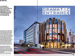
Page\Park’s flamboyant intervention at Glasgow's Theatre Royal has set tongues wagging with an ostentatious use of gold - but is drama best left on the stage? Urban Realm lifts the curtain on the newest addition to the city’s oldest theatre. Photogrpahy by Andrew Lee
Avid theatre-goers will avow that Glasgow’s Theatre Royal was never the city’s grandest institution, from the outside at least, but possesses bags of charm nevertheless. That shy reticence has now been ruptured however by the addition of a brash extension which hands the city’s oldest theatre its newest act and a swish front door to boot. Walking north along Bath Street the neat if understated theatre walls stand much as they have done since 1867 but this restrained glamour is turned on its head upon turning the corner onto Cowcaddens Road. The drab route was surrendered long ago to the car and marks the northern boundary of the city centre before the urban grain disintegrates within the sprawl of Cowcaddens proper (you can find out more about plans for the area on pg 60), so it is perhaps fitting that architects Page/Park should plump for a crenelated gold watchtower to look out across the no man’s land beyond.Sandwiched on an awkward plot overshadowed by the banal bulk of the Broadway office development the theatre’s brief for expanded front of house services within an architectural set piece was already a tough ask but keeping the existing theatre operational throughout whilst also opting for an ambitious curving plan wrapped around a double cantilever would drive anyone to distraction.
Designed to bang the drum for a revitalised theatre its cylindrical addition acts as a beacon to draw people into its public spaces whilst advertising the institutions presence to passengers on the many buses wending their way past. Boasting a rooftop viewing deck offering panoramic skyline views and a convenient café from which to admire an exuberant stairwell in comfort it is well worth a quick detour, showing that for the new theatre, drama extends far beyond the stage.
Guiding Urban Realm around the new space Jamie Hamilton, Page\Park’s depute of creative workspace, told Urban Realm: “I like the idea of a national theatre with a public foyer and terrace, you naturally gravitate toward it. This space is open to the public all day, anyone can come in here. Harry the project manager was going to claim it as his office.” This democratisation of access marks a conscious bid to topple cultural barriers which continue to shape the markedly differing demographics queuing outside to those waiting to buy tickets from Cineworld for instance, harnessing architecture to tackle preconceptions of theatres as elitist spaces and in so doing encourage those who wouldn’t normally dream of going to the theatre to take the plunge and step through the door.
“The idea is people come out here with their drinks”, added Hamilton. “The detailing and workmanship which has gone into this is unbelievable, the geometry is slightly different so each section is different. They’re Glasgow guys, a Scottish firm; you can see their warehouse from the roof.” This attention to detail extends to a window salvaged from a back wall within a bricked up archway, now on public display as a viewpoint to the stage from the gallery. Hamilton explained: “When you’ve got a hundred year old volume you just don’t know what you’re going to turn up. The window was one of the good things but there were lots of nasty’s too.” Joining the conversation David Page, Page\Park’s head of architecture, added: “The old bar has become cloakrooms. It’s all air conditioned in here now, before it got a bit stuffy. It’s almost an inverted form, there are a lot of structural gymnastics going on.”
Since its opening performance on 16 December the theatre has welcomed its first capacity crowd of 1,400 people, bolstering venue revenue as theatregoers linger longer, spending more time (and money) at the bar, café and newly opened box office (ending an absurd need to send walk-in trade away to the King’s to purchase tickets). Further commercial benefits accrue from the introduction of custom built advertising slots, tempering the temptation to plaster show posters upon every available inch of wall space. Hamilton conceded: “The risk is you get stuff stuck to the concrete but we’ve put our foot down do far.”
Another innovation is the incorporation of ventilation into the façade rather than the ceiling, opening up interior spaces. Hamilton continued: “The fins on each of the structural bays and intermediate bays are hollow with grilles at the base to draw air up and through via a motorised louver and the stack effect. There is also a heater hidden inside and they double as a drinks booth to observe the street. You make the most of the space because you’re not hiding anything in the ceiling.” Page added: “It’s nice to see the structure with the ventilators, it’s like our Scottish Power building, all the ventilation ducts and machines are down the sides. It’s like the Pompidou Centre but clad, you couldn’t have all glass, you’re not allowed that due to solar gain.”
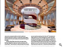
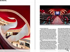
A feature staircase spirals through the heart of the foyer space, offering strong contrast between its hard concrete and soft leather, timber and carpets, a n aspect of the design lauded by page who said: “The stairs really draw you in, you’re sucked in. I call them the squiggle.” Whilst the results are pretty to look at they were also pretty challenging to build, as Hamilton recalled: “It’s had its challenges. Before the build started we did a six month contract on the existing building just to ready it for closing off the old foyer space and bar and jiggle things around so that they could operate with just the one entrance and reduced toilets. That allowed us to isolate this site for the build although there was also a period in the contract when there were no shows at all.
“The stair itself is a cantilevered off a cantilever. Each flight was six or seven sections, lowered down from the roof. All the steel surfaces are straight and then it was clad with the timber and leather work. The underside is even carpeted for the acoustics.” Describing the stairwell as a ‘chandelier’ for the extension Page observed: “The great thing about a theatre is all the levels change. It doesn’t end up like an office block. The drum circuits the full 360 degrees, it’s not just a façade to the street. Look at the geometry of that, I’ve no idea how it was done, no idea!” Breaking the magician’s code Hamilton continued: “These were built up from individual section with 6mm ply. It was all modelled and then spit out as a kit of parts basically using a CNC machine and then it was a big jigsaw puzzle to put it all together. The timber work was produced by Scottish Opera’s own set designers and it shows in the quality. The whole idea was to lose the idea of a hierarchy, historically the balconies were known as the cheap seats but they’re actually some of the best seats in the house.”
It is fitting that one of Glasgow’s most dramatic streets should play host to its most theatrical buildings of recent years Standing tall at the head of Hope Street the Theatre Royal is a fitting contemporary bookend to an historic street, providing vertical impetus in similar fashion to Lion Chambers further down the road or even the Hat Rack. In common with these Page\Park have adopted the very latest construction techniques and the finest local craftsmen to produce not just a functional building but an ornament for the city. That it heals another wound in the cityscape and adds a further eclectic layer of history into the mix can only be applauded.
|
|
Read next: Carbuncle Awards: Planning pain
Read previous: Urban Realm TOP100 Architects 2015
Back to April 2015
Browse Features Archive
Search
News
For more news from the industry visit our News section.
Features & Reports
For more information from the industry visit our Features & Reports section.


