Glasgow School of Art
15 Apr 2014
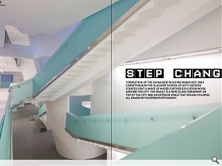
Completion of the Reid building marks not only a new phase in the Glasgow School of Art’s estates strategy but a wave of wider further education work around the city. The result is a new glass ornament on top of the city and an interior space that speaks volumes. All images by Mcateer Photograph.
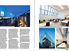
Designed by Steven Holl Architects, in association with JM Architects and Arup Engineering, the school immediately makes its presence felt with a striking skin of translucent glass that gives the appearance of a giant Fox’s Glacier mint that has run aground on Garnethill. Explaining the origins of this daring concept Chris McVoy, co-designer of the project alongside Steven Holl said: “We don’t quite know what we’re making but we know what kind of experience we want, then you work out techniques. If you start with only what you know you can do then you never push the envelope and create new experiences.“
This desire for a fresh experience led to the contrasting of the intimidating heavy masonry presence opposite with a structure that serves to draw light in by day and throw it out by night. These soft qualities belie a chunky build however, as it weighs in at around 11,000sq/m, rather more than the Mackintosh’s relatively svelte 9,000sq/m. This discrepancy forced the architects to pack a lot more volume onto a tighter footprint, a twin squeeze that has both forced the build to burrow down into the ground for the workshops and cantilever out to the north from above so you can’t see its structure. “It’s a bigger building but in terms of height from the street it’s no taller than the Mac,” observes McVoy. “That’s why from Sauchiehall Street our building actually seems smaller and why the back of our building is taller than the front; we wanted to make the profile step up as it goes up the hill.”
Governing the dimensions of the build is the golden section ratio, which Holl has always incorporated in his work; from the five, 15m wide studio bays, to the 9.27m double height spaces and 5.73m wide balconies. This approach has produced a building which is ‘complex in section but simple in plan,’ observes McVoy. Simplicity which proved to be a god-send given the tight budget which necessitated leaving much of the structure exposed internally, lending an integrity and toughness to these spaces which belie the soft shelled exterior.
The design process wasn’t entirely free form however and five key themes guiding thinking throughout the build. Foremost was the desire to construct the building out of studio modules. “This is where the creative life of the school happens and is the core teaching and working place,” asserts McVoy. Secondly the studios were to be as adaptable as possible with light and generous proportions – an acknowledgement that these qualities more than any other grant The Mackintosh its unparalleled ability to adapt to new media in ways that could never have been foreseen.
Holl once described light as his ‘favourite material’ and so it is not surprising that this attribute should be the third key concept behind the design. “Top light, clerestory light, side light, north light, direct light and light brought through a cut through the volume - that became an inspiration for us”, recalled McVoy. “In our building the windows in the north façade are angled to create the maximum exposure of light to the north.” This contrasts with the flush ‘silent screen’ of glass to the south which draws in light directly.
The fourth point McVoy draws attention to is the so-called ‘circuit of connection’, a vertical circulation route of stepped ramps that doubles as social space, saying: “Architecture more than any other art is built around time; we experience a building not only by looking at it like a painting but by moving through it.” This has proven so successful that few now bother to take the elevator and the building is now so open it forms a single fire compartment – leading to the absurdity of a sprinkler system being installed to satisfy building regulations despite the interior being predominantly fashioned from concrete and glass. The fifth point raised was a desire to connect the school with the street and the city, a feat accomplished by situating the Windows on the Mac exhibition on the ground floor with its own dedicated public entrance. “It’s a place where the public can see the Mackintosh framed in a way that wasn’t possible before,” notes McVoy.
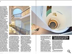
The structural and literal leading light of the build is its ‘driven voids of light’, a trio of whitewashed concrete cylinders modeled on the west façade library windows of the Mac which suck light in and air out of the building. “I like to think of them as oculi driven into the heart of the building,” McVoy states. The space at the foot of these light wells is inspired by artist James Turrell’s skyspaces, as McVoy observed: “You can sit here for hours and watch the light change, especially at dusk. When you make spaces which hold and channel light it heightens the changes and you become sensitized to all the variations. One of the things I love about Glasgow is the fact that the sun comes out for just a few minutes every day, it’s like a pulse.”
Each 6m wide concrete tube is slanted 12 degrees to the south with the top sliced off vertically to catch the light, a glazed bench here allows anyone so inclined to moon their posterior to the interior. The concrete is heavy as it is a structural support that must carry the weight of the building across its diameter, but it still achieves a weightless feel owing to the light within and the numerous perforated openings made by slicing rectangular volumes from the concrete, carving abstract shapes from the shadows which carry deceptive depth. Whilst the driven voids are smooth to funnel the maximum light some of the interior concrete has a slatted texture to highlight the play of light and shadow, qualities which subtly shift through each floor as more distant views emerge.
“This is probably the sharpest concrete corner ever constructed,” claimed Holl as he slid his fingers over the razor sharp edge of one such cut-out during a tour. “Because of the precision of the CNC computer milled block outs we had to build custom doors to slot around the driven voids,” the architect continued. These spaces also afford oblique views through to different levels of the building, opening up a multitude of people watching opportunities as people navigate the stairs. McVoy notes: “When you see a student leave the studio you see them once, then a couple of seconds later again, and then again!” These jaunts through the building are enlivened by a feeling of openness and fun, with the central stair suspended from above to give it the appearance of floating in space.
The voids don’t continue straight down to the foundations but rather have an elbow kink in them at ground level before resuming their descent. This is for structural reasons and also prevents the voids travelling beyond the bounds of the site. By happy coincidence it also marks a formal transition to subsurface areas.
One key design decision taken early on was to retain the existing 1930s built student union, something which was close to Holl’s heart McVoy explained: “When Steven came here he thought this was a fine stone building, so why tear it down? It makes a great turning point and means our building doesn’t face off against the Mackintosh across the whole width of the block. It also gives the students their own identity; it’s their place where they can do whatever the hell they like.” The student union also marks the intersection of the architecture, design and fine art schools at the junction of Scott Street and Renfrew Street. An observation not lost on Holl who suspended a viewing platform at just this point.
McVoy said: “There’s a moment from November to early January when the Mackintosh casts its shadow on our building and you see its profile. We call it complimentary contrast. It wouldn’t be wise for us to even try to create a stone building here today so we wanted to use a different material which would highlight the intensity of that stone. The matte glass becomes a ‘silent screen’ which highlights the intensity of the Mackintosh building.”
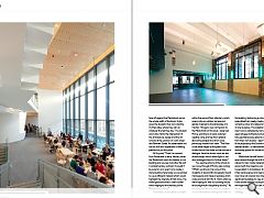
The primary social space is situated within the second floor refectory, which opens onto an outdoor terrace and garden inspired by the landscape of a machar. “We get a new connection to the Mackintosh on this level,” observed McVoy, pointing to a newly restored weather vane and top floor setback above the parapet line which were previously hidden from view: “This floor is the same height as the great cubic studios across the street so the two are in dialogue. Here the driven voids are also double height which draws light in, but also recharges them for further down.”
You see the activity of the school as you move through it McVoy said, noting: “What’s exciting to me is one of the students of silversmith and jewelry found mannequins and made a necklace which is also a kind of shirt for it. That’s what we were hoping for, that our building would encourage multi-disciplinary activity.” As the building makes its mark on students so too are students making their mark on the building, fashioning a colour wheel assembled from ready-made objects sorted by colour and placed at the foot of one skyspace. This adoption of their new home is reflected by some green eyed refugee architecture students, who have spontaneously opted to decamp from their own studios – deemed not fit for purpose by the School in a recent estates review – to take advantage of the workshop spaces for model making and review.
Mackintosh himself would likely approve and though the shift from natural to man-made materials doesn’t accord with the maestros own work it is equivalent in its boldness. As a result it has real presence and means visitors now have not one but two internationally significant buildings to view and admire. It also bodes well for future phasing with the hope that the school can score a hat-trick in their campus redevelopment strategy.
|
|
Read next: Practice Management
Read previous: Cowgate
Back to April 2014
Browse Features Archive
Search
News
For more news from the industry visit our News section.
Features & Reports
For more information from the industry visit our Features & Reports section.


