Charlotte Square
13 Jan 2014
Morgan McDonnell’s refurbishment and extension of a Robert Adam townhouse at Charlotte Square, on behalf of corran properties, drags Edinburgh’s new town into the 21st century with a suite of flexible grade A office space. Signposting the way ahead for the repurposing of historic buildings it is as modern as any new build but, as we’ve just seen at the ECCi, retains its period elegance and a sense of history with it.
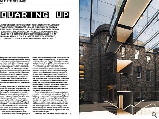
Blending period grandeur with modern technology Charlotte Square bristles with fully refurbished period cornicing, stairwells and wooden wall panels across six townhouses once occupied by the National Trust for Scotland. Behind this elegant facade however lie a host of modern building services such as cat 6 wiring and air conditioning hidden in window sills lamp shades.New additions elsewhere such as Adamesque wall lights have been given greater prominence to help marry the modern with the historic but this fusion really comes alive in a dramatic interior sandwiched between the new and the old elements. Bridged by a dramatic roof of lightweight ETFE pillows, last seen at Foster’s Hydro Arena, this atrium space serves as a spectacular showpiece, held aloft on steel supports shrunk to the slimmest possible dimensions in deference to the Georgian architecture.
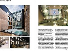
Conducting a tour of the property for Urban Realm Morgan McDonnell director Guy Morgan said: “When people walk into that atrium, almost to a man they say ‘wow’. It’s so unexpected; it’s very un-Edinburgh. This was a car park, there was a bit that the NTS used as an outdoor café space but it was barely used. We’ve raised the ground with glazed flooring, like a pool, playing with the idea of space. One of the challenges was creating a four storey office building with car parking below it that was subservient to the principal buildings.” This glazed flooring allows light into a workmanlike basement level which retains some of the safes from the old wine cellar and adds a range of building services, such as showers and a bike store.
McDonnell continued: “At the same time as being subservient it had to rise to the same height as the atrium. We’ve used ETFE pillows in the roof to keep it as light weight as possible so the structure is really minimal, but also we were able to join the building horizontally because if we joined the in and out facades with any kind of pitch at all it would be a complete guddle on the roof. By using ETFE on the structure you can just tailor the cushions to tie in. It’s a much neater option.”
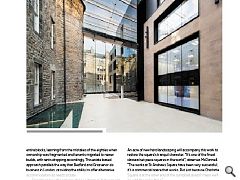
This minimalist approach is reflected in the gables where the maximum size of glass possible was specified, an unintended consequence of which is the confusion amongst some occupants who have taken to smoking in the space in the mistaken belief that they are outdoors. “The idea here is to create an enclosure which is as invisible as possible rather than shouting ‘look at me’”, observed McDonnell. Drawing light to the black glass cladding of the buildings core it reflects the dynamic play of bay windows opposite, interconnecting link bridges above and transparent flooring below. This also allows daylight to enter at both ends of a space which is intimate enough to allow a dialogue between buildings and to act as a focal point for internal circulation.
Another set piece addition can be found embedded within the heart of the original Adam structure, a disused lift shaft that had been driven down one of the original stairwells. McDonnell recalled; “Previously there was no daylight here at all, it was floored over on every level with a lift shaft going up and down The play here is rather than put in a pencheck stair with glass and stainless steel we’ve kept it 50mm from the wall, so rather than cantilevering out from the wall we’ve left a gap. It flows rather than being a part of the wall and was done in exactly the same rise and tread dimensions as the original stone stair… so it feels natural within the space.”
For a project on this scale in a city as fickle as Edinburgh, the assumption might be that feathers will get ruffled but McDonnell expresses satisfaction at the relatively pain-free gestation of the project, saying: “The whole process has been really quick, we’ve had a lot of support from Edinburgh World Heritage who got what we were trying to do. To attract businesses back into the city centre you’ve got to make buildings fit for purpose.
“The proportions are amazing; the first-floor gallery is about as open plan as you’re ever going to get in a series of buildings like this. One of the interesting things when you go to the new build is you’ve got that layering of space which Adam was interested in. You see right through. We kept to a minimal palette, with over scaled pendants that contain an amazing amount of kit – giving us LG7 lighting levels even though we’re in a 200 odd year old building.
A secondary façade of the building stretches along Hope Street Lane, a ‘robust’ service lane which presented the design team with its own particular set of challenges. McDonnell noted: “One of the things we had to be cognisant of is that the lane itself is a really robust environment, the back of McDonald’s is always going to be a back of McDonald’s. The language of this building onto the lane is redolent of that industrial city centre environment. We’ve got a robust finish with large timber panel sections that are a play on the idea of a warehouse with sliding doors. If we attempted to put anything showy here it would have looked ridiculous in the context so what we did was create a solid robust space and the space between the townhouses was that sparkly jewel.”
Utilising Accoya timber, ’real wood with the living daylights sucked out of it and impregnated with chemicals’, these panels will resist discolouration and are extrapolated indoors through the use of ply alternatives. “We played on the idea of principal levels on ground and first, the classical idea that the other floors are plain white whilst here you’ve got something else happening,“ continued McDonnell.
Asked what Robert Adam himself would have made of all this tweaking and tinkering McDonnell stated: “I would hope what he’d find quite interesting is that the buildings now work in an Adamesque-way, which is all about serial vision sequences and moving from one room to another in a journey through the building. Previously the connections were very expedient whereas now they flow. Adam designed the facades and the feu lines behind but not the interiors, which were developed piecemeal by developers or private individuals. What we’ve done on the first floor is a response to that front facade with the large gallery space.”
Making all this possible was Corran’s fastidious acquisition of properties resulting in the ownership of leaseholds for entire blocks, learning from the mistakes of the eighties when ownership was fragmented and tenants migrated to newer builds, with rents dropping accordingly. This estate based approach parallels the way that Bedford and Grosvenor do business in London, providing the ability to offer alternative accommodation as needs dictate.
Describing how the scheme strikes a ‘balance’ between old and new McDonnell adds that Charlotte Square offers a unique proposition to tenants: “You have the office building at the back which is almost the engine room and then you have the address, boardroom and grandeur of the period property. By making it all work we hope people will see the value of having this type of office instead of a big contemporary box.”
That all-encompassing approach is reflected in the ambitions for Charlotte Square itself, where, in partnership with Edinburgh City Council, the intention is to reduce four lanes of traffic to a single one way system and sort out discrepancies in levels associated with a camber introduced in the sixties. An acre of new hard landscaping will accompany this work to restore the square’s tranquil character. “It’s one of the finest classical set piece squares in the world”, observes McDonnell. “The works at St Andrews Square have been very successful; it’s a commercial space that works. But just because Charlotte Square is at the other end of the dumbbell doesn’t mean we’ll go with the same thing.”
Musing upon the privilege of overseeing two of probably the best sites in the Old and New Town’s (after completing work at Advocate’s Close) McDonnell states. They’re very, very different albeit you’re dealing with some of the same aspects. It’s that Robert Louis Stevenson Jekyll and Hyde thing where classical town houses rub shoulders with medieval tenements. It’s the Edinburgh story.” For too long Edinburgh has been about compromise, governed by a fear of the future and debilitating deference to the past. It is to be welcomed that it is belatedly growing the balls to shake things up a bit by writing a fresh chapter in the history of Charlotte Square.
|
|
Read next: Nigeria
Read previous: North Glasgow
Back to January 2014
Browse Features Archive
Search
News
For more news from the industry visit our News section.
Features & Reports
For more information from the industry visit our Features & Reports section.


