Atria Edinburgh
23 Oct 2013
In a rare sign of life in the commercial property sector BDP have completed work on Atria, Edinburgh, offering both open plan office space to tenants and an extension to the Edinburgh International Conference Centre. Opening its doors in the nick of time for this year’s festival it expands capacity and offers improved facilities for visitors, as well as being the final piece in the jigsaw of the exchange district business quarter. In the calm before this storm Urban Realm paid a visit to find out what it has to offer both for festival-goers and occupants. Photography by Keith Hunter and David Barbour.
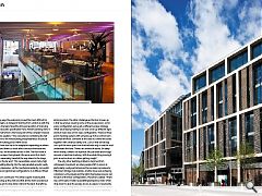
With such a large scheme permeability to the surrounding streets was always going to be challenging and this is adroitly addressed by splitting accommodation into separate office and conference elements - and cleaving through a pedestrian passageway lined with retail units. This diagonal route achieves the dual benefits of breaking up a monolithic mass, squashed to fit within severe sight lines toward Edinburgh Castle, whilst also granting pedestrians north south passage. Etched into the sandstone of this space is a stylised city skyline complete with a quotation from local literary luminary Alexander McCall Smith.Paved in Caithness granite, specified in favour of York stone which was found to have prematurely weathered, these external spaces lead to the scheme’s most striking feature - a 15m cantilever tied directly to the central core. This core supports the entire building by way of bridge style trusses vaulting a 50m x 30m all-purpose open span hall below. Within the retaining wall giant 4.5m doors have been carved to provide direct access between old and new parts of the building.
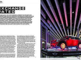
Ensconced within the streetscape the buildings belie their true scale which becomes apparent only when venturing into the subterranean network of rooms and passageways which run beneath the surface. The stygian gloom at these depths has necessitated generous circulation spaces to invite light and the careful consideration of lighting includes features such as a fully programmable LED media wall. “A lot of conference goers come over jet lagged and you can actually time the lighting to reverse their jet lag’ observed project architect Garth Fitzsimons. “The media wall won’t play text or anything, it only has a resolution of 16 pixels but it can show shapes and fire and even a Mini driving through.”
The ability to ferry large scale objects up and down is made possible by a multitude of rigging points situated every three metres throughout the communal space. These have allowed a Mini to be suspended from the ceiling to tease passers-by, particularly those standing beneath it. Another key feature of the space is the 16.5m long champagne bar, second in size only to one at St Pancras (if you include their seating area). Somewhat fitting given that the site was once home to Princes Street Station, more popular than Waverley amongst locals as it avoided the need to plumb Waverley’s precipitous depths. “With the retaining wall directly behind the idea was to punch through the underground windows with cove blue lighting,” added Fitzsimons: “The bar reflects what is going on up on Morrison Street and again picks up the context of the railway line, which diverts at this point to Dundee.”
In many ways the extension proved the most difficult for the design team, as instead of starting from scratch as with the office block the team faced the tricky proposition of marrying the fire and acoustic specification Terry Farrell’s existing work. It is the main hall which is the focal point of the complex however as Fitzsimons explains: “The concrete box containing the hall is standalone to the Atria building and presented a structural challenge of building a box within a box.
The air flow also has to be adaptable depending on where the floor is and there’s a stack effect because there are two large volumes. We modelled all this in BIM. The floor itself is completely unique, the hydraulic lifts are a world first. Each section lifts separately, tiered all the way down to the stage in front or to the far end.” This necessitates seven metre high partitions folding directly into the oak panelled acoustic walls. Even more impressive - all this mechanical wizardry can switch between pre-programmed configurations in as little as fifteen minutes.
Fitzsimons continued: “The time is spent checking that it’s free moving up the walls and that all the chairs are laid out. Then you’ve got to drop down stairs at the back. Everything has to be flush to the wall from fire escape signs to entrance points and even ironmongery on doors, had to be built to 6mm precision. The other challenge as the floor moves up is that we end up covering some of the escape doors, so for every configuration we’ve got a different escape strategy. What we ended up having to do was cover up different signs and turn new ones on for every configuration. There’s a three point checking system with someone up in the control room to handle the floor, someone at the sides to control the doors together with a manual safety lock. Just so that somebody can’t pull the door open from the backside only to see the void underneath the floor. There’s an undercroft about 2m deep which mainly contains six hydraulic lifts per table and a huge amount of electrical trunking. With the whole thing moving it puts an extra stress on cables getting caught.”
The only other teething problems stemmed from unforeseen movement, as when people shift in unison at particularly rowdy performances the resonance produced a Millennium Bridge style wobble. Another issue was achieving consistency of lux levels and the lights themselves are pre-set for each of the floor configurations. Fitzsimons added: “There are 2,000 seats in total necessitating temporary stairs which drop down to give fire escape access as egress is necessarily tricky, being underground, for the climb up to Morrison Street. As such we’ve squeezed in scissor stairs spaces to maximise escape width, although to the north the loading bay is directly accessible.”
A central control room which wouldn’t look out of place on the space shuttle sits at the back of the hall, and is the nerve centre for everything from breakout rooms and café to foyers and sound systems. With a flick of a button floors are raised and lowered and walls retracted in accordance with the demands of each performance. One of the first to benefit was no less than Bill Clinton who put the venue through its paces during a sell-out speech.
Adding a touch of personality to the corporate interiors is the lift voice which is provided by the centres very own marketing director, although the elevator itself is sadly opaque because of an illuminated crown, that blocks lines of sight through the central atrium. Another claim to fame is that, at the time, the project boasted the largest commercial kitchen contract in the UK outside of the Olympic village, although the latter was just temporary.
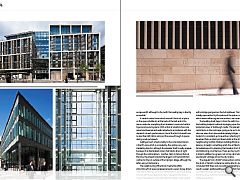
The neighbouring office block meanwhile offers 200,000sq/ft of space wrapped around a seven storey atrium. “We had to draw up some innovative plans to get the building to work with these deep floor plans,” explained Fitzsimons. “One of the features is the full height fire rated curtain walling with a bridge going across the full cantilever. The trusses were initially exposed but by the nature of the splice connections, which were neither regular nor random, we covered them up.”
The building itself steps in from the sixth floor to maximise the building footprint without impinging upon the wider protected views of Edinburgh Castle. This placed tight restrictions on the roofscape, going as far as to stipulate obscure views from inaccessible railway bridges. As such the footprint is consistent up to level four, reflecting the street level tenement flats on Morrison Street whilst at the other end the neighbouring Scottish Widows building affords a little more leniency in height, something which the architects have taken full advantage of by stepping the façade in from the sixth floor and fashioning a roof terrace. There are four such terraces in total in addition to a green roof on top, all of which boast spectacular vantage across the city skyline.
The angular form of BDP’s intervention contrast with the drum of Farrell’s conference centre after its designers concluded that there was no point in competing with it. The result is a plain vanilla building envelope which hides some accomplished engineering, sadly obscured from view. For the first time since West Princes Street Station Exchange Place is finally going places.
|
|


