Liverpool Central Library
22 Jul 2013
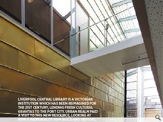
Liverpool Central Library is a Victorian institution which has been reimagined for the 21st century, lending fresh cultural gravitas to the port city. Urban Realm paid a visit to this new resource, looking at how a marriage of new build and historic elements has fashioned an archive which looks to the future as well as the past.
The form of the humble book has undergone the most marked change in its centuries spanning history over the last few years as the inexorable digitisation of the world rumbles on via eBooks and tablets. In many ways this is no longer surprising in a world in which music and film have already succumbed but what is interesting is the knock on effect it is having on our public lending libraries which, far from disappearing, are enjoying something of a renaissance.Whilst local libraries remain under threat from cutbacks central civic collections and resources from Mecanoo’s Library of Birmingham to Schmidt Hammer Lassens University of Aberdeen Library and the John Rylands Library, Manchester, by Austin-Smith:Lord, are being reborn.
Nowhere is this process of transformation now more apparent than at the Liverpool Central Library which recently opened its doors to the public following an extensive rebuild by Austin-Smith:Lord.
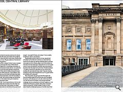
Dominated by the new main foyer and restored Picton Hall the scheme immediately dispels preconceptions of the ‘Please Keep Quiet’ sign suspended above a grey table and worn chair by hitting the visitor square between the eyes with a blazing riot of colour and sensual curves that relegates right angles solely to the four corners of reading material. This playful approach is especially evident in the new children’s wing, a circular Jules Verne confection that is a conscious effort to banish the subconscious elitism which psychologically barred the young and less academically inclined from stopping by.
Much more than a library the complex incorporates a drop-in grab a book service, café, IT services, conservation studio and even a disaster reaction store to handle the fall-out from flood or insect infestation, amongst the armoury of weapons now at librarians disposal is a downstairs freezer which can chill books to -90, killing any tenacious mites within
Outlining the design challenges presented by the scheme Chris Pritchett, partner at Austin-Smith:Lord, told Urban Realm said: “It’s not floors and floors and floors of ‘please be quiet’. There are sections like that but there is enough variation within the library to be able to find your own space. The challenge is getting 14 to twenty year olds into the library whilst also giving help to people who don’t have internet access and offering social events, poetry readings, book launches and private hires. It’s still called a library; they haven’t fudged it or called it a media centre. It’s just that the service it provides is much broader. There are a high percentage of books but there is also a games room with Boss sound system.”
Ross McFarlane, commercial director at Azzurro, was subcontracted to draw up specifications for the interior spaces. He said: “Libraries have always been quite dull and austere places, but that’s no longer the case. Austin-Smith:Lord’s core design specified the shelving, desk system and soft seating. We were then appointed and everyone sat around to discuss the best way forward. We were given pretty strict guidelines by the architect on what was going in each area, including what furniture and colours to use. We gave options on the look and feel and supplied the products.”
Dating from the 1850s Liverpool Central Library is situated in the heart of the cultural quarter around William Brown Street, a World Heritage Site it is nevertheless somewhat cut-off from nearby commercial and retail districts. To counter this a host of remedial works have been specified, including the remodelling of the 1950s interior (initially conceived to repair bomb damage) and a 1970s extension. These additions were no longer functional and just as books themselves have been swept up by technological progress so too has the building in which they are housed, with new technology and furnishings, from workstations to illuminated shelving and wheelchair access now all taking pride of place.
Pritchett observed: “It was a typical library of its time with lots of levels, it worked okay as a library but didn’t offer very good access to the historic part of the building. For fifteen years the library were looking to refurbish and we were one of four teams appointed to conduct a feasibility study. Perhaps unusually for a cultural building this went down the PFI route, aside from a very nice library by Bennetts in Brighton I can’t think of any others.” This arrangement did place ‘limitations on budget”, conceded McFarlane, who added: “It was a healthy budget but it wasn’t a nice process.”
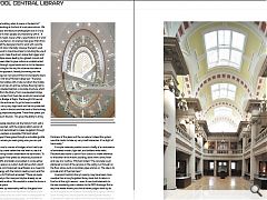
Questionable funding model or not a key requirement articulated by the brief was to address an underwhelming entrance to the space by creating something special, a process which gave rise to the ‘literary carpet’ which now extends the front door into the streetscape. Taking the form of a list of great works of music and literature it provides direct level access to the library from the street for the first time. Pritchett remarked: “The idea is it becomes a café terrace so you come out the building with your book and have a read. These are imposing buildings but they don’t broadcast their use. It’s a great location but probably a bit underused.”
Part conservation and part new-build the project saw the roof carefully raised off the Picton and one of the biggest temporary roofs in Europe put in its place whilst a brand new zinc roof was built. If this weren’t tricky enough additional challenges were also presented by next door neighbours, most notably World Museum Liverpool (whose layout precluded internal connections). Pritchett recalled: “It gave us some really interesting challenges because on the other side of that party wall is a collection of mummy’s which complicated the demolition work.” So as not to wake them Pritchett had an acoustic professor install seismographs which would issue text phone alerts above a certain frequency of vibration.
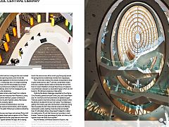
“Coming into a building when it opens is the best bit”, states Pritchard, standing at the foot of a set-piece atrium. We all like these set piece architectural photographs but it is nice to see it and record it when people are interacting with it.” It ably satisfies library head, Joyce Little’s, specification of a ’wow’ factor to draw the punters in, an onerous task given that (from the front at least) all the designers had to work with was the landscape and front door. Internally however the team used every trick in the book to maximise impact, including the use of Tromp l’oeil lighting to make the atrium space feel bigger and plumping for an ellipse space leading to a glazed conical roof dome, which has been tilted to give visitors an unobstructed and inclined view through upper levels and on to the heavens.
As well as reaching for the sky the scheme also takes a more down to earth approach, literally burrowing into the bedrock to reconfigure a new ground floor and properly aligns floor levels for the first time Pritchard observed: “The basic idea is a series of floor plates with a hole cut down the middle and a dome placed on top. An archive (whose flooring had to be mm perfect) is situated behind, a concrete structure which is only accessible from the library from one elevated bridge. Everything which comes from there has an almost ceremonial passage across this Bridge of Sighs. We thought it’d be a lot easier to separate the archive as it’s got to have incredible structural stability, carry very high loads and be fire protected. It’s much easier to build in the box and the back of the building is not a particularly prepossessing area. These floor plates just hang, they don’t touch the box. This gives the ability to bring daylight in.”
Essentially a façade retention job the historic front wall is independently supported, with the original rabbit warren of passageways behind demolished to make navigation through the huge space as painless as possible. Pritchard noted: “Whereas before you’d have gone through a complete guddle and not even seen where you were going now you can just walk in.”
Spanning this void is a series of bridges which had to be hoisted into place by crane before the roof went in, each of which conceals lighting hidden underneath the bannisters. To keep these rectangular floor plates as simple as possible all the escape stairs, lifts and toilets are located in a zone either side. Capping this space is a custom built dome which wasn’t in the brief but was commissioned nevertheless as a means to provide some synergy with the historic reading room and this new circular space. As Pritchard remarked: “There are quite a few domes already in the Liverpool skyline already so we thought why not add another. We wanted to make the dome a continuation of the space.
“The timber went up reasonably well but the glass took a little longer as there is very little repetition. Because of the way the dome is constructed we didn’t want to triangulate the glass, so that a pane could hit three points - we wanted it to hit four points and that’s not actually possible because of the thickness of the glass and the curvature. Instead the system uses the mastic to take up very small tolerances; it’s a slight of hand really.”
A simple materials palette consists chiefly of a combination of laminated timbers, light oak, and brilliant white walls. Reconstituted stone is used in four colours to make reference to the ashlar of the historic building, albeit with a shiny finish and new zinc roofing. Pritchard noted: “The concrete is just plastered so most of the services in the ceiling run through on the floor above such as sprinkler pipes and so on. The idea is to provide a bit of thermal mass.”
Liverpool Central Library’s revamp may have been more overdue than a long forgotten library book but its return is fine for all the right reasons - even if new-build elements to the rear inevitably pale in relation to the 1850 frontage. But as any true reader knows you should never judge a book by its cover though and the interiors here really are a sight to behold, book-ending the cultural quarter and lending fresh impetus to pedestrians seeking solace from the commercial hubbub of Liverpool’s revitalised city centre.
|
|
Read next: Changing Geography
Read previous: Dementia
Back to July 2013
Browse Features Archive
Search
News
For more news from the industry visit our News section.
Features & Reports
For more information from the industry visit our Features & Reports section.


