Aesthetics of Recycling
18 Apr 2013
The passing of Howard Liddell, founder of Gaia Architects and co-founder of the Scottish Ecological Design Association, has been a bitter blow to those championing respect for the environment. Here Chris Stewart of collective architecture recounts SEDA's inagural ‘green drinks’, an event which seeks to maintain Liddell’s legacy through promotion of environmental issues to a new audience.
The first rule about SEDA Green Drinks is to tell everybody about Green Drinks and the word will be spread on the last thursday of every month.For our first drink in February 2012 we packed the WEST Brewery adjacent to Glasgow Green and as a follow up to recent lectures on the emotions of sustainability I decided to tackle the subject of aesthetics.
It could be said that ‘greenwash’ and elitism have brought a renewed fight to SEDA members.
On a more personal level I believe that green designers need to shed the perception that we hug trees. The purpose of SEDA Green Drinks is to create provocation from which some decent debate may flow. This premise formed the opening gambit to my lecture where an image of the Hobbit sat next to a hi-tech weather station to form the two best known pictures of how ecological design may appear. The opening slides definitely set the tone as most people in the crowded room began to check to see how hairy their toes were.
After this initial shuffling of feet we had a closer look at the main questions of the evening. These were ‘what is recycling?’ and the even harder question of ‘what are aesthetics?’
Most definitions for recycling consider the return or processing of materials to form new products. However, some might identify this further to encompass the reuse of thought, memory or action.
The scientific definition of aesthetics is strangely ambiguous and finds difficulty in understanding ‘the study of sensory emotional values’. Our group was happy to further muddy this definition by listing the many and varied types of aesthetics that exist, including Western Medieval, postmodern, Chinese and, what most caught the attention, evolutionary aesthetics.
Evolutionary aesthetics interested the group, as this particular philosophy raises issues beyond style through its reflection of human need. Examples include an artists’ display of healthy symmetry and human habitation within their work. Consequently, the group considered that the aesthetics of recycling might be linked to evolutionary aesthetics due to the association of recycling with human survival, which in turn brings an attraction towards it as an aesthetic.
Together, with some recycling history moving from Plato, St Marks in Venice and Gaudi’s use of reclaimed tiles, we were happy to further approach the main subject of the lecture with an open mind. In our post lecture discussions we made some analytical sense of this by listing the various scales of recycling that might be considered. These were;
spirit: something wider that may bind us all
global: ecology would not be complete without mention of our planet
structure: the primary component elements: bits placed into the primary component
modules: those building blocks materials: what everything is made from
products: an effort to include all designers lifestyle: what every good salesman describes
mind: could there be something else to all this in each of us
The lecture contained a number of project examples that had used recycled materials to varying degrees and in a wide variety of innovative ways. These project examples had been gathered through both an ongoing twitter campaign and the generosity of friends.
We carefully examined and graded these projects and materials according to the appearance of that which was being recycled. We then limited these into three specific states of aesthetics as follows;
intact: where the recycled object is reused pretty much in its original state.
broken: where the original material is revealed after some searching.
lost: where there is no evidence nor intention to tell a recycling story.
Our analysis directed us to the likelihood that recycled items which had been used ‘intact’ typically led to the most aesthetically pleasing aesthetic. Equally, to many, the notion of recycled materials being ‘lost’ through the process created a preferable aesthetic. Second hand goods can, at times, be considered undesirable.
We then set about categorising the project precedents into a series of topics or headings as follows;
Spirit and Global: This section contained images of recycled, religious sites, in particular the Wailing Wall with its layers of runic stones through Judaism, Christianity and Islam with a likely underbelly of paganism. Global references were incomplete without the image of Al Gore standing next to a huge globe for a cheap laugh. This formed an unpleasant contrast to those who in the Developing World who rely on recycling for a living as they pick through their own and imported western cast aways. There was limited discussion around this category.
Structure and Elements: This topic formed the meat, or at least the bones, of the talk. Notable was Sheigeru Ban’s cardboard bridge (impressive but lost) and his paper church (which sneaked a broken). Herzog & de Meuren’s corten inserts into existing structures were familiar if broken.
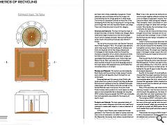
The star of the structure show was Edward Francois’s intact Hotel Fouquet in Paris. This project used elements which shied away from the multitudes of container and trains and laughed a bit at the village underground. It managed an intact double whammy through the impressive acquisition of six London underground trains for £100 to form office space, (information courtesy of recycledarchitecture.blogspot.co.uk). Turbo hotel near Mexico City by T3arc was easily the most beautifully intact example through its use of old sewerage pipes to form bed-spaces that appeared more comfortable than converted planes or oil tankers.
Modules and Materials: This section was dominated by Rural Studio and the wondrous broken reuse of carpets, signs and the most beautiful church formed from car windscreens.
Dispersed between this were an intact Dutch cafe constructed from products bought from Ebay by Bureau SLA and a lost cardboard school by Cottrell & Vemeulen made broken with the folding instruction printed on the facade Materials were more serious. Everyone loved Smile’s broken plastic products for moral reasons as they were no more acceptable than a despised lost recycled UPVC window. Everyone agreed that UPVC was principally toxic and apparently responsible for the lowering of sperm-count.
Products and Lifestyle: This topic generated plenty of input from product designers and artists who used found materials to create useful objects or make a statement of thought.
Jo Royal’s intact Plastiki yacht made from flotsam gathered in San Francisco and sailed to Sydney made the most active of statements in an effort to protect marine life. Meanwhile, the trendy intact elderly couple kitted out by Oxfam got the biggest laugh.
Mind: It was in this section that we found examples which brought together different strands that allowed us to re-imagine as opposed to recycle. The work of Ash Sakula Architects often reimagines materials and place. Their wonderful, intact Caravanaseri in Canning Town conjured up images of camel trains drifting through East London. More literally, the Caravanaseri brought together community and recycling.
Since our talk Ash Sakula Architects have recently brought more of their individual work to our attention in particular their scavenger Circuits in Newham and the Flitched Upcycler Design Competition shared with Building Design.
Closer to home we enjoyed table tops full of recycled memories by the Glasgow East End designers Briggs and Cole and Dressed for the Weather’s broken GIA Competition winning interior design at Greek Thomson’s Holmwood House. This project spun together recycled paper in homage to James Couper who commissioned Holmwood House and made his fortune from paper manufacture.
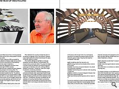
That brought the first half of Green drinks to a conclusion followed by some lively discussion chaired by Matt Bridgestock. The floor was lead by Howard Liddell and Sandy Halliday who, in fine form, reminded everyone that SEDA was formed as a protest group. SEDA has battled for the last 20 years to alter the public’s perception of ecological designers.
Specific to the subject of recycling Bruce Newlands stressed that the project examples has shown the ‘clean’ side of recycling and aesthetics, whilst much was commendable about the ‘dirty’ side of recycling. He stressed that aggregate, hidden insulation and much lost material would never be retained yet remained important to carbon reduction.
Many of the examples used where dramatic and eye catching, however it was the more commonplace projects which brought the greatest joy: the faces of the children who made their own intact greenhouse from plastic bottles to grow vegetables lifted our hearts.
The numerous ASSIST contributors naturally put this down to the inclusive possibilities of recycling. The last word of the night was left with the much loved and respected Howard Liddell who personally berated me for not getting involved with SEDA earlier. He was however most pleased that myself and others were starting to pick up the baton.
There ended the inaugural SEDA Green Drinks brought to life by the presence of Howard Liddell to whom we are all indebted and continue to make a promise that ‘the bad guys will not win’.
|
|
Read next: Advocates Close
Read previous: St Albert’s Catholic Chaplaincy
Back to April 2013
Browse Features Archive
Search
News
For more news from the industry visit our News section.
Features & Reports
For more information from the industry visit our Features & Reports section.


