Sir Duncan Rice Library
30 Jan 2013
Aberdeen has been making waves for all the wrong reasons lately from Menie to Union Terrace Gardens but in one small corner a landmark has emerged that is worthy of the name. We assess what lessons the educational hub might teach the wider city.
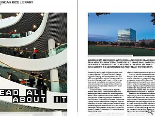
It’s taken a full year but finally the Queen has gotten round to opening Aberdeen’s Sir Duncan Rice Library, the most bombastic of the three new libraries presented here. With a £57m price tag the Borg cube hasn’t come cheap but the University of Aberdeen have far more in mind than a mere storehouse for books, they’ve commissioned a landmark which can reconnect their campus with the wider city and act as a physical standard bearer to draw lucrative foreign students to the city.In a city and campus defined by the use of granite however Danish practice Schmidt Hammer Lassen have harnessed glass to achieve these aims, as founding partner Morten Schmidt explained to Urban Realm: “We believed we were not able to do that using entirely the same materials from 1200 like the Kings College, we needed to transform that typology into a new metamorphosis of the granite. If you see the buildings on campus as being introvert, somewhere where knowledge was shared at that time only for the elite, today it’s the opposite. The knowledge is something which comes from outside, it’s shared, it’s collaboration, it’s cross knowledge and it’s a lot of other things.
“Therefore the architecture needs to reflect that openness, we couldn’t do it with a heavy material. Initially we had a light veil around the building, a beacon of light we also call it.
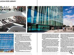
In striving to eschew the stereotypical use of granite in favour of a lighter material the architects have, unwittingly, come full circle, adopting a more scientific approach as the parallels became clear, as Schmidt explained: “The interesting thing is scientists at the university came to us and said, ‘do you know the pattern that you’ve got on the façade is exactly the structure of granite as seen through a microscope? It’s layered in dark and light. If you go further down it has these awkward angles, a sort of crystalline shape.’ The nature of granite is really embedded on the pattern on the façade. “
Perhaps the most important issue as assessed by the competition jury was not its materials selection however but rather the integration of the library within the wider campus. Located on the perimeter of the university estate the library has been given height principally as a mechanism for visually connecting the building to all parts of the campus, reinforcing its position as a social hub for the university. That connectivity isn’t just visual however, with the creation of a new square which reaches all the way down to the street and then connects up and through the ground floor into the library itself. The square also creates a new axis across the university campus and is built on a base of Scottish stone with ground floor areas incorporating lounge and café spaces, which play host to regular exhibitions.
Asked what a foreign architect brought to the project Schmidt added: “We have come with a Scandinavian approach which has a different view on how to build up against and close to historical buildings. There are many talented architects in Scotland but I have a feeling they are more cautious in doing this because there are strict rules on what can be built.”
Citing the design influences on the scheme Schmidt added: “Our reference projects come from Copenhagen where we designed the extension to the Royal Library, the Black Diamond. This is also up against the most historical buildings in Denmark but it’s a completely modern interpretation that connects in another way by showing that it belongs to a new age and a new way of thinking. I strongly believe that we need to reflect that in our architecture and not let the 13th Century design come through in our buildings in the modern age.”
Turning toward the buildings crown, Schmidt said: “A lot of consideration was given to the roof, a library needs an extensive amount of mechanical plant but the building is organised in such a way that in the plinth beneath the building we’ve got the rare book collection. It means it’s very difficult to locate the plant anywhere other than the roof. We also heard the story of the aggressive seagulls and we needed to keep them off the roof and avoid them attacking… the roof could not be accessible to the public because of the weather, climate and animals!”
Awarded a BREEAM ‘Excellent’ sustainability rating the library utilises a high thermal envelope achieved through insulating 50% of the façade, visible on the facade as the white panels interspersed with clear vision glass. Schmidt noted: “If you compare to the National Library in Paris, it is completely the opposite where the sunlight comes in through the glass and you then try and stop it with some wooden panels. The heat is in there and you need to get it out, which is of course completely silly.
“I hope that a design like this which has a lot of vision, thinking and money behind it will act as a catalyst for other projects coming up. Lately there has been quite a few nice projects like the sports village and other research buildings but I have to confess I haven’t put a lot of research into other new build projects in Aberdeen because I haven’t had the time. I think this will change attitudes toward modern architecture, but is there enough? I would say no. Some projects must lead and only then will the political system understand it. If young people are to stay where they are and not leave you need to modernise your city and that needs well designed urban spaces, well designed retail streets and well-designed cultural buildings.”
Casting an eye to the future Schmidt added: “I’m moving onto the Central Public Library in Halifax, Nova Scotia. What is interesting is it belongs to the same climate as Scotland and I believe that climate heavily influences the people living in these areas to think the same. Their requirements are the same and their behaviour is the same, so it’s interesting working that far away but still with the same nature of building. We’re also working on new projects in Asia, using knowledge gained in the UK and Scandinavia and combining it with Chinese culture.”
Schmidt concluded: The architect normally gets a lot of credit for the architectural piece he has designed but it is very important to mention that it’s the vision that the client and the people behind the client, in this case Sir Duncan Rice, have that really makes a state of the art library. You can find lots of other universities and bodies of clients who do not have that vision. Without these visionary people there will be no visionary architecture.”
Read next: Noreen & Kenneth Murray Library
Read previous: Wind farms
Back to January 2013
Browse Features Archive
Search
News
For more news from the industry visit our News section.
Features & Reports
For more information from the industry visit our Features & Reports section.


