The Golden Section
25 Oct 2012
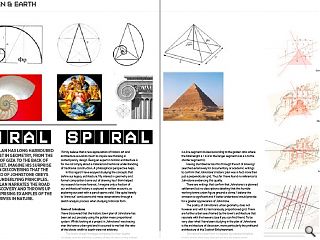
Paul Stallan has long harboured an interest in geometry, from the pyramids of Giza to the back of a fag packet. Imagine his surprise then upon discovering that the urban grid of Johnstone obeys the same underlying principles. Here Stallan narrates the road to this discovery and throws up a few surprising examples of the sexiest curves in nature.
I firmly believe that a new appreciation of historic art and architecture would do much to inspire new thinking in contemporary design. Being an expert in historic architecture is for me not simply about a material and technical understanding of traditional construction. A philosophical perspective helps.In this regard I have enjoyed studying the concepts that define our legacy architecture. My interest in geometry and formal composition borne out of drawing has I think helped my research be more forensic. I imagine only a fraction of our architectural history is captured in written accounts, so exploring our past with a pencil seems valid. I like quite literally to ‘draw out’ conclusions and make observations through a sketch analysis process when studying historical form.
Town of Johnstone
I have discovered that the historic town plan of Johnstone has been set out precisely using the golden mean proportional system. Whilst looking at a project in Johnstone I was tracing over the towns urban grid and it occurred to me that the ratio of the blocks width to depth were not arbitrary.
The towns street frontages compared to their depths correlate exactly with the qualities of the phi ratio or the golden section as it is more commonly known. (i.e. The golden section is a line segment divided according to the golden ratio where the total length a + b is to the longer segment a as a is to the shorter segment b).
Having stumbled across this through the act of drawing I searched extensively for documentary or academic writings to confirm that Johnstone’s historic plan was in fact more than just a perpendicular grid. Thus far I have found no reference to Johnstone evidencing this quality.
There are writings that confirm that Johnstone is a planned settlement but no descriptions detailing that this humble working towns urban figure ground is divine. I believe this omission is significant and if better understood would provide for a greater appreciation of Johnstone.
The poetry of Johnstone’s urban geometry does not however end with its harmoniously proportioned grid. There are further urban axes framed by the town’s architecture that resonate with the heavens (see if you can find them). To be very clear what I have been studying in the plan of Johnstone is the architecture of classicism, more particularly the profound architecture of the Scottish Enlightenment.
Johnstone’s urban form is inspired by classical timeless truths, truths that have shaped art and architecture for millennia, which for the most part are now are largely unrecognised or of little interest to people in the 21st century. It is unfortunate in my view that an understanding of proportion is not more understood, certainly in architectural and design practice.
Beyond being a student of architecture and experiencing a rudimentary module in classicism, my interest in the classical has come more through my continued study of art than architecture. As someone who is continuously drawing it is natural for me to deconstruct and reconstruct shapes and forms in search of a beautiful composition. This preoccupation has naturally led me to appreciate classical art, not just on an aesthetic level, but more fundamentally.
Dalkeith Palace and Gardens
I like to think my interest in classical art played a key role in unlocking a major estate strategy for Dalkeith Palace and Gardens for the Duke of Buccleuch. Tasked with trying to consolidate an approach to the project that would capture the Duke and Duchesses interest I set out as I typically do at the start of a commission, by adopting a completely splatter gun approach to my research. After a week my desk was covered in an assortment of collected maps, photographs, images and plans.
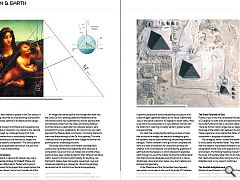
An image that stared back at me through that week was the Dukes Da Vinci painting called the Madonna and the Yarnwinder (some may recall that this was the painting that was famously stolen from the Dukes Drumlanrig Estate in Dumfries where six years later two Glasgow lawyers were arrested for trying to repatriate it). At a loss to how we might approach the Palace estate commission, I randomly started to draw over the photocopy of the Da Vinci painting. The more I sketched over the painting the more I began to see that the painting had an underlying structure.
Obviously many historic and modern paintings have construction grids that have helped the artist structure a composition. Given Da Vinci is a master and an artist whose paintings have been widely studied for their different narratives I didn’t expect to find and wasn’t looking for anything new that hadn’t already been thoroughly researched. I was just obsessively sketching as I always do. I found the paintings secret and not for the first time I had a divine epiphany.
Leonardo Da Vinci’s Madonna & The Yarnwinder
The paintings underlying diagram starts with the baby Jesus looking at the cross on the yarnstick as if understanding His fate. Secondly the yarnstick has two diagonals which set up a dynamic perspective across the painting focusing on a far a way hill again significant relative to His future. Additionally Jesus is also set at a dynamic 45 degrees to assert status. Mary is set within the composition in a very different manner with her bodily form outlining a visually ‘perfect’ golden section isosceles triangle.
It is clear that underlying the painting are lines of union that structure the image, two beautiful overlapping grids, the dynamic and the static reinforcing the paintings internal dialogue. There is however a third grid which completes the work as a work of classicism, for classicisms primary aim whether in art or architecture is to embody the greatness of earth but also the heavens. In short classical art celebrates earth through its use of the Golden Section the mathematical ratio that structures absolutely everything found in nature. Additionally classical art also makes very direct reference to astronomical geometry.
In the Madonna and the Yarnwinder these heavenly geometries can be seen in the use of the angle 23.5 degrees, which is the earths tilt. For example simply refer to your standard world globe drinks cabinet and you will see it is angled at 23.5 degrees - the dynamic axis that the earth rotates around.
The Great Pyramids of Giza
Further, if you mirror the composition the paintings diagonal is 52 degrees on both sides and describes the cross section of the Great Pyramid of Giza, a recurrent reference in classical art. There are further cosmic angles like six degrees which refers to the angle of the ecliptic plan between the sun and the moon. These angles are not accidental but rather a fundamental component in language of classical art.
My colleagues whilst I studied the above were beginning to worry about my mental health. They were also concerned that this research was entirely irrelevant to our pending presentation to the Duke with regards to his Dalkieth Palace and Gardens. My thinking therefore moved more specifically to the study of his estate rather than his art collection, an estate that clearly blossomed fully during the time of the Scottish Enlightenment as my research confirmed.
The Scottish Enlightenment
Edinburgh and Glasgow in the early 18th Century had a concentration of great minds whose writings and achievements changed the world. The Scottish Enlightenment describes this period understood as an intellectual movement that ranged across the fields of philosophy, chemistry, geology, architecture, poetry, engineering, technology, economics, sociology, medicine and history.
Commonly referred to as Scotland’s ‘Golden Age’ the thinkers of the Scottish Enlightenment asserted the fundamental importance of human reason, combined with a rejection of any authority which could not be justified by reason. They held to an optimistic belief in the ability of humanity to effect changes for the better in society and nature, guided only by reason.
The central tenants of classicism being the study of earth’s natural order and the heavens was, for the architects of the enlightenment period, a language that they made their own. The Scottish artists and architects of this time continued to invest in a classical language that built on a lineage that directly connected back beyond even the great Italian renaissance.
William of Oranges Palace of Het Loo
That said Dalkeith Palace was a direct copy of William of Oranges Palace at Het Loo in the Netherlands but it established a context where architects like John and Robert Adam, James Playfair, William Burn and David Bryce were to be commissioned. Despite some of Scotland’s finest architects having contributed it has been recognised that the landscape structure of the Estate has been lost in more recent times. Like my sketch study of the Dukes Da Vinci, I typically started to draw over an ordnance survey plan of the Palace Grounds in an attempt to make sense of how the estates structures might be better connected.
The Palace of Versaille
Dalkeith Palace being a facsimile of Het Loo lacks however its majestic formal gardens. As Dalkeith was a copy of Het Loo, Het loo was a copy of the gardens of Versaille. Het Loos gardens like Versaille are existential in their ambition. It struck me that the grounds of Dakeith Palace were potentially incomplete or that a more rural romantic approach to the natural setting was envisaged. Given that the architecture and the art of Dalkeith Palace involved some of Scotland’s finest artists and architects of the day, I thought it odd that estate plans ambitions had not been documented by historians. Could it be that the placement of the architecture within the landscape was arbitrary? I didn’t think so.
By sketching repeatedly over the Dalkeith O.S. I was trying to find a strategy that could be presented to the Duke that would encourage him to invest in the Palace environment. Trying to find a historic narrative that we might extend, a future in the past you might say. With my marked up photocopy of the Madonna and the Yarnwinder at one side and a plan of Versaille on the other I started to deconstruct the geometry of Dalkeith Palace and Grounds only to discover that Dalkeith Palace was orientated at 23.5 degrees the Earth’s tilt.
From this point I began to understand not only the Palace grounds and to discover connections between structures in the Park but had found the basis upon which to advise the Duke on his Palace renovation plans. With classical structures like Montagu Bridge by Robert Adam, a student of Piranesi no less, to the exquisite orangerie structure by William Burns, we felt confident that we had an intellectual framework that would enable us to reconnect this landscape. Unfortunately the collapse of the financial markets affected not only our commercial clients but also impacted on Buccleuch affairs at this time. The Palace and its landscape remains an opportunity for Scotland.
Steve Jobs & Apple Design
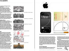
But what of contemporary architecture and design? Are the tenants of classical art relevant to our modern life? Is not the golden section and its divine proportions a geometric system and phenomenon of the past? Steve Jobs didn’t think so. Take everything Apple for example. From Apples logo to their computer screen dimensions to your iPod, you will find all Apple products and their primary graphics are strictly proportioned and designed to conform with phi grids. Studies have proved that phi proportioned shapes appeal more than arbitrary forms.
Given that everything from your own body proportions to the rhythm of your heart beat are determined by phi, I can imagine Steve Jobs and his team thought it was obvious that their products were an extension of us. Note, next time you watch Casualty on television lookout for the heart monitor as the mathematical heart beat graphic that appears to tell you that you are alive is a phi wave ratio. Your heart gives a double beat their rhythm being 1 to 1.618033988749895…... divine.
Benson & Hedges
I also learned from Will Alsop that Benson and Hedges cigarette packets are not only gold in colour but golden in their dimensions. Tobacco companies like Apple have understood that a pleasing shape has commercial potential. Will described how his fag packet was his inspiration for the spectacularly suspended building for the Ontario College of Art. Its a scaled up version of a B&H box supported by a few cigarettes. Will is completely serious.
St.Brides Church, Gillispie Kidd & Coia
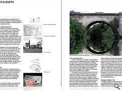
An ongoing project that I am currently involved with is Gillispie Kidd and Coia’s St.Brides Church in East Kilbride. Tracing repeatedly over the floor plans and elevations I discovered that the length, breadth and height of the building are based on the section. I was actually gob-smacked by this discovery. Again I thought this quality must be documented or written about somewhere, but no. I have found no comment on the proportions of the churches and buildings designed by both Andy MacMillan or Izi Metzstein. I was due to meet Andy to discuss our work on the church and presented him with my diagrammatic studies. Andy was stunned.
Andy acknowledged that he had finely developed visual intelligence but he did not recall drawing the church so exactly that it conformed to a section grid. For him it was more intuitive and, well, it looked right. He confirmed however that within his drawing office there were older draughtsmen who had been classically, or rather traditionally, trained who would take their sketches and by default he guessed naturally ensure the building as it was being drawn had a proportional integrity. Alternatively Andy confirmed that he always suspected he was a genius. Regardless Andy was so pleased, it was a wonderful moment.
My Triangle Studio
I have designed my own studio on a triangular plot which I bought. The dimensions of the site its length to breadth have determined the plan form of the building. The dimensions were so close to a ‘harmonious’ triangle that it seemed perverse to deviate from it. I certainly do not consciously set out with designs to force them into a straightjacket of mathematical correctness but grids can be liberating.
13 Degrees
Another geometric occurrence I believe I have discovered further to stumbling through a design project relates to Glasgow’s Victorian gridiron. On the numerous urban projects I have worked on within the Glasgow urban grid I often asked myself why is the city’s grid rotated at 13 degrees to ordnance. Why did our city forefathers set a grid out a 13 degrees and not make it exactly perpendicular to north south east and west?
It wasn’t until sitting in our wee flat in the Kyles of Bute staring at a beautiful detailed sailing map of the West Coast of Scotland that I noticed the map had a set of different compass rose diagrams up one side all with different north points. Sailors I understand use them when they navigate around our shores. These diagrams don’t show polar north but rather magnetic north. Magnetic north changes depending on where you take a reading.
The thought occurred to me that perhaps the Victorian surveyors of Glasgow, thinking that they were setting out a strict north south grid, were not referring to the stars but were using a magnetic compass. I laughed to myself thinking that surely not; the Egyptian pharaohs could exactly map out the heavens on earth with mathematical precision yet a bunch of city surveyors plan Glasgow on a wonky grid. Subsequently I have looked at a series of city plans to understand if this might have happened elsewhere. I have found that this occurrence happens in the Soviet grid plan of Almaty and in the grid plan of Melbourne where the city grid is rotated at eight degrees, whilst magnetic north is offset by exactly the same extent.
In our design for North Glasgow College I exploited a ‘happy coincidence’ of true north and Glasgow’s skewed north to create a new public space. Flemington Street in Springburn that the College fronts is parallel to Sauchiehall Street. Surprisingly the influence of the City grid extends this far north. We thought that the building responding like a compass, offering direction to its learners was an appropriate metaphor. The building is therefore cut to form an exact north, south, east, west, axis from the skewed Glasgow grid. Like a giant sundial you can even learn to tell the time precisely from the movement of the buildings shadows. Importantly however the new space is orientated exactly in a south westerly direction, to derive maximum benefit from mid-day and afternoon sun.
Drawing as a Research Tool
Through direct project working and especially drawing rather than detached academic research or study, I have learned a great deal about art and philosophy and its importance in historic architecture and consequently for me its place in contemporary architecture. With each and every new project I am involved in I try very hard to understand the factors that have shaped that architecture or urban context I find myself working in.
|
|
Read next: Port Glasgow
Read previous: Rediscovering lanes and backcourts
Back to October 2012
Browse Features Archive
Search
News
For more news from the industry visit our News section.
Features & Reports
For more information from the industry visit our Features & Reports section.


