Navel Gazing
1 Nov 2011
On October third Maggie’s opened their eighth cancer care centre in the UK, Maggie’s Gartnavel, the first of three such facilities to open in the UK this year as part of the latest (and greatest) wave of expansion in the history of Maggie’s treatment centres. 15 centres are currently either built (or in development) to coincide with the charities 15th birthday, putting the charity well on course to achieve its goal of opening one centre for every British cancer treatment centres, currently around 50.
As the first Office of Metropolitan Architecture designed project to be built in Britain – just pipping the headquarters of NM Rothschild and Sons in London to the title, Urban Realm paid a visit to find out whether it has been worth the wait.Since 1996, when Richard Murphy completed the first Maggie’s Centre (in Edinburgh), progress has been slow, with Page\Park not putting the finishing touches to the second centre until 2002. Since then however growing awareness and publicity to the cause have witnessed an accelerated programme of construction, first in Dundee, Frank Gehry (2003); then Inverness, Page\Park (2005); Kirkcaldy, Zaha Hadid (2006); London, Rogers Stirk Harbour + Partners (2008) and Cheltenham, Richard MacCormac (2010).
As Maggie’s themselves state: ““The Centres do our ‘marketing’ for us. Crucially, these special, unique buildings help us to raise the money we need to build them in the first place, and then to keep them running. Our buildings are special and we chose special architects, not for some luxury add-on value, but because they are a critical component of what we do.”
Gartnavel is notable for being Glasgow’s second such centre, reflecting the high incidence of cancer in the west of Scotland but also the pressing need to relocate alongside the Beatson West of Scotland Cancer Centre, which decamped to Gartnavel from the Western several years ago. Whether Glasgow needs two such centres’ isn’t yet clear however and usage of the former will be watched before any concrete decision is taken as to its future.
The ribbon cutting frenzy at Maggie’s reflects the growing fund raising clout of the charity, which was able to build this latest centre courtesy of the largesse of a single donor, grant making charity Walk the Walk. Tens of thousands of power walking fund raisers wore brightly decorated bras to scrape together sufficient funds to build the piece. Their work commemorated with a series of footprint engravings which pad their way around the glazed façade of the building.
The chief remit of Maggie’s is to enhance care for those hit by cancer through provision of a warm and welcoming space, far removed from institutional hospital architecture -not qualities instantly associated with modern architecture but something which both architects in charge; OMA’s Ellen van Loon and Charles Cutting (formerly of Keppie) have striven to effect. Their approach softens the robust if austere use of unadorned concrete with extensive use of timber in both the ceiling spaces and giant screen doors which can be rolled into place as and when the function of the building demands it.
A simple materials palette of concrete and wood is used throughout to help foster a calming environment, enhanced by the prodigious use of cushions, throw and rugs. Contemporary artist Callum Innes adds to this comely feel with the gift of three oil paintings - similar to works displayed in the Pompidou and National Galleries of Scotland.
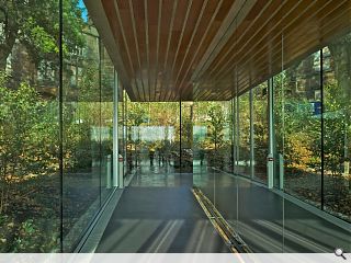
Despite being restricted to a single storey, there are just three steps in the whole in the whole building (aside from access to a basement service area), there is a sense of grandeur in this build, imparted in no small part by the use of floor to ceiling glazing and doorways in the generously proportioned spaces. (even the khazi has a doorway stretched to the full height of the space, though it remains light to the touch).
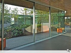
In plan form the centre takes the shape of a heptagon, a seven sided doughnut housing seven primary spaces; a kitchen, dining room, office, two counseling rooms, multi-purpose room and library. Rather than string these along a central hallway however, OMA have opted to do away with corridors (and conventional doors) altogether by meshing the plan of each room into the next and wrapping them around a central courtyard.
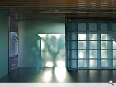
Overshadowed by the brooding presence of a Gartnavel Royal Hospital, a Grade A listed Tudor Gothic asylum. Currently derelict the NHS are seeking to offload to a residential developer. Boasting an elevated panoramic vantage across Glasgow’s west end, its little brother takes full advantage through prodigious use of full height glazing which envelops the façade. Shelving devised by Vincent de Rijk, which is partially opaque to the light only serves to heighten the effect.
An autumnal opening served to showcase this asset to fullest effect by capturing the dappled light filtered by the red and gold leaves (perhaps appropriately for a “pavilion in the woods” it was certainly keeping the cleaners busy). A short pathway leading to a wooded glade, intended to serve as an outdoor contemplation space, continued the forest theme.
Maggie’s design philosophy is expounded in the charities own design brief which states: “Maggie’s asks a lot of its buildings and hence of its architects. We expect the physical space to do a significant amount of our work for us. We need our buildings to feel safe and welcoming. They need to be small, and domestic in scale. On the other hand these little buildings should not pat you on the head, patronise you by being too cosy.
“Maggie’s was lucky in our architect for the first Maggie’s, Richard Murphy in Edinburgh, who showed us how much a building can achieve by creating the right atmosphere. We were also lucky to be able to draw on the close friendships of Maggie and Charles Jencks with some of the most imaginative architects working in the world today, and who have reinforced for us how much a good building can do. We hadn’t realised, until it happened, how powerful a tool it would be that each community feels so proud of its Maggie’s.”
As important as the architecture is it is the landscaping which provides the meat of Gartnavel’s spaces, design of the internal courtyard and surrounding wooded glades being the first thing to strike the visitor to the sloping hillside site. First impressions count and at Maggie’s this takes the form of a meandering path through the landscape, leading up to a fallen tree trunk. A former occupant of the land upon which the centre now sits it serves to reinforce the marriage of nature and built form.
The trees demise was borne out of a necessity to carve out a level platform within the steeply sloping site in order to accommodate the horizontal space necessary to build. This has resulted in one side of the building being elevated above the hospital campus and the other side being partially buried, a side effect which literally beds the centre down into its setting.
Landscaping was devised by lily Jencks, daughter of Maggie’s founders Maggie Keswick Jencks and Charles Jencks, who said: “The landscape is a buffer surrounding the centre, providing a place apart, so that as people enter they feel a different pace and emotional connection to their surroundings. The garden actively embeds the building into the ground, cushioning and embracing the centre in a hill, showing the necessity of a supportive environment that is so central to Maggie’s philosophy.”
OMA’s doughnut can be said to have come full circle since Maggie’s first foray into the world of architecture, offering all the comely appeal of Richard Murphy’s Edinburgh trailblazer but wrapped in a package all of his own. Koolhaas’s British debut has only served to whet the appetite for more.
Photography by Philippe Ruault.
|
|
Read next: icecream architecture
Read previous: Handyman
Back to November 2011
Browse Features Archive
Search
News
For more news from the industry visit our News section.
Features & Reports
For more information from the industry visit our Features & Reports section.


