Zed Shed
22 Jul 2011
Zaha’s zinc zigzag has been the subject of more hype than any other project but as a hangover from the heady boom years does Glasgow’s newly arrived Transport Museum merit the praise of its most vocal adherents and moreover does it merit its budget busting £74m price tag - nearly 50% more than its initial £50m estimate when first approved?
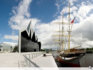
Intended to bring to life Glasgow’s transport heritage in a manner to which the museums prior Kelvin Hall incarnation purportedly failed to, the Transport Museum is but the second in a big four of big budget cultural baubles to emerge in Scotland over recent months. Commencing with the Burns Museum and concluding with the opening of the National Museum of Scotland and refurbished National Portrait Gallery, this quartet promises to redefine the presentation of Scotland’s treasured heritage.As the most unabashedly modern of all Zaha Hadid’s Transport Museum hasn’t come without controversy however, principally from a choice of location location that feels psychologically remote from the city’s current centres of gravity and complicated by a circuitous trek alongside a busy main road or cumbersome river taxi from the two nearest subway stations.
Speaking on a rare contemporary visit to the site to celebrate the museum’s launch Hadid recalled her first Glaswegian foray, which actually occurred back in the 1980s whilst delivering a lecture in the city: “I first came to Glasgow many, many years ago and basically I didn’t sleep that much because I was clubbing all night,”Hadid recalled. “I was really staggered the next morning when i went to get the plane with no sleep. I used to always complain how dull London is but the student body at that time was really energetic and it was exciting to be here. They were basically my support group at the time because nobody in the establishment was into this stuff."
That early brush with the city was to prove but a foretaste with what was to come however as in 2005 Hadid won the competition to design the city’s new Transport museum. Hadid told Urban Realm of her rationale: “It’s a very simple but fluid idea of taking on the shed or the train station at the corner of the two rivers, turning it into a fluid space which gives the visitor direction through the trains and the landscape.”
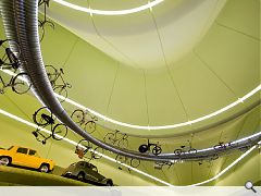
Musing upon the idiosyncratic lime green hue of the cavernous space which resulted Hadid said: “I’m sure many people will ask me about the colour of this building. I think it’s quite nice to have a space which is playful for the many different visitors to be in. It has many cars, trains and vehicles of different colours. It’s not treated as an art gallery where there is only a white box. We had many conversations between Jim Heverin, Hadid’s associate director, myself and the team on the exact colour scheme. My only answer to any question about colour is you’ll have to gradiate it going from one colour to the other. The nightmare of having painters spraying buildings going from green to white would have been almost impossible.”
Prompted by Urban Realm to detail what quotient of the design stemmed from her own hand Hadid responded: “The story of any architects success is being able to delegate. I’m a pain to the design team because I’m involved in all the details. I do take responsibility although its maybe not too much hands on - I don’t think these guys like me to interfere and put my nose there. I’m operating with different layers of directors within the office and am in constant communication with even junior staff.
Explaining the origins of the Museum’s industrial aesthetic Hadid observed: “Some architects believe in the brand and that the brand should be repetitive, we don’t believe that we can’t really reinvent the wheel every time but every time you have a new opportunity you should use that to inspire we see a new site it will increase our repertoire. We try in every project we do to be inspired by the site.”
Most dramatically the space exhibits a vast column free space around a central spine, lauded by Heverin “as a great engineering solution.” Singling out the “pleated roof” solution, Heverin noted how it facilitated the integration of services, all of which are contained at a lower level so that the roof is left as a clean architectural surface. “What we have here is a building which is using energy because you need to create a climate controlled environment but it is mitigating this by ensuring that the building is as insulated and as airtight as possible,” Heverin observed.
Rod Manson, director of engineers Buro Happold explained the structures stand out (and up) feature, the sheer length of span in its column free space when Urban Realm paid a visit: “What we needed to do was engineer the roof profile, both in terms of the vertical and horizontal, to twist through it and twist through it like folding a piece of paper to put a bit of stiffness through it and provide support.”
Describing the resulting structural gymnastics as “one of the most complex pieces of engineering” his practice had ever completed Manson continued: “If we’d gone for a flat roof we could have gone for a more conventional truss system but if you look at the silhouette, the elevation, it is designed to represent Glasgow’s skyline...Glasgow cathedral and the other buildings. In a real sense the building elevation is about Glasgow.”
The elevations, which face out to the city and onto the river, are intended to reflect the Glaswegian skyline – “almost like a flow of energy connecting the city to its heritage and the river beyond” explained Manson. Who added: “So despite what you might think - that this is just a piece of avant garde architecture, that is not actually the case. There is symbolism in the skyline form of the building... which I admit sometimes can be a bit lost on the public.
Commenting on the 2.5k tonnes of steelwork which support the roof - and hold the walls up, Manson commented: “The roof is the fifth and most important elevation; I can see this becoming the image of the museum. I know graphics designers are using this image as the logo effectively because when you drive past on the Expressway you don’t appreciate the building in this form. How does the public appreciate that? I don’t know… they can buy the T-shirt! There is a helicopter company who do guided tours, just the next step along at Stobcross Quay.”
Looking to the polished concrete floor Manson continued: “The floor is load bearing and four to five times heavier than a traditional building. It’s a suspended slab and though there is some light contamination there are 800m of concrete service ducts under it which will take the height of a man for IT, power and air circulation throughout the building.”
Surmising, Manson observed: “Glasgow is all about engineering. There is no doubt that they (Glasgow City Council) wanted a building which was inspirational in addition to the contents, that they were looking for a building that was a vision for the future in terms of the design and that was one of the reasons that the building was selected.”
Cladding the museum externally and internally in an expanse of custom fitting zinc proved to be an immense coordination task which wouldn’t have been possible without CAD software. Originally to be clad in aluminium, this was ultimately rejected in favour of zinc by Hadid as a cost saving measure. Manson stated: “Rheinzinc offers long term durability and was chosen above Titanium, which has not been such a success at the Glasgow Science Centre. It is beginning to wear a bit, particularly in the south elevation where it has grown a bit patchy; there has been some solar deterioration near the river and the Armadillo.”
Heverin elaborated: “We were very much inspired by this location, its historical reference for Glasgow at the junction of the Clyde & Kelvin coming together. It was very clear that this building had to be designed from the inside out; it wasn’t about the objects par se but about the stories about the objects. We really thought that the architecture could add something to that in a kind of symbolism to the relationship between how the city has developed, that connection between the river and the city and flowing inbetween.
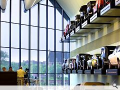
“We knew this space was going to be very packed; it wasn’t going to be an empty art gallery type space for one object with a wide area around it. One of the key parameters was that we create a space that was flexible over the next 10 and 20 years, allowing objects to move and of course that we conserve these objects by reducing air humidity and exposure to ultraviolet light. We’ve achieved 30% better than the building regulations in insulation and in terms of air tightness the results came back two and a half times better than the specified range. When you create an envelope like this there really aren’t a lot of glazed openings, this is to reduce the exposure of objects to UV.
“This is not a building which stops at the front door but which spills out into the public realm and that really gave us quite a lot of issues to deal with, most notably that there is no back of house. You can walk around all sides of the building from the education space on one side to the cafe on the other. The museum was really looking to occupy and engage the public from the public realm. We have no external plant you would normally associate with a building like this; it has all been incorporated to the roof space. The building is performing a lot of its technical issues in the background whilst opening up and encouraging for the user - it’s something they shouldn’t be aware of but just enjoy this building.”
That enjoyment is heightened by the removal of most physical barriers around display objects, removing railings and glass display cases in favour of a bright light boxes which delineate public and out of bounds areas around exhibits. This is further accentuated by the subtle use of acoustic panels, each sporting dozens of perforations which increase the surface area of the walls 10 fold, muffling sounds emanating between the hard floor and ceiling.
The battleship grey edifice sits well alongside the Type 45 destroyers currently being launched as part of the Royal Navy’s modernisation plans but displays scant joy when sat beneath the leaden skies of a Glaswegian summer. It remains to be seen if the museum can act as a spur for regeneration around the stalled Glasgow Harbour masterplan with the acres of barren scrubland presently serving as context doing little to pleasure the senses. As the expectant millions pass through the museums gates over the coming months and years Hadid will be hoping they give her an A for success, not a Z for failure.
|
|
Read next: Fight Clubs
Read previous: Dolly’s House
Back to July 2011
Browse Features Archive
Search
News
For more news from the industry visit our News section.
Features & Reports
For more information from the industry visit our Features & Reports section.


