Pedestrian barrier
26 Oct 2009
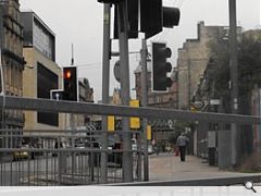
Our streets are becoming ever more cluttered with a forest of traffic lights, miles of metal barriers and assorted objects including telephone boxes, poster sites and now Ð the next BIG thing Ð wayfinding systems.
Ellie Herring asks if what is needed is some high powered street sweeping.
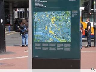
Such a dilemma inevitably concerned the designers of GlasgowÕs new wayfinding signage, the dark green and grey scheme involving 149 maps, information panels and finger posts that have been popping up across the city in increasing numbers since the Spring. A collaboration between the City Council, Clear Channel Outdoor, Applied Information Group London and Lacock Gullam, by September these objects will be situated on key routes throughout the city, including London Road, Gallowgate and St Vincent Street, as well as George Square, Sauchiehall Street and Buchanan Street. Initially generated out of a desire by Councillors to find ways of promoting the city, the new scheme will replace the existing blue tourist signs which were put in place about a decade ago, and were considered ÔtiredÕ. By contrast, the new signs are considered by Council Leader Steven Purcell to provide a Ô21st century welcomeÕ to visitors to Glasgow.
According to Tim Fendley, Chairman and Creative Director of AIG, the new signs are intended to reflect the visual identity and character of ScotlandÕs largest city. Indeed he describes the objects as having a strong relationship with GlasgowÕs architectural vernacular, a suggestion echoed by his colleague Sam Gullam, Product Director of AIG and founder of Lacock Gullam. During a recent interview Gullam described AIGÕs approach to the project: Òwe try to make products which suit the local environment. The scale of the street and buildings in Glasgow meant that the physical objects needed to be a bit bigger Ð to establish a presence on the street and feel like they belong. It was a happy coincidence that the larger streets afforded us more space to show more information but in other cities that would feel wrong, as well as cause obstacles. With Glasgow, the sloping shape comes from the steep hills in the city and the architecture being quite grand and rigid. ThereÕs something about how the objects hit the ground which is unexpected, and yet the slightly off-shape of the Glasgow product doesnÕt look out of place.Ó
In London AIG have developed a scheme which is even more obvious than that in Glasgow Ð taller with a huge bar at the top and very yellow Ð and despite having attracted criticism from conservation groups, AIG insist that if you walk down Oxford Street you wonÕt spot anything unless the object shouts out loudly to you. This compromise is not necessarily just about scale or aesthetics, itÕs about context, yet Gullam says clients often ask for an iconic design, which he believes to be impossible to deliver. ÒWhat we can doÓ he says however, Òis build a product which has the quality to last, with information Ð and ways of maintaining that information Ð that will function for about 15 years. Then, if the product functions both physically and functionally, itÕs possible to reach the point where people engage in some sort of heritage lobby because it becomes part of where that place is, and in that way it becomes iconic. So as designers we can give them the ability to get to that iconic point through time.Ó
Unlikely as it may be that GlasgowÕs signage has become iconic at this early stage, there is certainly a strong visual relationship between the existing signage and the new, which lends them a sense of familiarity. However, in places the new scheme looks bulky and dominates the pavement, meaning that pedestrians are required to negotiate around them. Placement and positioning are largely driven by the throw of the map, defends Gullam. Nevertheless, there are some who believe that there are already far too many objects in our streets, many of whom identify with the principle of shared space.
A familiar concept to many, the reasoning underpinning shared space is that if pedestrians can make eye contact with drivers and the streetscape allows them to, then by and large traffic accidents will be reduced as a result. This is because a form of negotiation takes place between all the different users of the space, and no one relies on traffic lights or the green man of a pedestrian crossing. By this logic, street furniture and ÔunnecessaryÕ signage render the street a cluttered and confusing place, which effectively turn the users into automatons. A shared space forces us to become more accountable for our actions.
While there have been well publicised experiments in Europe Ð in the Dutch city of Drachten, for instance Ð the UK has been slow to adopt the shared space values. One London borough however Ð Kensington and Chelsea Ð has adopted some of these principles. Dubbed Ônaked streetsÕ by its critics, High Street Kensington is well known for having removed all markings, signage, pedestrian barriers and much unnecessary street furniture. And, to the surprise of its critics, the scheme has proved to have lsignificantly reduced injuries to pedestrians, in fact it has reported that in the two years after the scheme was implemented, casualties fell by 43.7%. In nearby Exhibition Road, a similar project is expected to be completed in time for the 2012 London Olympics. Developed by Dixon Jones, the new Exhibition Road streetscape will be designed as a single surface space (i.e. no kerbs) covered with a graphic interlocking design, which prioritises pedestrians over vehicles.
So why is Glasgow introducing additional objects to its streets? While Fendley agrees that the streets should be cleared of things which have no real use, he questions whether things are clutter if they are used: ÒthereÕs no architecture which can tell you that the next street over is really interesting, and [although] sightlines and landmarks are the preferable way to navigateÉ you need signs to guide peopleÓ.
Yet is there a conflict of interests evident within this scheme? If one examines the companies involved Ð and even the objects themselves Ð itÕs possible to detect another reason why Glasgow City Council may have been keen to update its signage. According to Councillor Steven Purcell in a Clear Channel press release from April, Òso much has changed in GlasgowÕs tourism landscape over the last 15 years. These new signs not only better reflect the many great attractions Glasgow has to offer, but also serve to underline the cityÕs seriousness about becoming a major league tourist destinationÓ. So, in addition to the finger posts and map panels, the new wayfinding signage developed by the media provider Clear Channel Outdoor also incorporates new ad panels on premium FSUs across the city. Moreover, as the scheme is partly funded through advertising income, Clear Channel has offered to replace the existing signage at no cost to the Council. Therefore, Glasgow City Council has been able to renew its advertising contract as well as its signage with very little cost, and, with existing street furniture contracts in Edinburgh and Aberdeen, Clear Channel has now gained a strong advertising presence in Glasgow.
Yet Tim Fendley rejects all suggestions that AIGÕs scheme for Glasgow is simultaneously advertising. Despite many of the objects having signage on one side and advertising on the reverse, Fendley insists that these particular objects are not wayfinding points, but merely advertising points which incidentally have no value in advertising terms: ÒIf people donÕt need it they donÕt see it. People ignore stuff all the time. And thatÕs the big fallacy with advertising Ð 98% of it is ignored.Ó Whilst some of the ad panels are in areas which donÕt attract much footfall, Fendley points out that these points allow the investment to go into the city centre where the Council didnÕt want advertising and where thereÕs just information.
The privatisation of public space and the objects contained within those spaces is not a recent phenomenon, indeed telephone boxes and bus shelters have incorporated advertising for many years. As cities increasingly compete with each other Ð and the increase in place promotion and city branding testifies to this Ð it seems somewhat inevitable that furnishing their streets would become, in turn, a lucrative business opportunity. The conflict in Glasgow then, is that while assuming the role of a public service, the new signage scheme has been appropriated by private economic interests. Despite FendleyÕs claims, wayfinding signage and advertising sit uneasily together, and merely reflect a growing trend by Glasgow City Council to turn Glasgow into a city of consumption.
|
|
Read next: Why wood is good
Read previous: Going with the flow
Back to October 2009
Browse Features Archive
Search
News
For more news from the industry visit our News section.
Features & Reports
For more information from the industry visit our Features & Reports section.


