Beacon
6 Apr 2006
Prospect talked to Scott Turpie, the project architect on An Lanntair, about the design and redesign of Stornoway’s new centre. Following the original competition brief the project was downsized to correspond to the available funds. As a result, it’s become a multi-purpose, highly adaptable building. It may have even benefited from the financial constraints. Photography by Keith Hunter.
Stornoway is on the east side of Lewis, Scotland’s most westerly island. The town provides the main links to the mainland in the form of a ferry to Ullapool and the island’s airport. Last month Jack McConnell travelled to Stornoway to officially open An Lanntair, a new multipurpose arts centre that provides Lewis with a theatre, gallery, cinema, bar and restaurant. The building cost £3.9 million, £3 million of which came from the Scottish Arts Council (SAC) lottery fund; the rest came from Highlands and Islands Enterprise, the local authority and the European Regional Development Fund (ERDF).
Stornoway’s built fabric is very familiar to those conversant with the language of Scotland’s small towns. There is the ferry terminal and a harbour road that sweeps along the edge of the water, providing access to the backs of the town’s bulkier semi-industrial buildings. Behind them sits the polite side of the town, a main street that runs parallel to the waterside containing the town’s civic buildings and its shops. One other significant civic street – in Stornoway’s case it’s called Kenneth Street – cuts up north from the waterfront up to the main street.
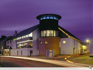
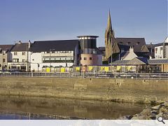
An Lanntair sits at an important junction between the water and the main street, occupying an entire block with three faces, one to the water, one to Kenneth Street and the other onto Francis Street and the main pedestrianised shopping area. The approach of Nicoll Russell, the architects on the project, was to complete the town’s waterfront edge.
So An Lanntair sits opposite the ferry terminal and the bus station, marking the main arrival point for the town and at the same time responding to the character of the main street. “What we were trying to do was to reconcile the grand waterfront with the more intimate character on the north side of the site. It was important that there was a civic scale on that corner overlooking the water, but we decided to put the entrance on the shopping street where all of the activity is,” explains Scott Turpie.
The architects decided to mark the corner with a lighthouse-like structure, or lantern. The centre was called An Lanntair because ‘lanntair’ is Gaelic for ‘beacon’, and the client’s ambition was that the building would be a beacon for the arts, so the creation of a corner drum with a light at the top seemed very appropriate. Nicoll Russell made an early decision to put a large community room at the top of the corner drum directly underneath a lantern. On the middle floor the drum space opens out into the foyer to form part of a function area.
The building changes in character as it moves away from the water. On the waterfront it is solid and as it turns to meet the high street, into a more protected environment, it becomes more transparent. With the exception of the corner drum, the massing of the building is simple and almost domestic in scale. The building is steel framed with a mono-pitch roof that runs away from the waterfront and Kenneth Street, and is two storeys high to match the building opposite. Rather than fill the whole site, the architects left some space directly opposite the town’s church, to allow the building and the street some breathing space. So a six-metre-high blank forms one face of a public square while the church forms the opposite face. Inside the building the blank wall forms the gallery.
“The key issue in the development of the brief was to respond to the client’s desire to break down the barriers, both physically and philosophically,” says Turpie. An Lanntair was formed in 1984 as a visual arts collective and until the group occupied the new building its home was on the first floor of the town hall, where it ran a café and gallery. There was a feeling that many people used the café but that the gallery got overlooked, so the brief contained a demand for a social function, which was to pull people through the building and get them to engage with the art.
The project was first put out to competitive interview in 1997 but, after developing the original design, Nicoll Russell was asked to go back to the drawing board in order to meet the budget. “In its previous incarnation the building was much grander. We had a separate space for every possible function. Then we had to review the project and start again so the spaces became multi-purpose and flexible. We now have an auditorium that alone is not big enough for an annual ceilidh but when it is combined with other spaces works well,” says Turpie. “No doubt the first scheme would have been quite a statement, but the new scheme has a modesty and cleverness and even a frugality that makes it quite rich,” he adds.
The unique thing about the final building is the manner in which the spaces open onto one another, and Turpie is very pleased with the way the building is being used. Roddy Murray, the director of the centre, has taken on the idea of the foyer as an extension to the gallery space; there is material scattered throughout the building and this has helped to blur the boundaries between gallery space and other spaces. Looking at the programme on the website, it is clear that the theatre programme is strong, but the cinema is also very popular.
The auditorium space occupies the middle of the building and when it is not being used its walls are removed to form a bigger space. Two large acoustic panels hang from the building structure and are raised up vertically like a safety curtain and a third wall is made up of sliding screens, which are stored in what becomes the sound lobby. The architects took great care to avoid the unwelcoming feel of many multi-propose halls. They have used changes in levels around the hall to break down the space into small components. There is a dancefloor with retractable seating that can be pulled out over it, a terrace level and two side balconies.
“There is very much a need to ensure the community engages with the building or it will fail,” says Turpie. “At the public opening, Ric Russell and I were touring around the building and a large number of members of the public came through the door. Ric and I heard a person behind us say, ‘I’ve met more people I know here in the past 15 minutes than I have met in the last six months’. There was no real social heart in Stornoway that was easily accessible. The centre provides a place for people to congregate. The centre is opening till late in the evening every night, except of course on Sundays,” he adds.
Read next: Extension to the Barajas Airport, Madrid
Read previous: Hoskins
Back to April 2006
Browse Features Archive
Search
News
For more news from the industry visit our News section.
Features & Reports
For more information from the industry visit our Features & Reports section.


