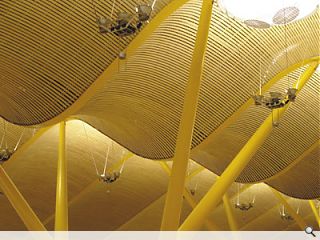
Extension to the Barajas Airport, Madrid
6 Apr 2006
Penny Lewis was invited by the CUPA Group to visit its Piforsa quarry in northern Spain. The quarry is used to produce CUPA 3, a slate that is used widely in the Scottish market because of its looks and performance.
A recent trip to Ponferrada to look at slate meant a flight in and out of Madrid’s new airport terminal in the very week that it opened. The morning TV news broadcasts in the days after the opening were full of horror stories about queues for the underground, major flight delays and problems with the luggage system and the airport’s own concourses were littered with camera crews looking for angry passengers. But the media circus didn’t detract from the pleasure of using Madrid’s Terminal 4.
The building was designed by Richard Rogers Partnership, working with Spanish architects Estudio Lamela. Spiers and Major and Anthony Hunt also worked on the project. There was a competition for this building in 1997 and work began on the project in 2000. The new terminal sits to the north of the original airport and is made up of three elements: a large multi-storey car park, a terminal for domestic flights and a satellite terminal, accessed by an underground system for international flights. The new terminal should be able to handle 50 million passengers annually.
Passengers are organised on levels depending on their activity; level zero for arrivals, level one for boarding and level two for departures. Within each floor the functions – check-in, security and boarding – are separated by gaping light-filled canyons. To cross a canyon or move from floor to floor, users cross glass-floored bridges or fully glazed lifts; the circulation is very hi-tech. In contrast, the main bulk of the building is almost Teletubbies. The forms are simple and although the building is very big and is designed to allow for extension, from a distance it appears to lie close the ground. Internally, the use of vast areas of timber cladding give the building a warm glow and avoids the rather unfriendly metallic quality of many airports.
The building feels like a cross between the Pompidou Centre and the Welsh assembly, half hi-tech megastructure, half timber-clad organic forms. Despite its slightly schizophrenic character it is highly legible and manages to be both comfortable and slick simultaneously.
Read next: Natural materials
Read previous: Beacon
Back to April 2006
Browse Features Archive
Search
News
For more news from the industry visit our News section.
Features & Reports
For more information from the industry visit our Features & Reports section.


