Glasgow Caledonian Library Re-visited
24 Jun 2008
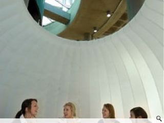
In Practice There are no dusty shelves or rows of books at Glasgow Caledonian University's Saltire Centre. The purpose-built library concept was designed to mimic the organic space of a city, with a suffuse interior to foster and stimulate learning. Four years after its doors opened, Prospect took the interior designers back to school to find out how the project is faring
Val Clugston had only three months to design the interior of Glasgow Caledonian University's landmark Saltire Centre whilst at Curious Orange. Construction slippages ultimately extended that timeframe, but the lessons learned and applied, drawn partly from her own PhD thesis work at Glasgow School of Art on the design of the learning environment, springboarded the founding of her own design partnership, Nomad. The challenges of designing a learning environment that would stimulate as well as educate drew in Clugston's own innovative ideas, as well as concepts rooted in the 1960s, to create something entirely unique.
"We brought in a lot of the theories that had informed my PhD, looking at different levels and how to create different types of space for different learners. How to lay out a public building on this scale when you are dealing with people aged between 8 and 80 with different learning abilities," she says.
"We thought about how they could and should navigate around the space and how they can read space; people with different literacy levels, from different cultures, and how to find a common denominator between them.
"The reason we started doing this is because, as an undergraduate I was frustrated with the lack of information available to interior designers in how to do spaces like this. I started looking at urban planning and environmental psychology, and pulling these things together."
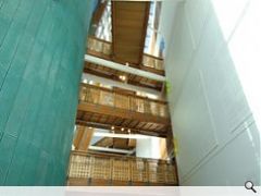
The bright pastel colours were a rigid design constraint applied by the client. Clugston says one of the priorities in designing the space was to take advantage of the layered depth of the building, to give the users space to work, with tapering ambience as users ascended.
"A lot of libraries just cram seats in. We were allowed to do broad pathways through the space to allow people space to learn in. We layered up different types of spaces for different types of learners. I like a lot of noise around me for instance, so I would probably have used the ground floor atrium. Others would have preferred level four. Allowing the building to be flexible that way allowed us to create different levels of space." Clugston says the layout of the interiors was designed to meet the generic requirements of a wide constituent client body of students, who needed to know how to use the space to maximum benefit.
"It is not only how it communicates its culture and identity - which we think is really important - but how it communicates general information, such as where are the WCs, what is happening on other floors. So the landmarks are an important feature of trying to convey that information about what is happening in the rest of the building," says Clugston.
To achieve this, Clugston drew on Kevin Lynch's celebrated city method, which studied perceptions of spatial information used as people navigate through cities, forming mental maps with five elements: paths, edges, districts, nodes and landmarks.
"We used that within the building; as you go through the building you can see that it is based on a city, we have landmarks on each floor, broad pathways. The edges are detailed, and edges can sometimes be neglected in buildings," says Clugston, who explains that by adding different characteristics to the districts within the building, each feels like a different place.
"We hoped that would help with understanding the space and create that identity. All the graphic design on the floors are based on landscapes, which is about communicating behaviour. Downstairs it is Edinburgh and Glasgow merged together; upstairs it is a domestic landscape, based on research which discovered that students get less stressed at exam times if they can look on a natural setting. It informs behaviour; downstairs it is really busy with lots of things happening. As you get upstairs, it becomes calmer and calmer.
"Now in its fifth year, the building interior has remained resilient and fresh, despite the rigours of catering for the notoriously clumsy student populace. As a study centre, rather than the library it replaced, it holds less books, but is far busier as a working proposition than its predecessor building, which has now become the home of the University's on-site security.
Present and former students say the building works largely as the designers intended, relishing the atmosphere and bustle of the lower atrium, which doubles as a cafe, meeting spot and hub, then decamping to the upper levels where quiet study and solitude can be enjoyed. The signature bean bag communal seating remains, and the only variation to the original interior specification is the shortening of the study booths on the first floor, narrowed to a more practical width. The only complaints heard about the working of the building were in respect of the occasional bottlenecking at the building's few entry points with its campus neighbours.
Reflecting on the interior design and the way it has bedded in, Clugston says she remains very fond of the Saltire Centre. "A lot of it works. We watch students interact, and I like to think we have taken forward the things that we got right, to find new ways of doing things. It has a lot of energy in it."
|
|


