THE DANGER OF BEING OVERWHELMED BY 3D
4 Jun 2008
WOW Good art is good art , whether it is hand drawn or computer generated. Dougie Cross argues that it's important not to get overwhelmed by new visualisation technology. His studio is very interested in putting the art back into the illustration business
I still have all my pantone pens, airbrush, .25 & .5 Rotring pens and even an AO drawing board...somewhere...I think. I know, how old fashioned. Truth is somewhere in the transition of architecture from pen to mouse something of the personal craft of art has sometimes been lost. I remember getting my first copy of a Francis Ching book in the first week of my Part 1 architecture at Dundee and marvelling at the skill and precision of his instantly personable drawings, I think it sealed my love of illustration as part of the ‘art’ of architecture.
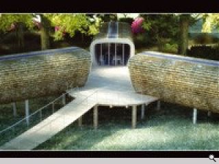
I’ve seen rational and skilful architects say ‘wow’ at a 3D representation of a building on a screen when what they are actually looking at is the CG equivalent of a terrible drawing! What motivates us to drool at technology when sometimes it’s actually no good? Good art is still good art whether its hand drawn or computer generated. Software and hardware are fantastic tools. We couldn’t function without them! But, all too often, the sheer fact that something is a CGI doesn’t make it good. The team here at TIGERX.STUDIO are all first and foremost artists and we try to do things differently, on any given project, purely so we don’t get tied to a certain bit of software or way of doing things. We’re an illustration Studio - it just so happens that we use computers to produce our work. Architecture is an emotive art and architects are passionate people so graphically representing carefully designed spaces, lighting and materials should be seen as part of conveying that emotion. As an example, we recently created an image for KITA Developments who had designed a shingle clad, triple pod-like classroom extension, in a forest setting, to a school in Windermere. Our brief was to provide an image that would ‘get us through planning’. Given the nature of the design, we suggested that the image have an almost fantasy-like feeling that would inspire everyone’s inner kid that these classrooms were really in fact fantastic tree-huts in an enchanted forest. It worked. KITA got planning permission for the development in January, just an arm’s length from a very traditional stone Victorian School building. Job done.
I say don’t settle for a good image, settle for a great one. After all, who would ask a professional photographer to take some shots of their finished building on anything less than the perfect day, from the perfect angle and showing off the greatest success of the design. Un-emotive images, be they photographs or CGI’s, are, to be honest, a bit of an insult to the work of the architect who after all has put all his or her efforts into the careful design of their building. Are your illustrations works of art that convey the emotion of your design? If they are lacking something, then maybe it’s time to call on some artists to put the art back into your practice’s illustration. If you ask me nicely I might just dust off the Pantones one more time. After all, art is…well, its art.


