Glasgow Harbour
5 Oct 2007
High Rise Glasgow has had some bad experiences with tower blocks, but the early anxieties expressed about the new blocks at Glasgow Harbour reflected concerns about other social and political fears, rather than a desire to engage in a genuine debate about housing design. Now that the first towers are complete we can assess their merits. Photography by Keith Hunter
This year Dandara picked up the Grand Prix at The Herald Property Awards for gh2o. But when the developer submitted the planning application for gh2o in February 2005, the media carried highly sceptical reports about the Clydeside development, comparing it to the notorious 1960s Red Road flats. Today the first of three phases of development is complete and sold, and the second phase is underway. The third phase, which includes commercial units, should be completed in 2010, providing a total of 770 units.
"They use the Red Road flats because it’s pejorative, short-hand for everything that is wrong with high-rise living,” believes Gordon Murray, a partner in the architects behind the project. “In the 1960s and 1970s, a lot of the problems with tall blocks derived from the new technology. We are now in a much better position; we have a much more sophisticated understanding of construction and materials and a smarter awareness of the issues at ground level," he adds.
As Murray knows, concerns about tower blocks extend to issues far beyond the limits of post-war construction techniques. In recent years the tenement form has undergone a revival, but it has also had something of a stranglehold on the imagination of designers and planners. There are others that believe that any large-scale homogenous development is likely to undermine the capacity of residents to make meaningful social relationships.
Despite contemporary prejudices, gm+ad managed to convince the planners that the waterfront demanded this scale of development, and also that they should be allowed to design blocks in a way that did not comply with the area’s master plan. “If cities are to be sustainable then they need a critical mass of population, they need to re-densify,” argues Murray. “If you don’t have a critical mass you lose out on work and leisure.”
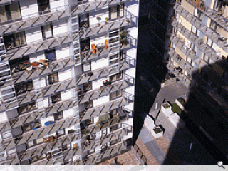
Looking at an iconic image of Red Road beside the gh2o towers, there are some parallels – there is a stunning simplicity in the form of both schemes and there is the impressive speed of delivery. Red Road was produced using prefabricated building panels in the face of chronic housing shortages, while Dandara is a highly efficient developer and contractor machine which is driven to rationalise the construction process.
Where gh2o differs from Red Road is in the design quality. Although Dandara is building in a highly competitive market, they understood that the design of this scheme required careful attention. The planners were working to a master plan drawn up by Kohn Pedersen Fox in the 1990s, which proposed the creation of traditional tenement-like blocks. The first phase of the development was already underway and they could see that the highly prized waterside units tended to cut out river views for other units. In gh2o between 94% and 98% of the flats have river views. By placing the main towers at 90 degrees to the river, the architects have maximised views and daylight. If there was any real parallel to be drawn between this scheme and the 1960s towers it is with Robert Matthew’s Hutcheston B where Matthew turned the blocks against the city grid in favour of improved orientation.
The design of any tower block involves the delivery of numbers of units and demands attention to issues of overlooking, daylight and views. Then there are also trickier issues, such as how the tower meets the ground, what kind of environment it creates and how one enters the building. The best architects will consider how to avoid the monotony of the repeated floor plates and the dumb façade. gm+ad have dealt with these issues pretty systematically. The main entrance, which leads to a generous foyer, sits on the podium level on the east side of the towers to provide wind protection. Parking is below ground, leaving the street level free for pedestrians. The central court between the blocks has been carefully landscaped with granite paving and sculptural concrete planters, and each block is clad in Chinese black granite up to the first floor.
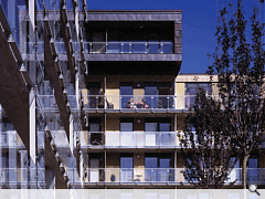
In order to refine the edges of their towers, the blocks were split in half so that a horizontal and vertical shift around the core would create an animated plan with a good rooftop profile and terraces. The west tower ‘element’ is clad in horizontal standing seam sheet copper cladding with an ‘oxide’ finish to form a ‘frame’ around vertical full-height curtain walling to north-south facing blocks. To create some rhythm on the façade, double-height vertical screens are overlaid over the horizontal floor plates. A continuous clear glass balustrade and ‘third skin’ translucent vertical glass panels over 2/3 storeys provide protection to full-length pre-cast concrete balconies.


