BBC Interiors
27 Sep 2007
Chipperfield's New hq for bbc with interior designed by graven Images
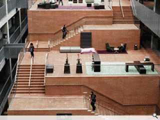
The BBC has now officially opened its new building. All of its staff have been relocated and broadcasting is now coming from Pacific Quay. Photographer Renzo Mazzolini was asked to go into the building and take a series of shots to show how the BBC’s staff and members of the public are using the space. The BBC building was designed by David Chipperfield working with Keppie Design (the latter was responsible for the building’s delivery), while Graven Images were commissioned to design the interiors. The two main elements of the interior design are the furnishing of the main atrium stair and restaurant; and the detailed organisation and design of the large open plan offices. Design of the studio spaces was driven more by the technical specifications, although the open studio on the upper level has a strong visual quality.
David Chipperfield’s original competition-winning concept for this building – that it should basically be a big glass box, and cut out of the centre of that box would be a super-sized staircase around which all other activity would circulate – was incredibly strong.
The principle of a central ‘street’ has now become common in many building types – both corporate and public – where the client wants to encourage interaction and collective activity among the building’s users. The BBC’s ‘street’, or giant stair, is now in place and cascades down from the top of the building to the entrance. It appears to be functioning very effectively as a new corporate space for the BBC. Where it meets the ground, there is an extremely generous lobby which is given over as a multimedia public space complete with coffee bar, sound pods and media walls.
In the office space, the garden sheds have attracted great attention from the media. These brightly painted sheds were installed to be used by staff for, well, anything really. Graven suggested them as a bit of fun, a symbol or reminder that the BBC was a creative institution in which a bit of Heath Robinson creative eccentricity would not be out of place – even if it was housed in a new flashy building. On a more serious note, Graven Images worked carefully with engineers and staff to produce a working environment which meets the needs of programme makers and their support staff, and which aims to be flexible without becoming soulless. For instance, long floor spans are broken up by bespoke screens which also provide signage and other functions, while desks are organised in long, well organised benches for flexibility, with cores for administrative staff and resource centres for each department. The resource centres are beautifully designed organic sculptural pieces manufactured in bright coloured Corian.
The Atrium space has been furnished with a combination of formal – yet almost domestic – furniture for meetings and some much softer furnishing to be used by individuals or small groups. The main aim was to create a space that felt like the lobby of a boutique hotel and which would be suitable for informal meetings away from the office environment.
Photography by Renzo Mazzolini


