Hoyle Early Years Centre
16 Sep 2004
Hoyle Nursery in Bury won an RIBA Award earlier this year. The achievement is much greater – the building sets new standards in nursery design, thanks to a talented architect and dedicated client.
“Good Clients = Good Architecture” was the title of this year’s RIBA Annual Conference in Dublin, a name which could easily have been inspired by the Hoyle Early Years Centre. Clare Barker, the head teacher of the Bury nursery school, not only bent over backwards to secure extra funding for the new building she so badly wanted, but got involved with its design and day-to-day construction. The result is a sophisticated and inspirational building designed by London-based DSDHA, which is as excellent an advert for client-architect-contractor teamwork as you are likely to find.
In 2001, CABE and the Department for Education and Skills launched a Neighbourhood Nurseries Initiative national design competition, seeking imaginative and high-quality designs. Of the three winning schemes earmarked for Bury, Bexley and Sheffield, Hoyle was the first to get off the ground. Barker applied for Early Excellence Centre status, which was also approved for funding, and persuaded the DfES to combine the two funds to get a bigger budget.
The original Hoyle Nursery was a tired group of 1970s brick buildings that Barker described as depresssing and with no presence. DSDHA’s design replaces the bulk of the old buildings - only the foundations and one wall were retained, in order to fulfil some of the funding criteria that required the project to be classified as a refurbishment.
Hoyle is Bury’s only local authority nursery, providing mainstream pre-school education as well as catering for children with special needs who make up around a quarter of its intake. The old centre took children from two to five, but additional space in the new facility has allowed them to expand the age range to include under-twos. There can be as many as 63 children and 26 staff within the centre at any given time – 40 three- to five-year-olds, 15 toddlers and 9 babies. The centre also provides adult education such as cookery, craft, literacy and numeracy for parents of children who attend the nursery.
The area around the nursery is a deprived one, 200 metres from the M66 and made up mainly of local authority housing. It is one of the lowest funded education departments in the country, but often wrongly categorised, “Bury often falls into the ‘leafy green suburb’ category and therefore misses out on money, but this area has significant problems, such as drug abuse and vandalism.” explains Barker. “It is, in fact, one of the 20 per cent most deprived wards in Britain – one of the criteria for Neighbourhood Nurseries Initiative funding.”
Barker applied for further money from the New Deals for Schools scheme, which allowed her to set up temporary accommodation in Portacabins in the field opposite the site, while the new centre was being built. She was given her own hard hat and boots, and came across to the site almost every day. This enabled her to spot problems she had missed on the drawings, and change things that she felt would not work, such as the position of one of the doors. The children also found the gradual emergence of the new building before their eyes an exciting experience.
Barker’s brief for the centre concentrated heavily on the prevention of vandalism, a problem which had been a regular occurrence at the old centre. All windows facing the street have metal shutters. A full-height steel mesh, which protects the front entrance and buggy park, has been carried round the side of the building to prevent graffiti on the rendered wall that borders a public footpath. The mesh does look quite inhospitable, especially for a nursery school, but planting is planned to soften the effect. The dry-stone walling used on the majority of the street elevation has proved a rather more beautiful way of thwarting the intentions of impromptu muralists.
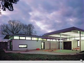
The plan is divided into three areas – admin and staff quarters, the 3-to-5s accommodation and the under-3s area, arranged around a spacious entrance hall and a glazed central courtyard. This can be opened on two sides, bringing light and natural ventilation into the centre of the plan and allowing views right through the building from the entrance space to the back garden.
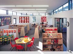
The largest space in the centre is the 3-5 room, which has been built over the footprint of the original building. The simple rectangular room has clerestory glazing along three sides, creating a wonderful quality of light and the appearance of a floating roof. The space is divided into smaller bays by movable storage units designed by Early Excellence, which help focus the children’s attention on the activity at hand while allowing teachers a clear view of what’s going on. The smaller under-3s room has a wall that folds back to join the space with the adjacent parents’ room, creating a larger training area. “Each space has to work hard for a living and be very flexible,” explains Barker.
The interior lacks the usual gaudy colours of a nursery, in a deliberate attempt to create a calming environment with the autistic children – who can be distracted by bright colour and pattern – in mind. The muted backdrop also allows the children’s artwork to become the focus, rather than being overwhelmed by colourful walls. The light is intense enough to prevent the lack of colour making the building seem drab. The larger spaces are simple, serene and light, and every room has clerestory windows through which you can catch glimpses of sky and trees. This, along with high ceilings, makes them appear larger than they are. Natural light tubes have also been used to bring additional light into administration spaces.
The protected external play areas are a joy. The oversailing roof of the 3-5’s room, made from translucent polycarbonate and supported by two coloured columns, creates a striking feature while providing shelter. In dark winter evenings, this canopy can be illuminated to great effect. The garden is mainly grassed and landscaped to form a mound on which a small slide is placed. The baby room also opens on to its own designated outdoor play space.
I asked Barker why she felt that the architects were so complimentary about her as a client. “I don’t know!” she laughs. “We did have a good relationship. The contractors were great too, so I guess you could say there was good teamwork. I was very interested in the new building, as it took me so long to get it. When I came to Hoyle 12 years ago, my goal was to get a new entrance, so it was really exciting to get a whole new building. The architects allowed me to get involved. My husband is also an architect, so he helped me with the technical side, the translation of jargon and the reading of plans.” In fact, Barker’s husband had once produced sketches for a proposed extension to the old nursery building, which DSDHA looked at when producing their design.
Barker is delighted with the building, and the effect it has had on the children. “We have half-a-dozen autistic kids who have used both the old centre and the new centre,” she explains, “and we’ve been able to observe how they have responded to the new building. They are definitely calmer, and there are spaces where they can go if they need ‘time out’”.
The architects have clearly never stopped thinking about how children will use the centre; it is the thoughtful little touches, like the external storage doors, which double as chalkboards for drawing on, and the baby’s-eye-view, ultra-low window in the under-2s room, that make this building outstanding.
Hoyle is now being used as an exemplar of good design for the Sure Start Children’s Centre Initiative and CABE, and has recently won an RIBA Award. The RIBA judging panel sang the praises of Barker. “She was totally involved in the design and, with the children, watched the construction daily from their temporary accommodation across the road. Although the head says ‘It’s been perfect’ it was a constant battle to get exactly what she wanted.”
Written by Anna Chambers
Photography by Martine Hamilton Knight
Read previous: Experimentation
Back to September 2004
Browse Features Archive
Search
News
For more news from the industry visit our News section.
Features & Reports
For more information from the industry visit our Features & Reports section.


