The Zit Building Award
For the worst building completed since the last awards
Beacon Centre (Inverclyde)
An industrial unit plonked in a prime riverside location next to one of the few nice buildings in the town, the georgian custom house Nominated by: b johnston
Cooper Cromar building, Site 6, Dundee Waterfront (Dundee)
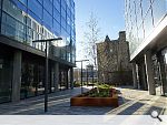
Reason for nomination: The Dundee Waterfront redevelopment is an ambitious, imaginative scheme. The centrepiece, the new V&A museum, is magical, inspirational and stunningly beautiful. It sits harmoniously beside RRS Discovery, with the backdrop and reflections of the Tay estuary beyond. The curves and facade of the new railway station building and associated hotel, with the open space and street sculpture in front, complements the V&A and offers a view towards it. To the townward side, the remaining Victorian buildings (such as the now Malmaison Hotel) show the link to Dundee's historic past. That is the good news.... Now for the bad news. Slap bang in front of the amazing V&A, is "Site 6". On that site, and totally blocking views of the V&A from the town and the surrounding area, a new building is being constructed by Cooper Cromar (whoever they are). A boring, rectangular, totally unoriginal, block of offices, apartments and a hotel with a row of retail units (no doubt the usual Starbucks/Costa/burgers identikit cafes and shops) at ground level. The structure is a giant shoebox, with no aesthetic merit and no sense of style. Its utilitarian rectilinear shape is a direct insult to the flowing lines of the V&A. Its height means that it will, when complete, overshadow the V&A and adjacent buildings. It seems the architects have not even had the imagination or decency to coat the exterior in mirror glass so that the block reflects the astounding beauty of the other buildings around it. The nomination could be for both Pock Mark and Zit awards. The construction of such an crass and ugly building in such a stunning site, destroying the vista and obscuring the truly awesome architecture of the V&A, somehow makes the situation even more appalling. The planners and architects responsible should be ashamed; and those who hoped for the regeneration of Dundee to be breathtaking and beautiful have reason to be very angry. An opportunity missed, a site ruined, and the waterfront view spoiled. Nominated by Nairnbairn
Lochore Meadows Visitor Centre (Fife)
Lochore Meadows Country Park Crosshill Fife
Reason for nomination: The Fife Council architect was asked to provide a budget design, so took his inspiration from combining a portakabin with a steel shipping container. Fife Council planners were ordered to rush the planning permission through under delegated powers in the midst of a public outcry to halt the development.
Nominated by: Tom Kinnaird
Marischal Square (Aberdeen)
Scott Campbell
After demolishing a truly horrible 60's building, the local council totally ignored public opinion and replaced it with an even worse design which envelopes the adjacent Provost Skene's house and overshadows the iconic Marischal College.
S Begg
The worlds second largest granite building, Marischal College, is now in the shadow of a second rate non-descript office/hotel block. The skyline of the city is changed by this utterly horrendous building.
Lindsay McCrone
Horrendous block of concrete and glass that totally overshadows the historic Provost Skene's house (one of the oldest properties in Aberdeen) Not chosen by the people of the city, and very unpopular with the people of the city.
Redrock (England)
Reason for nomination: How ugly is this? For people who are visiting Stockport or who pass it on the M60 it screams of cheap and nasty. Why couldn't the £45 million be spent on a design that had some class? Nominated by: Annie Smyth
Tynecastle Stadium (Edinburgh)
3 prematurely aged, cheaply built, bright pink stands are being joined by a new main stand, the design of which appears to be a throwback to 60s council office block style architecture. Incompetence and lack of budget has led to delays and compromises in the design. Sports stadia are often far from aesthetically pleasing but this abuses that privilege.
Nominated by: Richard Falconer
This construction is very 60's/70's and the disappointing use of glass has made this construction cold without any soul
Nominated by: Russell Kay
Unit 24, Sauchiehall Street (Glasgow)
The renovation of this shop unit in Glasgow city centre is the most ill-considered new addition to Sauchiehall Street in memory. The wonky, golden cladding thoughtlessly makes no attempt to fit in with the surrounding context of the street, so it's hardly surprising the building has remained empty since its completion.


